YO! by Paul Belford Ltd
Opinion by Richard Baird Posted 13 October 2016

London-based graphic design studio Paul Belford Ltd. worked with UK restaurant chain YO! Sushi, now Yo!, to rebrand, as it expands into the US, the Middle East and further into Europe. This included an updated logo together with an extensive 200 page brand book, presented in a bespoke Japanese bento box, that covered a variety of new assets. The brand book covers menus, packaging, signage and illustrative noren curtains, as well as a guide to art direction.
The logo feels far less anime and more urban in its influence. The breaks and monolinear letterforms move towards the neon signage, road networks and infrastructure of Tokyo’s frenetic cityscape, with some of the energy and equity retained from its previous iteration through italic characters and exclamation mark.
So, while perhaps a little less idiosyncratic, logo still leverages association, appears contemporary, honest and healthier in its restraint and expression, and establishes a stronger continuity between Latin characters and Kanji script. There is still personality and familiarity, but this works in conjunction, rather than in competition with, other more interesting assets, and comfortably sits alongside Aktiv Grotesk.


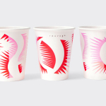
It is a huge project with plenty of assets, with only a selection picked out and presented here. Head over to Paul Belford Ltd. to see more. These draw on the iconography of Tokyo and the work of Tokyo-based designers, and introduce some playful little ideas and stories that lend identity an authenticity, but with a simplicity in keeping with a Live Fast, Eat Well position.


Individually, illustrations are distinctive and interesting, moving from the utility of powerlines and roads to the friendly tone of characters, from the dense to the more spacious, the architectural to the organic, but together form a rich visual expression. They are broad in their reference, yet tied to Japanese culture, and worked together well using solid colour and shared contexts that include menu covers, noren curtains and packaging. More from Paul Belford Ltd. on BP&O.
Design: Paul Belford Ltd. Opinion: Richard Baird. Fonts Used: Aktiv Grotesk.