
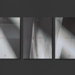
Rain, Gravity, Heat, Cold by Blok
Superkül is a Canadian architecture studio with a diverse portfolio of understated boldness, subtlety and spacial richness, rooted in a process that intends to find the essence of each project and remain true to this throughout design and development. To celebrate the studio’s first ten years Superkül worked with Blok to create Rain, Gravity, Heat, Cold, a book that would serve as a collection of...

Superkül: Rain, Gravity, Heat, Cold by Blok
Superkül is an Canadian architectural studio with a portfolio described as having an understated boldness, subtlety and spacial richness, and a process that intends to find the essence of each project and remain true to this throughout design and development. Superkül has won many awards and is considered one of Canada’s most progressive architecture firms. To celebrate the studio’s first ten years...

Maven by Design By Toko
Maven is described by Design By Toko, the Sydney-based design studio behind its recent rebranding, as a top-tier architecture recruitment agency operating worldwide. Drawing on the built environment and with the intention of expressing the agency’s prominence within the architecture industry Toko developed a brand identity of simplicity and impact through bold solid form and single colour that links business...
Kristin Jarmund Architects by Snøhetta
Kristin Jarmund Architects is an oslo-based architectural studio with a design philosophy that is focused on using a simplicity of form and a clarity of purpose to address complex problems, while at the same time, allowing for a contextual and human sensitivity. Reduction, as well as the duality inherent to the studio’s work, was the founding principles of their new...
George + Powlett by Studio Brave
George + Powlett is a residential property development of 11 apartments, created by ICON Developments, and located in East Melbourne. ICON’s properties are described as having a precision and balance, and this continues through to their latest project, which was designed by acclaimed architectural practice Powell & Glenn. The development is set within an environment of what is described as a place of elegant contrasts. This can...

Lundén Architecture Company by Tsto
Lundén Architecture Company is a Helsinki-based design studio developing innovative structures, infrastructures and spaces. The studio, through their knowledge of strategic development, experimental building technology and urban design, drawn from their collaborations with experts from different fields, offer proposals that affect the future of the built environment. Projects have included a new school and community complex that inspires learning during...

Raumindex by Moodley
Raumindex is an Austrian design, development and project management studio established in 2005 that creates integrated interior and exterior retail environments for national and international clients. Its philosophy is rooted in the shaping and arrangement of form, space and content to create functional and flexible environments to add value and elicit feelings. With a desire to appear more accessible, and with...
Superkül by Blok
Superkül is an Canadian architectural firm with a portfolio that is described as having an understated boldness, subtlety and spacial richness, and a process that intends to find the essence of each project and remain true to this throughout design and development. Superkül has won many awards and is considered one of Canada’s most progressive architecture firms. To celebrate their first...

Heritage: A User’s Manual by Bond
Heritage: A User’s Manual was an exhibition at Southbank Centre’s Archive Studio—a temporary space located within the foyer of the Royal Festival Hall—that took place between the 24th November – 13th December 2016. The exhibition was curated by MA Culture, Criticism and Curation students from London art school Central Saint Martins and “was founded on the belief that the heritage of a building is...

Verso Architecture+Interiors by Studio South
Verso is a small Auckland-based architecture and interiors business working within the residential and commercial sectors. Drawing on the oppositional nature of name and using a mix of simple typographical form, high-quality materials and print finish Studio South developed a new visual identity for Verso that is described as being both sophisticated and playful, whilst effectively working in some universal architectural principles. This links a variety of printed...
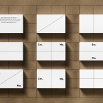
Emma Magnusson Arkitektur by Lundgren+Lindqvist
Emma Magnusson is an architect working from the Swedish city of Gothenburg primarily on private commissions and occasionally with larger corporate clients. These have included Benify and Warner Music. Scandinavian graphic design studio Lundgren+Lindqvist recently worked with Emma to craft a new visual identity. Drawing on some architectural staples such as space and materiality, and working in the systematic and the playful, Lundgren+Lindqvist’s identity work...
L’Observatoire International by Triboro
L’Observatoire International is a American lighting design studio co-founded in 1993 by Hervé Descottes. The studio is made up of architects, interior designers, engineers, artists and lighting designers working on a variety of projects, illuminating and accentuating both modern and classical architecture and spaces. These include retail premises and museums, airports, landscapes and concert halls. L’Observatoire International worked with New York-based design...