Art Direction
Feel the heat
Most branding has to give some suggestion of what said brand is, or does, or stands for – it’s usually not ideal if they bear little to no resemblance or representation of their category, audience or ideals. The exceptions are usually things like record covers, or other inherently creative entities like musical instruments, editorial projects; occasionally booze brands, like the...
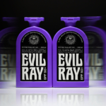
Evil Ray by Seachange
Until fairly recently, arguably sunscreen brands have had to do little in the way of brand design. Instead, they’ve been able to coast along relying on their credentials alone – and the fact that (in the UK at least) there hasn’t been a ton of competition. Things have been largely almost medicinal and rigidly adherent to category tropes: orange, yellow,...
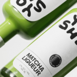
Yoshi by Saint-Urbain
Early days for sure, but this is hands down the best brand identity design I’ve seen this year – kudos to Saint-Urbain for once again putting a project out into the world that’s not only an absolute joy to look at, but which shows a razor-sharp nous for branding that’s both searingly zeitgeist and resolutely, timelessly future-facing. Said project is...
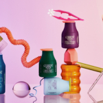
Cocolab by Wedge
It’s pretty hard to get excited about dental floss. Oral care, for the most part, lives firmly in the realm of obligation rather than desire, a twice-daily chore that sits somewhere between setting your alarm and taking the bins out. It’s precisely this emotional dead zone that Cocolab (formerly Cocofloss) set out to disrupt when it was founded in California...
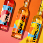
4P’s by Base Saigon
What with it being the season to be jolly and all that, it feels almost contrarian to not be as positive as I usually am in covering projects for BP&O – after all, it’s about showcasing the very best in brand design and packaging. But in the spirit of the ‘O’ for ‘Opinion’, it’s tricky to be as nigh-on-unanimously gushing...
Current State by Werner Design Werks
Current State is a skincare line launched by sisters Emily and Lanie Parr a couple of years back, which aims to “disrupt the status quo”, according to Werner Design Werks which created its boldly multicoloured branding. There’s a lot to love about this packaging and brand design – not least, that expansive approach to colour. It seems that Werner Design...
Double Diamond by Alec Tear
Our seemingly indefatigable fetishisation of the ghosts of branding past (i.e. why the design world is still talking about JKR’s Burger King rebrand nearly half a decade on) is perhaps little surprise: whether we’re consciously doing so or not, and to whatever extent we’re even aware we’re looking at something archival, returning to an amorphous yesteryear — real or imagined,...
Society De La Rassi by Blurr Bureau
Ideas around the ‘new codes of luxury’ have come up a lot lately; an updated, contemporary take on what makes something look special, valuable, covetable, and ultimately, expensive. The long and short of it is that it’s out with the old – lavish foils, gold everywhere, bling and ornamentation and ostentation – and in with a quieter, more subtle aesthetic...
Monica Rich Kosann by Here
There’s been a fair bit of chatter in recent times in the brand design world about the ‘new codes of luxury’ – how today’s hip young well-to-dos are eschewing the signifiers of yesteryear (ostentation, gold, bling, anything remotely showy) for a more understated aesthetic. Being fabulously rich today, then, is perhaps a little like the whole ‘no makeup’ thing: anyone...
Wolfe Bros Cellos by OurCreative
The likes of Strawberry & Lime Kopparberg and Old Mout Cider (pronounced, either ‘moot’, or ‘mowt’, few know, few care coz that cute little kiwi bird is so distracting) are both, let’s face it, the semi-grown up, pretty acceptable face of alcopops: people order them at very normal (even gastro!) pubs and no one bats an eyelid – the same...
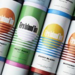
Fire Island Tea by Stephen Moss
Fire Island has always seemed far more a mythical utopia than a real, physical geographical, location to me; in part simply because of its name: Fire Island seems wrenched straight out of Greek legend – elemental, fearsome, alluring, almost a contradiction as surrounded by water yet inherently burning. But mostly, it’s thanks to Frank O’Hara, whose mid-20th-century poetry eschewed the...
Cashflow Vodka by Marx Design
Few brands dare to break the fourth wall, and all too often those that do, do it badly. Some smash through that wall Mr Blobby style – sure, it’s fun, but it’s so bold that it feels a little ridiculous, à la Brewdog’s ADVERT adverts by Uncommon. Some try to be a ickle-wickle bit clever but land on saccharinely twee:...