Designed by Believe In
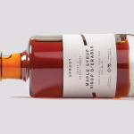
Uproot by Believe in
Uproot is a premium and limited edition maple syrup created to celebrate the opening of UK-based Believe in’s second design studio in Canada. It features a distinctive packaging design that takes a Canadian icon and infuses it with what the studio describes as a European design sensibility. Believe in, from its two studios and through their collaborative effort, will now support clients...
FS Silas Launch Campaign by Believe In
FS Silas is a new sans-serif and slab-serif font family from British type foundry Fontsmith, each available in five weights and an italic. The family is described as having a squareness of rounded forms with dynamically angles terminals and slabs capable of offering contemporary brands the opportunity to employ different voices with one typographic system. Fontsmith worked with graphic design studio Believe In to...
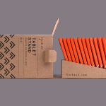
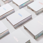
Finchtail by Believe in
Finchtail is dedicated to the design and manufacture of simple, useful and sustainable solutions to everyday problems. Its first product, a low-cost, flat-packed card tablet and mobile phone stand, features a distinctive brand identity and packaging design treatment developed by UK based graphic design studio Believe in. Monospaced type and corrugated card sit alongside die cut detail, white ink, a bold pattern...
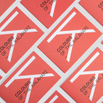
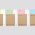
Colours Of The Kalahari by Believe In
Believe In recently published images of their print and brand identity work created for the Mall Galleries’ exhibition Colours Of The Kalahari, the first major display and sale of southern African Bushman art ever to be held in London. The exhibition represents the latest generation of contemporary San artists from an unbroken line that stretches back 20,000 years, and includes 150...
Lorient — Aura by Believe In
Aura is a new range of high end products from door sealing system manufacturer and specialist Lorient. These include drop seals, perimeter seals, door bottom seals, threshold plates and ramps designed with a distinctive curved profile that is described by Lorient as creating a sophisticated visual aesthetic that also spreads and diffuses sound. Design studio Believe In recently worked with Lorient to develop a brand identity for...