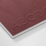
Abodo by Richards Partners
Abodo is a New Zealand-based timber specialist producing high performance and carefully crafted materials for architectural and structural contexts, and has a catalogue of cladding, decking, screening and timber panelling. Abodo worked with Richards Partners to better articulate its brand story, bring clarity to and emphasise the company’s respect for timber; where it comes from, where it is used and by...

Real Review by OK-RM
Real Review is an award-winning quarterly magazine that pursues what it means to live today through analysis, evaluation and enquiry. It is a collaboration between London-based design studio OK-RM and editor Jack Self, the founder of architectural practice and cultural institute Real. Real Review offers wide ranging comment on a variety of topics, is presented in a compact format and mixes dense...

Rain, Gravity, Heat, Cold by Blok
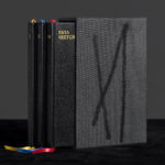
Superkül is a Canadian architecture studio with a diverse portfolio of understated boldness, subtlety and spacial richness, rooted in a process that intends to find the essence of each project and remain true to this throughout design and development. To celebrate the studio’s first ten years Superkül worked with Blok to create Rain, Gravity, Heat, Cold, a book that would serve as a collection of...
Ekta Sketchbooks Vol. I–III by Lundgren+Lindqvist
Ekta Sketchbooks is a three volume book collection dedicated to the work of Ekta, the moniker of Swedish animator, sculptor, designer and illustrator Daniel Götesson (b. 1978). Limited to 300 copies and available from ll’Editions these present—through pages thickened by collages, drawings and layers of paint and tape—moments of creative relief, and represent the context for the endless experimentation that characterises Ekta’s...

Superkül: Rain, Gravity, Heat, Cold by Blok
Superkül is an Canadian architectural studio with a portfolio described as having an understated boldness, subtlety and spacial richness, and a process that intends to find the essence of each project and remain true to this throughout design and development. Superkül has won many awards and is considered one of Canada’s most progressive architecture firms. To celebrate the studio’s first ten years...
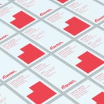
Maven by Design By Toko
Maven is described by Design By Toko, the Sydney-based design studio behind its recent rebranding, as a top-tier architecture recruitment agency operating worldwide. Drawing on the built environment and with the intention of expressing the agency’s prominence within the architecture industry Toko developed a brand identity of simplicity and impact through bold solid form and single colour that links business...

Don Alonso de Suquía by Bermudez, Porta & Casasus
A. Lozano Rodríguez, in his novella Don Alonso de Suquía, writes of the deeds of swordsman and fictional character Don Alonso de Suquía after the reconquest of Granada, at the beginning of the 16th century. This limited edition cover, designed by Barcelona-based Carlos Bermudez, Albert Porta and Guillem Casasus, touches upon location, period, theme and limited edition context using colour, type, material and finish....