Rain, Gravity, Heat, Cold by Blok
Opinion by Richard Baird Posted 5 September 2017

Superkül is a Canadian architecture studio with a diverse portfolio of understated boldness, subtlety and spacial richness, rooted in a process that intends to find the essence of each project and remain true to this throughout design and development. To celebrate the studio’s first ten years Superkül worked with Blok to create Rain, Gravity, Heat, Cold, a book that would serve as a collection of work and as a tool to articulate the firm’s unique philosophy and design approach. This was an exercise in discovery and positioning which then was expressed materially through paper transition, finishes and printing techniques.

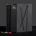
Rain, Gravity, Heat, Cold is smaller and more compact than expected, measuring 235 x 170mm and roughly 20mm deep. Its impact and the initial impression that it gives really comes through in its material qualities, how it feels in the hand, rather than through a prominent graphic or typographic expression.
There is a weight to the book that belies its page count and size. This is down to the double folded construction of each of the pages, giving the book a concertina-like quality and an unexpected volume once air gets between the pages. This aeration, once pulled from its shrink wrapping, whether unforeseen or intentional, is an interesting transitional feature that continues as the book is browsed.


The book records the process and output of Superkül in the literal sense through words and image, but thoughtfully extends to the book’s physical properties and the occasional dichotomy. Its compact size but weight, matt surface texture and the use of reflective metallic ink, the subtle and abrupt transition of papers, and the initial lightness but folded robustness of cover.

The materiality and light central to Superkül’s work is evident straight away, in the build of the cover and its graphic initial impression yet photographic origins. This is also present in the feel of the cover, printed on uncoated paper, folded twice to give it weight and rigidity, and in the shine of a silver metallic ink.
The cover features unusual folds that hide solid geometric forms which appear to be rooted in the structural explorations illustrated further inside the book. These play out within Superkul’s visual identity, designed a year after the book, as wireframes, and call to mind the spacial play of artist Richard Deacon. The hidden quality of these is interesting in their discovery but challenging in the difficulty of accessibility. What you might expect to fold out like a poster is hindered by its binding right into the spine of the book.
The cover’s abstract imagery, made up of diagonal lines and gradations of grey, and the reflective qualities of the metallic ink of title, also touch upon the more nuanced themes of light as ornament, and light through the seasons, as revealed by the book’s content. The interrelationship between text and material, beyond just ink on page, is satisfying and illuminating.

There are some lovely little details. The use of two different silver inks not only plays with light but also gives technical drawings a dimensional quality and forms a continuity with related information such as tables, diagrams and charts. This is something easily missed in promo shots, and straddles the line between the useful and a simple aesthetic pleasure.
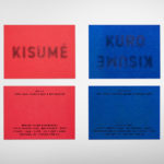
The promotional images do a good job of capturing the qualities of layout, the interplay of space and image, the natural and the built environment in both form and colour through good image reproduction. This is covered in BP&O’s initial impressions and remains the same in hand. Read more here.


Proportion and layout is used effectively. It often uses the very large to capture and emphasise the very small, the sequential to capture the transitional, uses linear overlap and colour to form connections or imply a narrative, and repetition to draw the eye to different states.


Again, hands on, the book reveals some interesting details not documented by image. For example, some of the layouts place text very close to the top edge of the book. This gives it the quality of being cut too closely but is effectively used within the context of a transcribed conversation between Eric Beck Rubin, Meg Graham and Andre D’Elia. There is a flow created by this approach, establishing an unbroken continuity that approximates the conversation for the reader.


The rich but subtle material detail, and the quality of image functions as a counter point to what is largely a practical approach to type, layout and colour. This is neither cold and mechanical or warm and cheerful. It leans into some familiar and current archetypal architecture publishing conventions but has enough little surprises, in initial impact and residual impression, that straddle the stylistic and conceptual in a way that is satisfying emotionally and intellectually.
Material and finish, type and image are judiciously worked together, much like Superkul’s buildings. There are moments of useful detail, thoughtful arrangements that work to pace, and elements that are simply materially beautiful, both hidden and in plain sight. Although in reading there is a lot of backwards and forwards, text of the back referencing projects further to the front, this emphasises the materiality of book.

The transition between the first two sections of cream and pink is very subtle, while the third into a cool grey is more abrupt. Contrast between the lighter paper sections is low, nearly imperceptible when reading, but evident when the book is closed. It is a thoughtful element that plays with different states of the book (open and closed) and and the effect of external lighting (warm and cold) on the perception of colour, linking back to the concepts that unite Superkül’s portfolio.
Above is the point at which the book moves from a very pale pink to grey. This happens mid-project, rather than signalling a chapter, content or thematic change. Images form a continuity, with a shared corridor-like quality that links the two, while colour transitions the reader into new content further in, in the form of interviews and technical insight.


Content is revealing. There are some lovely turn of phrases, some real insight into the work of Superkül. The material qualities of book work well to augment this, obviously and more subtly with the beauty being two-fold. Initial impression in weight, texture and finish, and, perhaps more satisfyingly, in the relationship with content, expressing the architectural concepts integral to Superkül using the tools of graphic design. More work by Blok on BP&O.
Design: Blok. Opinion: Richard Baird.