
REF by Kurppa Hosk
REF is an environmentally conscientious Swedish hair care brand with a range of products that are made from high quality organic ingredients. With a desire to enter the international market of the US and further into the Nordic regions, both dominated by well-established FMCG, Scandinavian design studio Kurppa Hosk were commissioned to rejuvenate REF’s visual identity. This included packaging design, art...
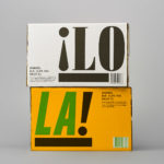
¡LoLa! by Neumeister, Sweden
¡LoLa! is a craft beer collaboration between Brutal Brewing and Supper, a restaurant that serves inventive South American food with a Swedish twist, and has locations in Stockholm, Gothenburg, Visby and Åre. The beer draws its inspiration from the fusion nature of the restaurant, and is named in honour of Lola, a woman who cooks food on a beach in Brazil and is...
Superfly by B&B Studio
Superfly is a limited edition non-alcoholic cocktail, and collaboration between celebrated mixologist Ryan Chetiyawardana, aka Mr Lyan, and naturally revitalising UK juice drink brand Firefly. The cocktail blends redcurrents, aronia berries and grapefruit with botanicals that include green coffee, angelica, wormwood, kola nut and cascara. It features a unique packaging design by London-based B&B Studio that wraps Firefly’s distinctive structural design with...

Hurly Burly by Midday
Hurly Burly brings the bold flavour and natural health benefits of naturally fermented foods to the United Kingdom. Its first range of products will be a variety of raw organic coleslaws. Flavours include Jalapeño & Oregano, Lemon & Ginger and Turmeric & Cumin. Name, brand identity and packaging design, developed by London-based design studio Midday, intends to bring to the forefront...

Summerhill Market by Blok
Summerhill Market is a family-run business, managed by the third generation, with premises on Toronto’s Summerhill Avenue and a smaller location—a floral boutique—on Mt. Pleasant Rd. The store has 200 employees, a butchers, bakery and deli, a BBQ in the summer and offers a variety of catering services. Summerhill Market is admired for its high quality products, and its ability—since 1954—to consistently redefine what...
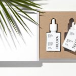
Tulura by Build
Tulura is an independent luxury botanical skincare brand created Eileen Feighny, a former professional model brought up in Korea and now working from New York. The first of Tulura’s products is a two-step moisturising program that includes a vitamin peptide serum and a botanical facial oil made from seasonal ingredients hand picked and custom-blended. Ingredients are chosen for their effectiveness, and formulations created without the use...
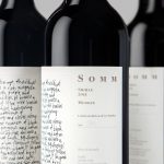
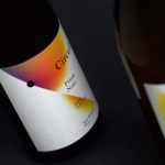
Niche Wine Co. — Somm by Frost
Somm is a limited edition Australian Shiraz from Niche Wine Co., a winery that embraces an innovative dry farming process that yields fewer yet higher quality grapes with an intensity of flavour and colour. With a desire to convey an established, old vineyard feel, and a sense of heritage and sophistication, Niche Wine Co. worked with Sydney-based studio Frost to develop a name and wine...

Filmore by Freytag Anderson
Filmore is a unisex skincare range and everyday routine. It is produced in Scotland for the national and international market using effective natural ingredients and Scottish water. Glasgow-based studio Freytag Anderson worked with Filmore on brand identity and packaging design. Referencing the International Code of Signals (ICS) and informed by their client’s love of Scandinavian design, the studio created a minimal graphic...
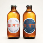
Galipette Cidre by Werklig
Galipette is a premium cidre made from 100% pure fermented apple juice (pur jus) pressed from apples that are hand picked from orchards in Brittany, Northwest France. Galipette is available as a Brut and a sweeter Biologique. These are free of gluten and added sugar and created for the international markets of Europe, North America and China by the Cider Supply Company,...
Black Estate — Circuit by Toko
Circuit is a 2014 Pinot Noir and 2015 Pinot Gris range from New Zealand’s Black Estate, a Vineyard run by The Naish Family and located across three hillsides in the Waipara Valley, an area of North Canterbury with clay and clay-limestone soil. Black Estate worked with Australian graphic design studio Toko on the branding and packaging of these two new wine varieties...
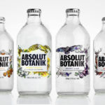
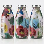
Absolut Botanik by Bold Inc.
Absolut Botanik is a new ready to drink, pre-mixed, single-source vodka range from distiller Absolut, flavoured with Scandinavian lingonberries, cloudberries and blueberries, blended with either pear, apple or lime. The range features a distinctive and bespoke single-serve bottle with a silver crown cap, and the Absolut logotype framed by rich illustrative detail. This mixes bold watercolour strokes with finer pen...
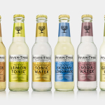
Fever-Tree by B&B Studio
Responding to the continued and widespread use of preservatives, artificial sweeteners and cheap aromatics, Charles Rolls and Tim Warrillow combined their experience of the beverage and luxury food industries to develop a tonic made from natural high quality ingredients. Since its launch in 2005, under the brand Fever-Tree—the colloquial name for the cinchona tree, source of quinine, a key ingredient in tonic—the range has grown year...