Chyna Club by Bibliothèque
Over the past few decades, high-street menu-scribbler Wagamama has become a rare beacon of actually-very-nice-food among a sea of uninspiring spicy chicken, Giraffes, and Five Guys (arguably, simply too many guys). It turns out Wagamama has some pretty big-name siblings: Mayfair’s Michelin starred, celebrity-beloved Hakkasan; Thai stalwart Busaba; Cantonese eaterie Yauatcha; and Turkish restaurant chain Yamabahce all sit within the...

Superkeen by B&B Studio
There has never been more awareness of allergens and inflammatory ingredients, with lupins and sulphites now on the mainstream radar alongside common culprits like gluten and dairy. At the same time, nostalgia and anemoia (‘a feeling of yearning for a past that you never experienced’) have become driving forces shaping contemporary tastes. Direct-to-consumer cereals neatly bridge a gap in this...
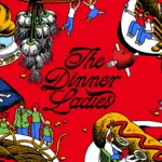
The Dinner Ladies by Universal Favourite
‘Dinner ladies’ doesn’t have the most glamorous connotations in England – depending on your experience at school, it likely conjures up memories of scoops of greying, tepid mash-adjacent slop unceremoniously plopped onto a plate; something to do with turkey dinosaurs; a troop of formidable but visibly jaded people responsible for making every school smell like on-the-turn cottage pie from around...
House of Reptile by Studio Gruhl
It’s not often that BP&O covers record label design. Unlike sectors such as fintech or FMCG, record labels naturally lend themselves to the more creative side of design and branding – they have far more niche audiences, and usually don’t have to work as hard as something aimed at the supermarket shelf to stand out or appeal to mass audiences....
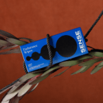
Sense by Buck
Since the pandemic, sexual wellness offerings have carved out a space on the shelves of beauty and pharmaceutical retailers, from Sephora to CVS in the US, and even Boots in the UK (founded 1849). According to business insight platform Crunchbase, that’s thanks to ‘an increased cultural shift that embraced sexual pleasure as a crucial component of physical and mental health’....
Ashton by LG2
For the rest of the world, Canada is synonymous with a few things – maple syrup; Celine Dion; wholesome, generally nice people; Neil Young; and when it comes to the realm of food, poutine (fries with cheese curds and gravy, for the uninitiated). Having opened back in 1969, Ashton is the oldest poutine chain in Canada. With 23 branches in...

Public Pool by Perky Bros
Suburban pool party culture is rather alien to us in the UK, where only the exceptionally wealthy have pools, and we muddle along in a climate that defaults to ‘grey, fair to middling’ most of the year. But we’re becoming a little more attuned to the joys of an open air funsplash: over the past few years we’ve seen the...

Tigre by Triboro
LES Tigre – not to be confused with seminal electroclash/riot grrrl combo Le Tigre – is a cocktail lounge in Manhattan’s Lower East Side area, which opened at the end of last year and apparently combines ‘sophistication and refinement in drink, sound and ambiance’ with an entrance that boasts ‘an original graffiti-worn door’. So far, so hip, amirite? It all...
Dirty Vegan by Jens Nilsson
Having been a vegan for almost 20 years now, various tropes have come and gone. In the early days, for the health conscious it was pretty much all about brown paper packaged Holland and Barrett goods, and references to the Young Ones cooking lentils. For the not so health conscious (hello!) it was ketchup sandwiches. Gradually the Quorn contingent came...

Drumroll by Gander
Donuts are one of life’s simplest pleasures, but they haven’t historically been the healthiest choice. Vegan – sorry ‘plant based’ – donuts are nothing new (Krispy Kreme’s been selling some non-dairy alternatives for a while now, and very nice they are too), but until now, we weren’t aware of donuts that also boast high-protein, low-sugar, gluten-free credentials. That is, until...
Reveri by Mother
There’s no denying the proliferation of all things that the more curmudgeonly crowds might deem ‘woowoo’ over recent years. Crystals, gong baths, singing bowls, silent retreats, tarot et al were once firmly languishing on the fringes of society, and are now de rigeur among the Stoke Newington set and TikTok classes alike. This rise in self-help-led esotericism has run concurrently...
Fluz by Koto
It can’t be easy designing the identity for a brand or company that’s hard to define, or which isn’t easily explained by that ‘new product, familiar ideas’ trope – the sorts of things described as ‘Like Tinder, but for cats!’ or ‘CityMapper for life decisions’, or ‘Uber for people who want to try dogging but can’t drive’ (if any investor...