Chocolate Packaging
Recchiuti by Manual
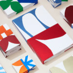
Recchiuti Confections is a San Francisco-based gourmet chocolatier that creates chocolates with unique flavour combinations. Using traditional European techniques, with locally sourced ingredients from Northern Californian farms and markets, Recchiuti’s chocolates have earned a loyal customer base and several accolades. After 25 years in business, Recchiuti sought the expertise of Manual – a local design studio – for a brand...
andSons Chocolatiers by Base Design
andSons is a second generation chocolatier and retailer run by Marc and Phil Covitz, two brothers who learned everything there is to know about fine chocolate from their mother. Seeking to offer something new to the world of artisanal chocolate, driven forward by Top 10 Pastry Chef Kriss Harvey who joins the brothers, andSons thrashes out a liminal space between...
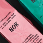
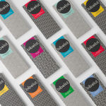
NOR Specialties by Re-public
NOR Specialities supports the development of plantation farmers and helps sustain local communities across Colombia, Guatemala, Nicaragua and Bolivia by way of its range of chocolate, cocoa nibs, roasted coffee beans and cold brew coffee products. NOR trades directly with family farms and producers of its raw ingredients, working with them to develop transparent and sustainable practices. Danish design studio Re-public worked with...

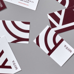
Bombonería Pons by Mucho
Bombonería Pons is a family owned Barcelona based business, established in 1960, dedicated to producing the finest handcrafted chocolates. With a desire to engage with a younger consumer Bombonería Pons worked with international graphic design studio Mucho to develop a brand identity that would be sensitive to its traditional values and history yet give it a contemporary appeal. This extended across packaging, brochure, stationery, business cards and...
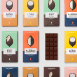
Mita Chocolate Co. by Moniker
Mita is an artisanal bean to bar chocolate business grinding and moulding on a single site in Bogata, and sourcing its beans from across Venezuela, Peru, Ecuador and Colombia. Mita worked with San francisco based graphic design studio Moniker to create a visual identity and package design system that would easily scale as new products are introduced....
Loving Earth by Round
Loving Earth is an Australian business, established in 2007 by Scott Fry and Martha Butler, that produces a variety of chocolates, snacks, cereals, butters and spreads. All of Loving Earth’s products are made from high quality, organic and fairtrade ingredients, and include ranges that are gluten, grain, dairy and sugar-free. Although taking advantage of a growing multi-million dollar industry, Loving Earth’s values are...
Bibelot by A Friend Of Mine
Bibelot is a luxury European-inspired dessert boutique in Melbourne with a coffee bar, chocolate shop, high tea salon, gelaterie and artisinal patisserie. It features an interior of long marble counters, a light spotted stone floor, spot lighting, cornicing, black and white walls, as well as bronze and tiled detailing. Informed by the sense of place and the permanence that underpins Bibelot’s...
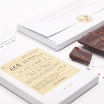
Casa Bosques Chocolate by Savvy
Casa Bosques is an initiative, founded by Mexico based design studio Savvy, to develop a variety of seasonal and sustainable products through a collaborative process across multiple disciplines. The initiative’s first product line, a range of 12 chocolates inspired by the months of the year, were created by master chocolatier Jorge Llanderal using high quality Ecuadorian cocoa fused with spices...