Recchiuti by Manual
Opinion by Kinda Savarino Posted 30 November 2023
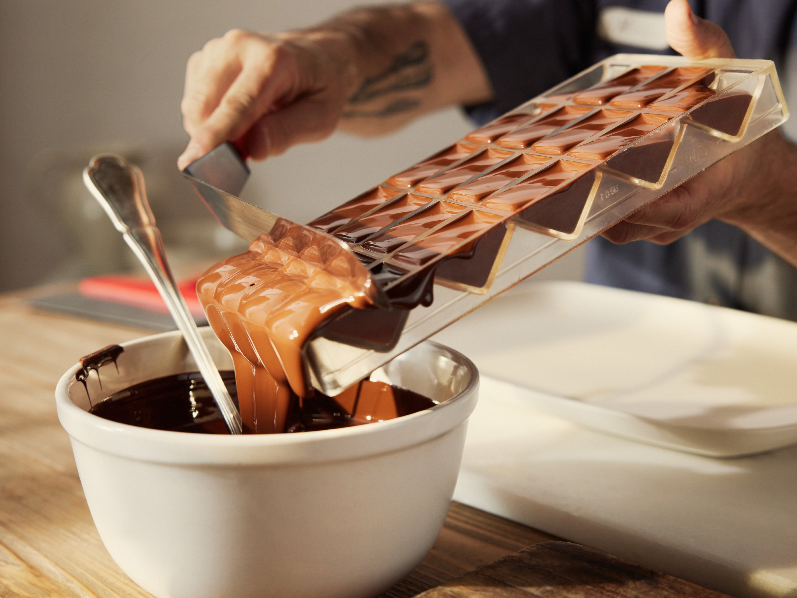
Recchiuti Confections is a San Francisco-based gourmet chocolatier that creates chocolates with unique flavour combinations. Using traditional European techniques, with locally sourced ingredients from Northern Californian farms and markets, Recchiuti’s chocolates have earned a loyal customer base and several accolades.
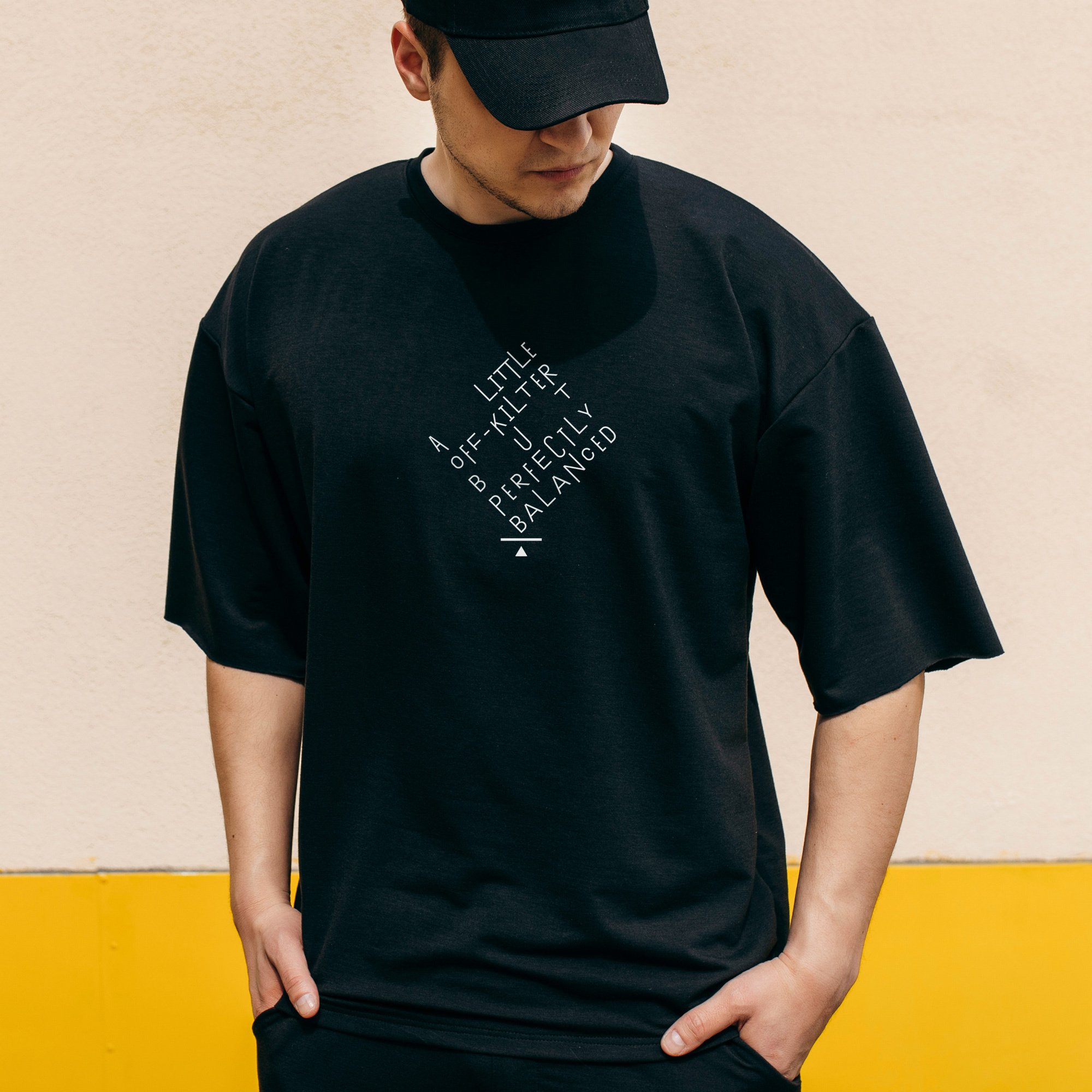
After 25 years in business, Recchiuti sought the expertise of Manual – a local design studio – for a brand overhaul that would modernise the chocolatier and represent it more fully. Core to this new rebrand is the concept of ‘sublime balance’ – a quality that Manual notes came up several times in its interviews with customers. ‘Sublime balance’ refers to Recchiuti’s skill at creating artful flavour pairings, and its ability to find the sweet spot between Sweet+Tart, Comfort+Discovery, Friendly+Fancy, Art+Science, Elevated+Whimsical.
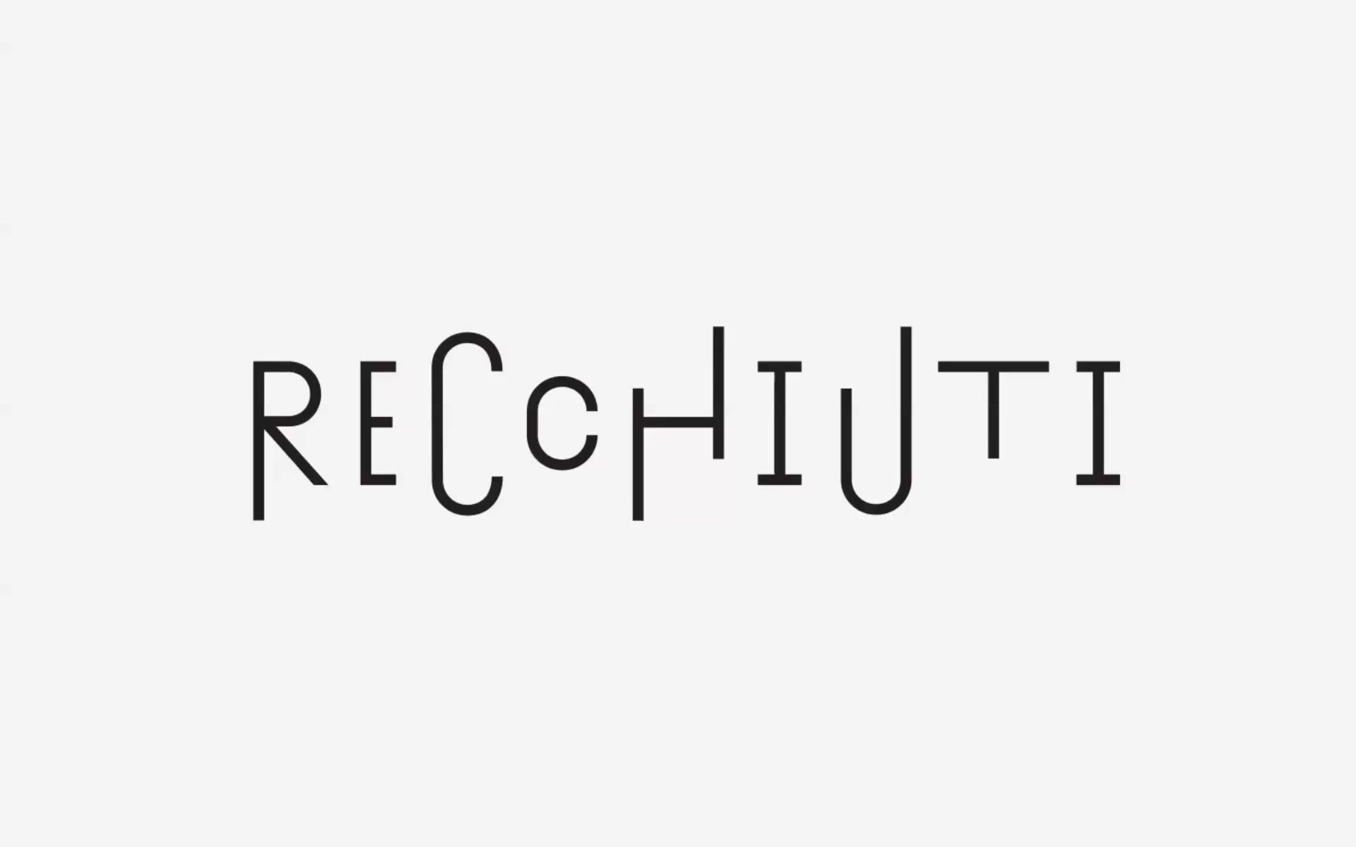
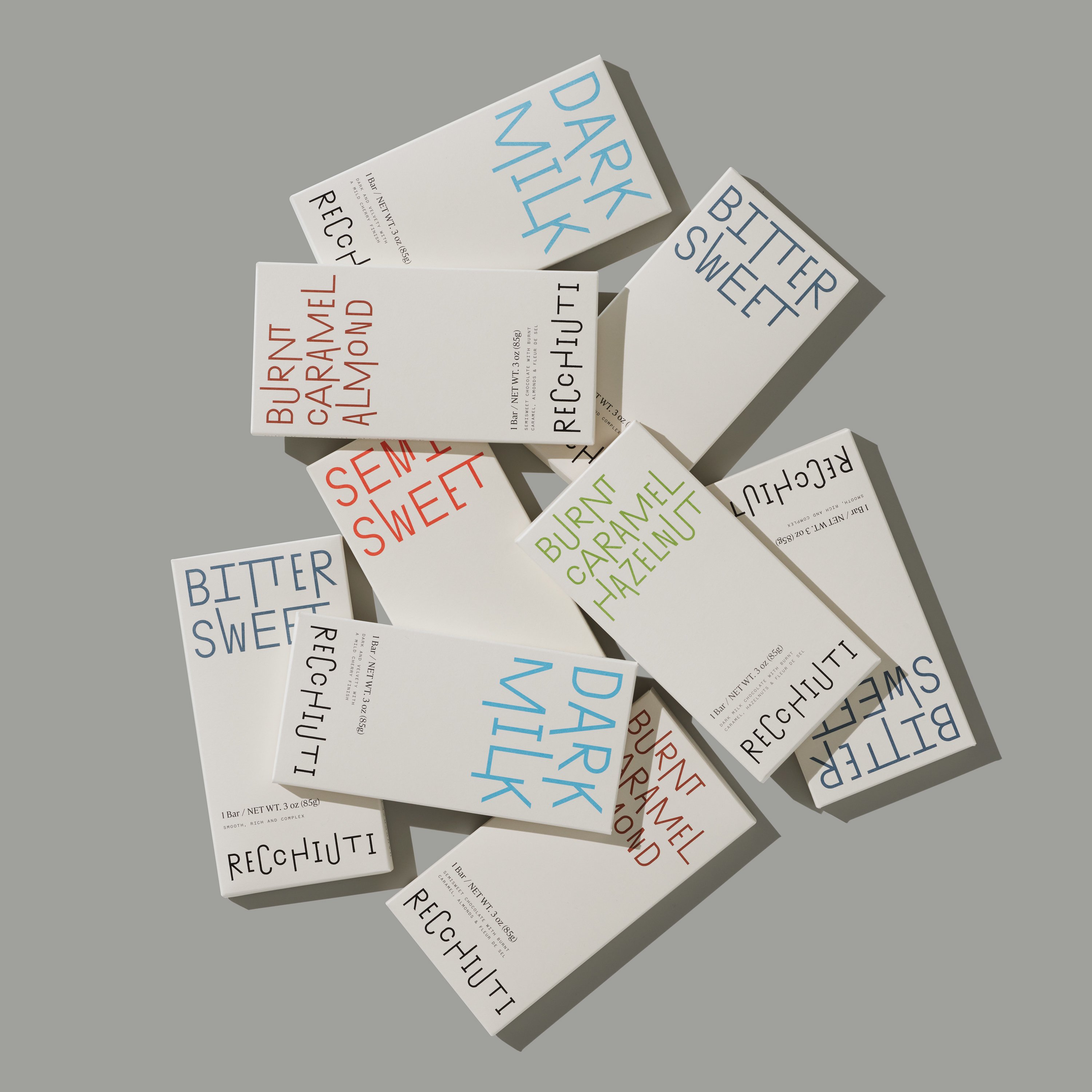
The small tweaks that are needed to achieve ‘sublime balance’ are reflected in Recchiuti’s new animated wordmark. Ascenders and descenders move up and down smoothly, as if performing a symphony. This link with music is deliberate, chosen to imbue more of founder Michael Recchiuti into the visual identity. Recchiuti, as well as being a chocolate maker, is also a musician who experiments with electronic music, percussion and contemporary jazz. The wordmark is playful and contemporary, capturing the spirit of Recchiuti Confections. The same typeface, based on Tightype’s Exposit, is also used as headlines and across packaging.

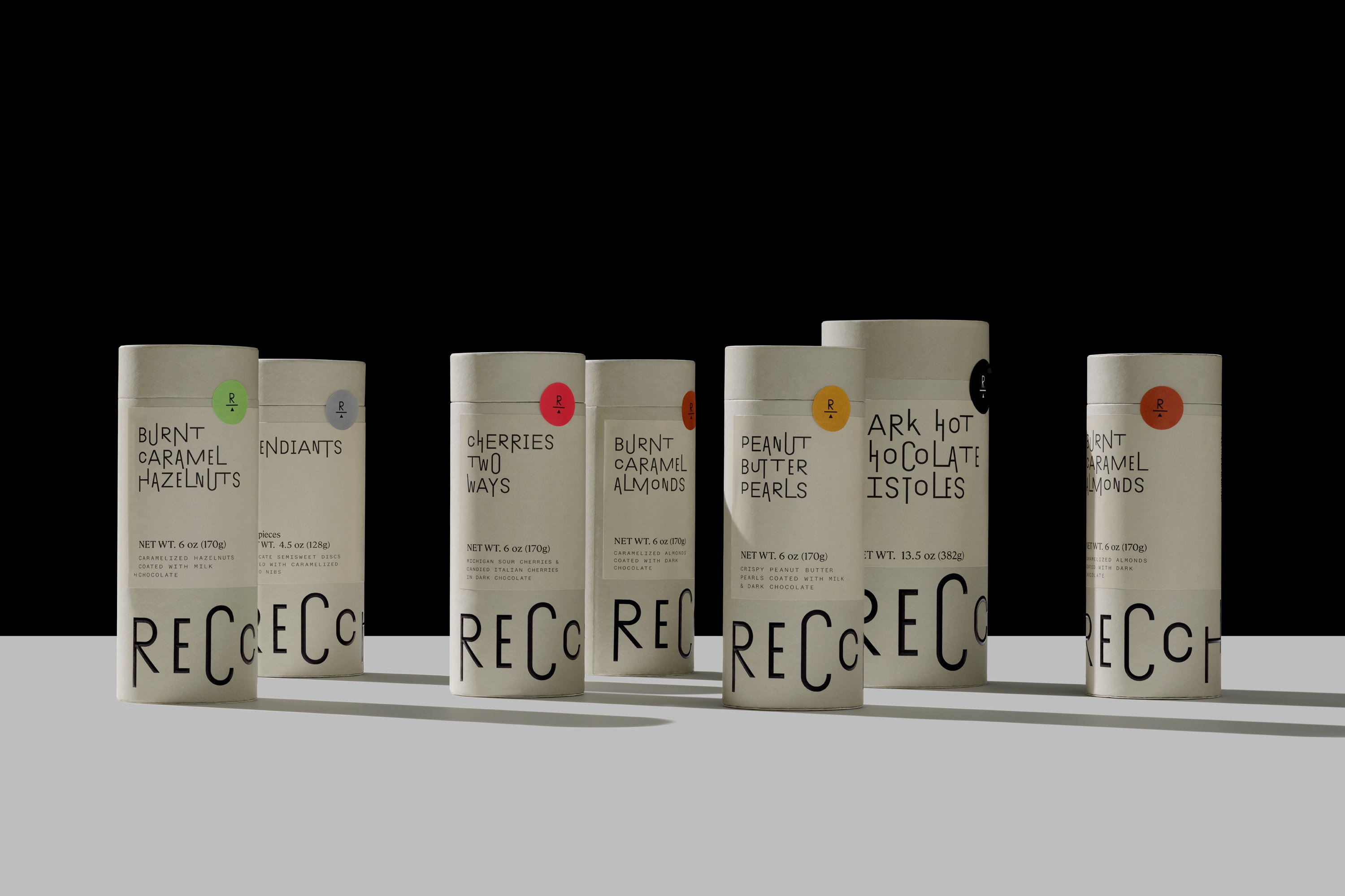
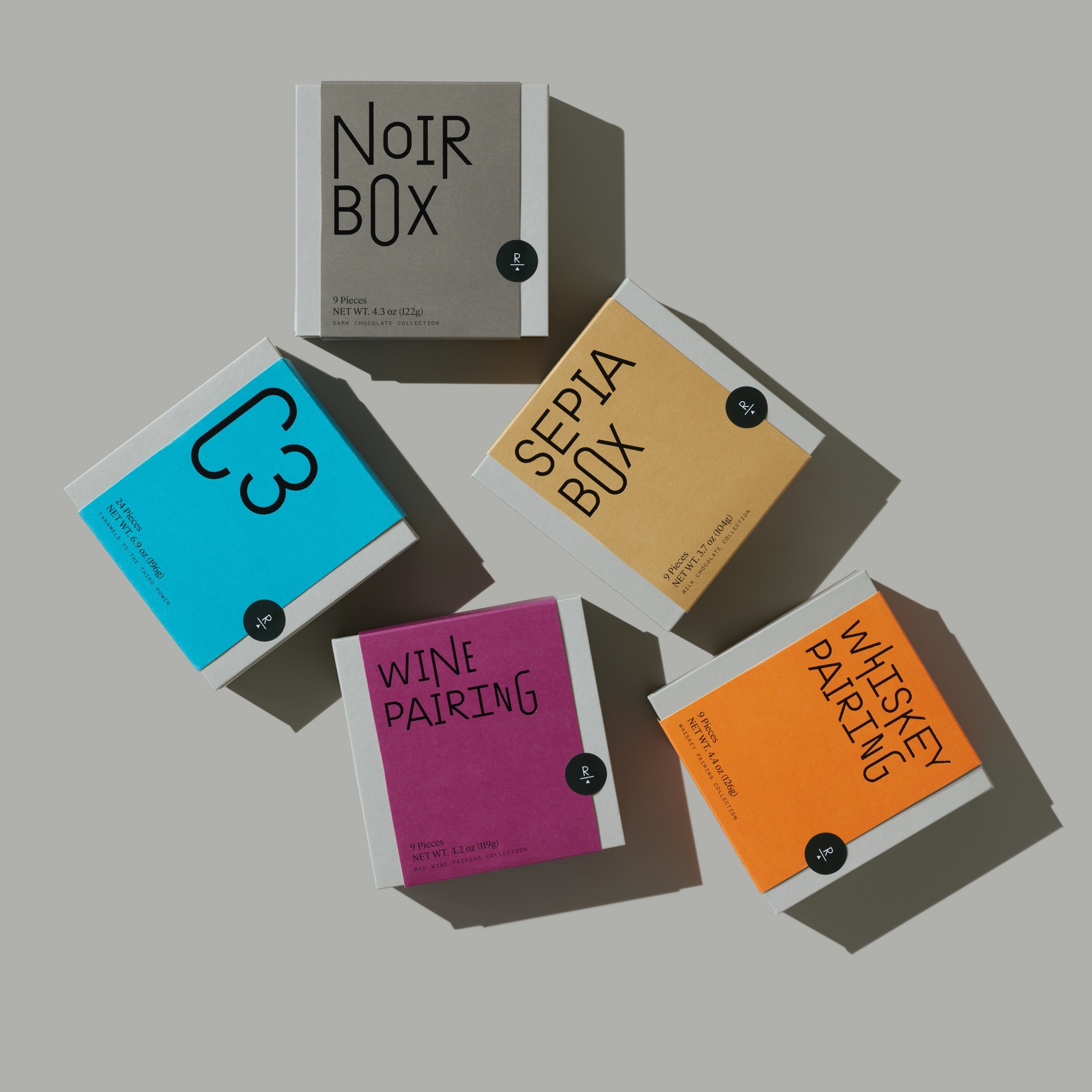
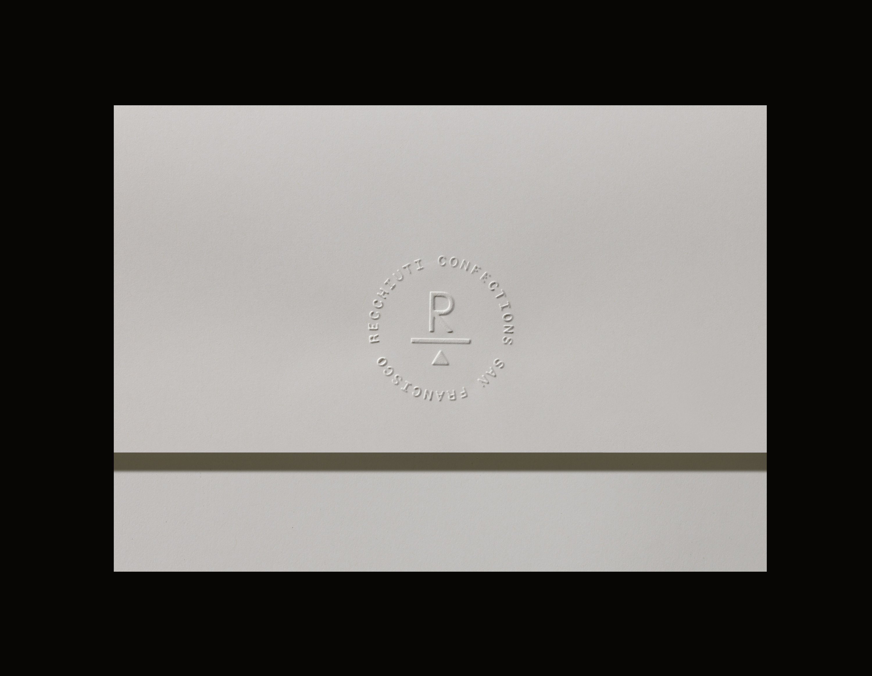
For most chocolate fans, packaging is the first interaction with this treat, and Manual has created a system of boxes, bars and tubes that convey the diversity of sweet treats on offer. The packaging is premium, considered, and strikes a balance between minimalism and warmth. In other words, each item feels as if it were a gift – which is exactly what you want to feel when receiving or giving chocolates. High-quality paper substrates, rigid structural integrity and diamond bevel foil embossing enhance the luxe tactility.
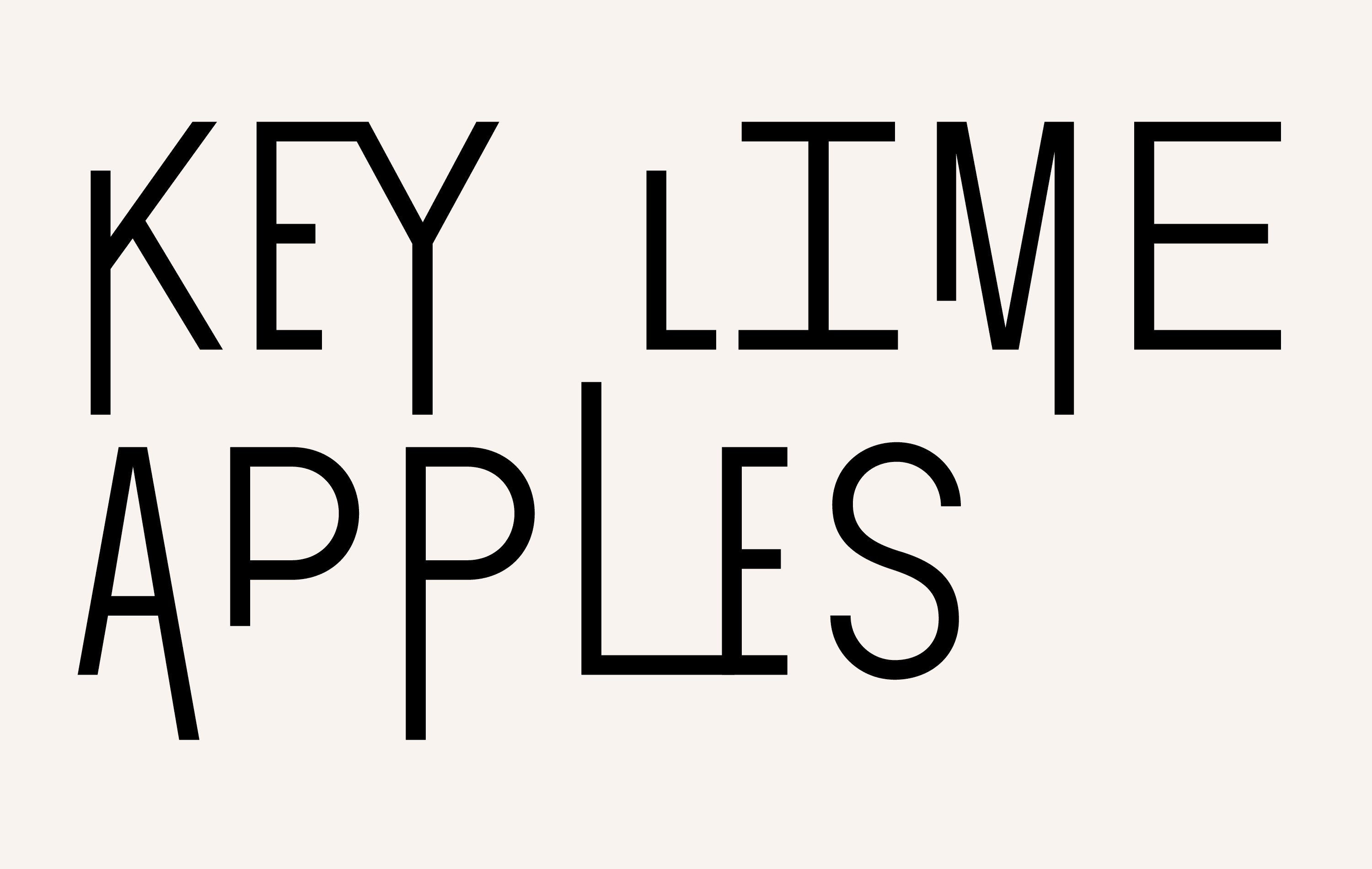
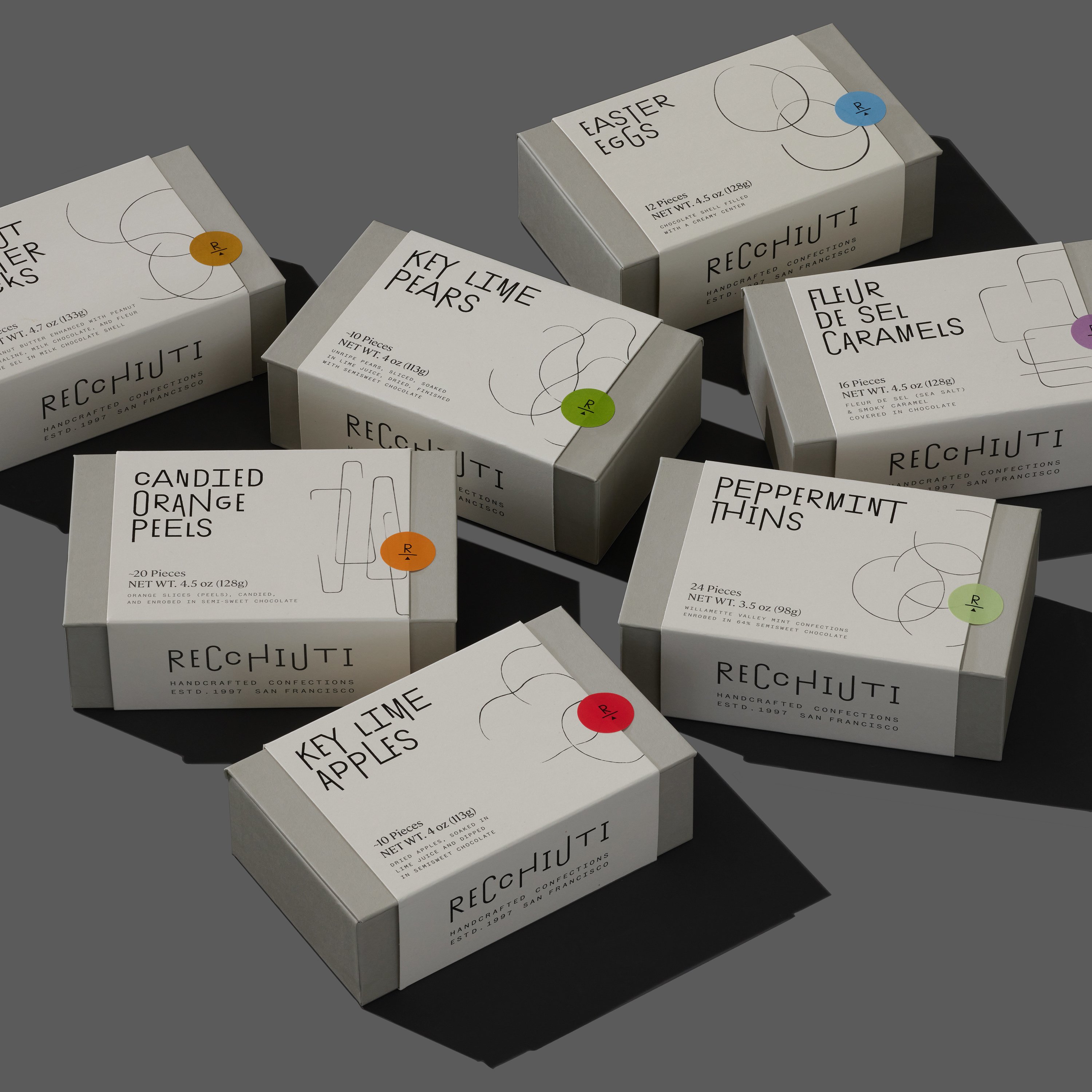
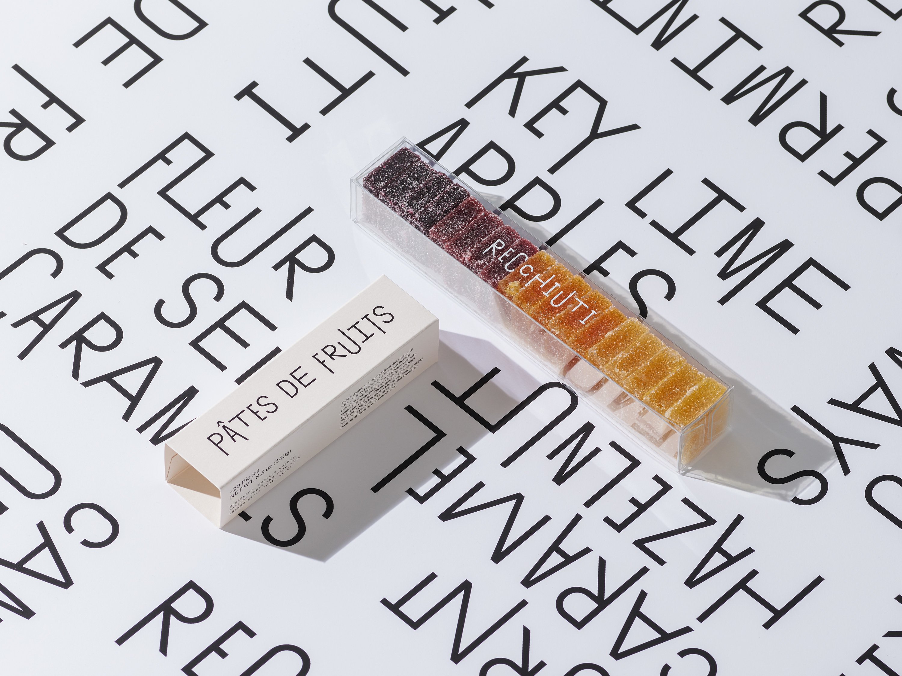
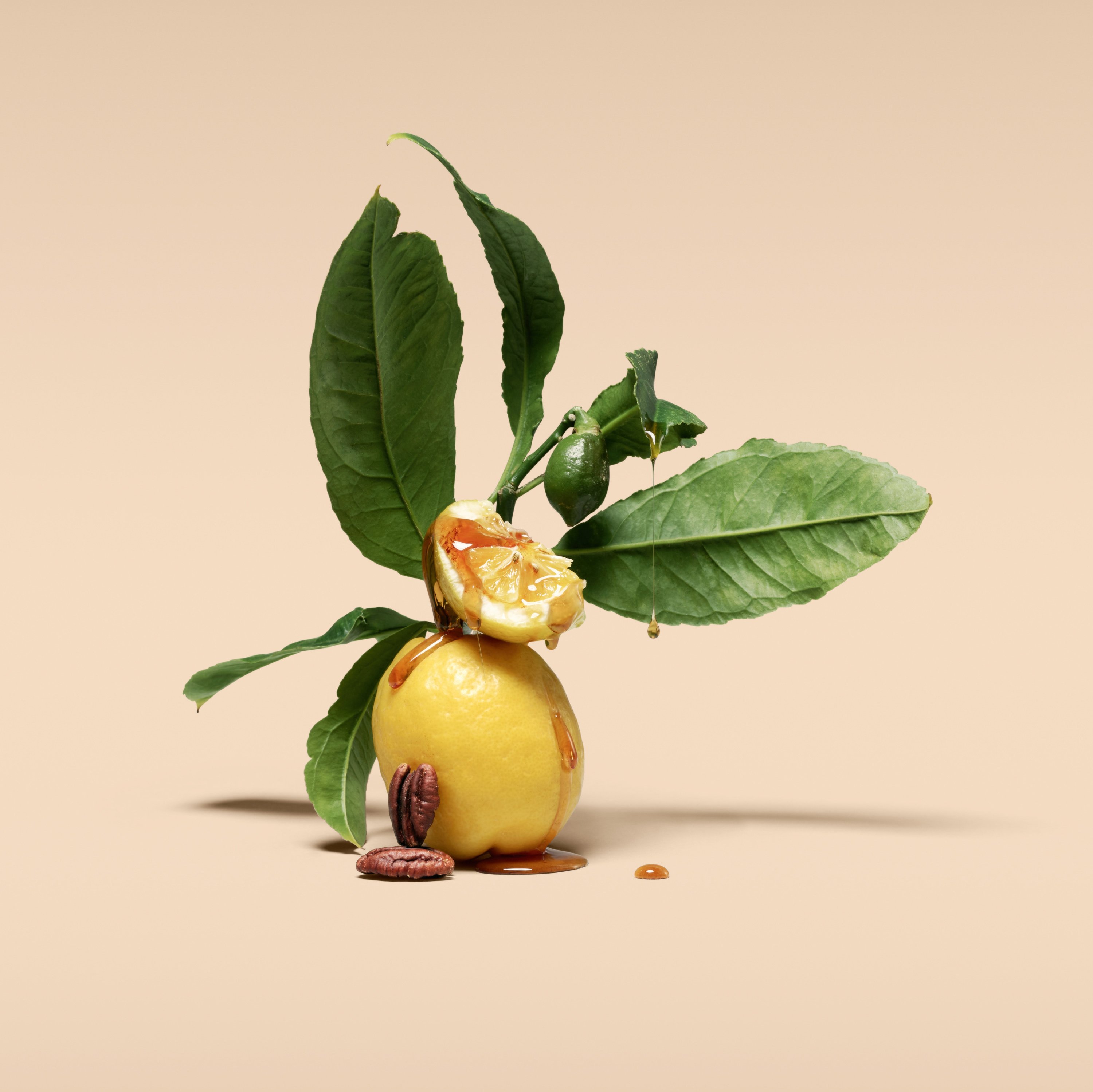
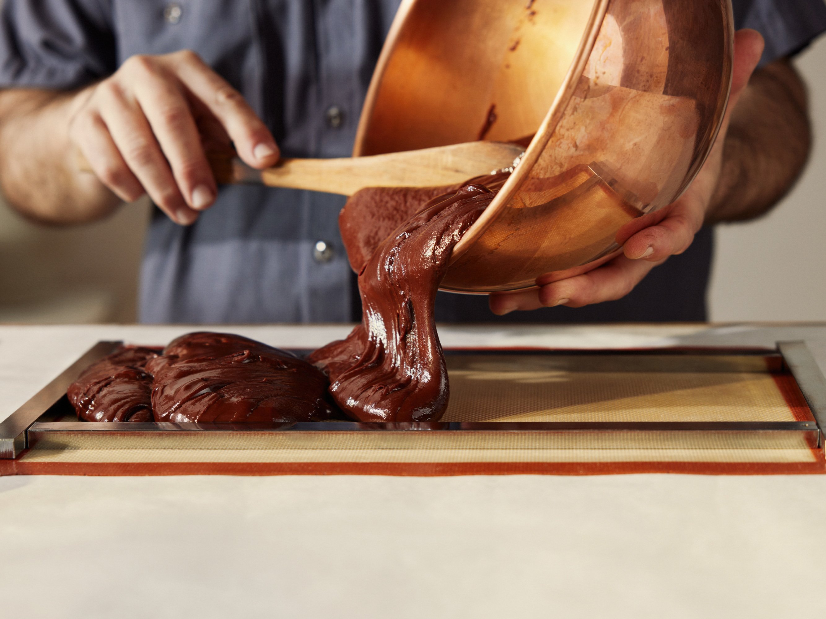
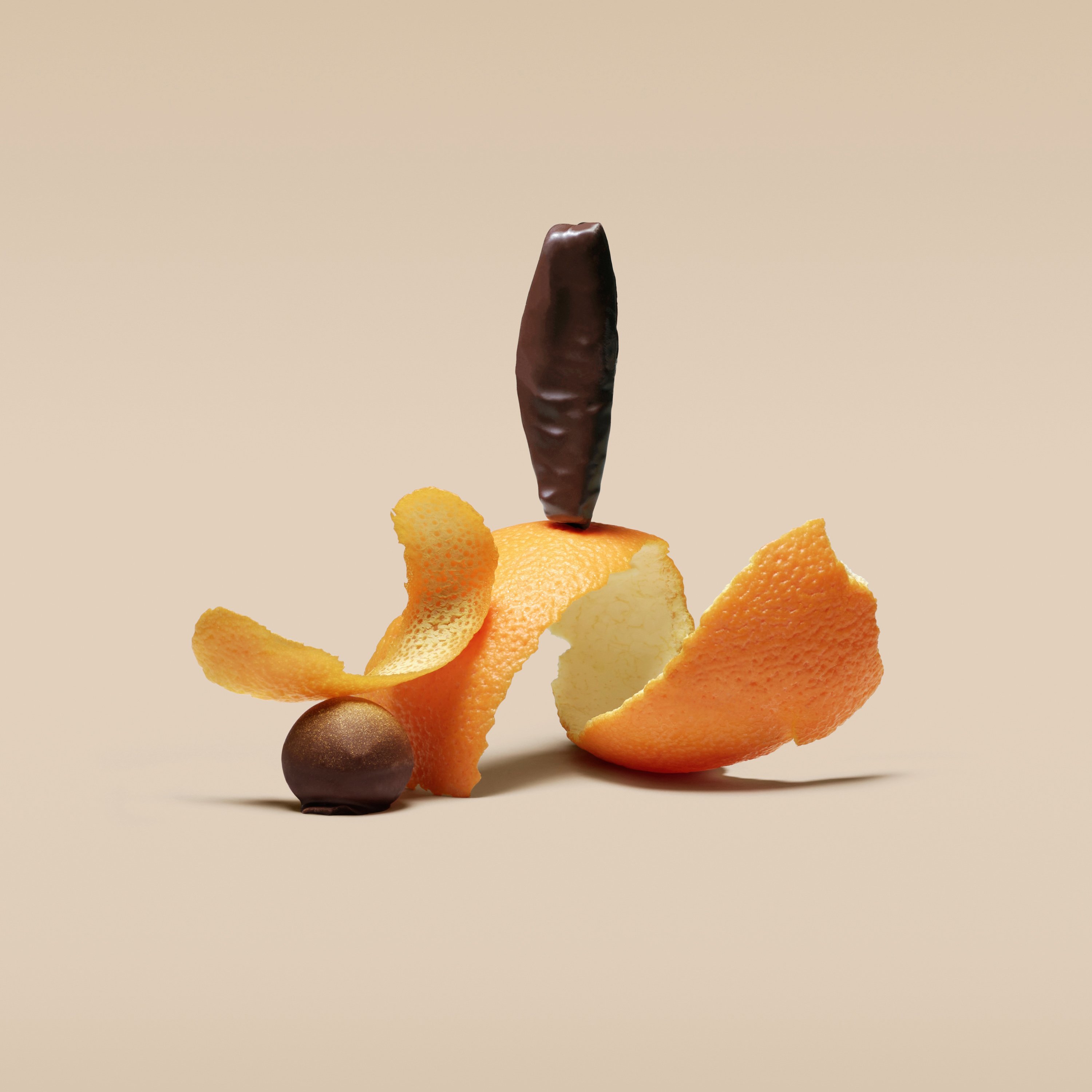
Much like the chocolatier’s creations, the visual identity strikes a balance between contemporary techniques and traditional craft. Honouring Recchiuti’s hands-on small batch production, Manual introduced illustrated linework elements that celebrate the natural ingredients and flavour combinations, and connect to the gestural decoration on the chocolates – the ‘art’. These contrast well with the highly-controlled, stylised studio photography, which speaks to the science and dedication that goes into flavour extraction – the technical skill. The studio worked with photographer Maren Caruso to coordinate the sculptural ingredient still life images, which equally fascinate and tantalise the tastebuds.

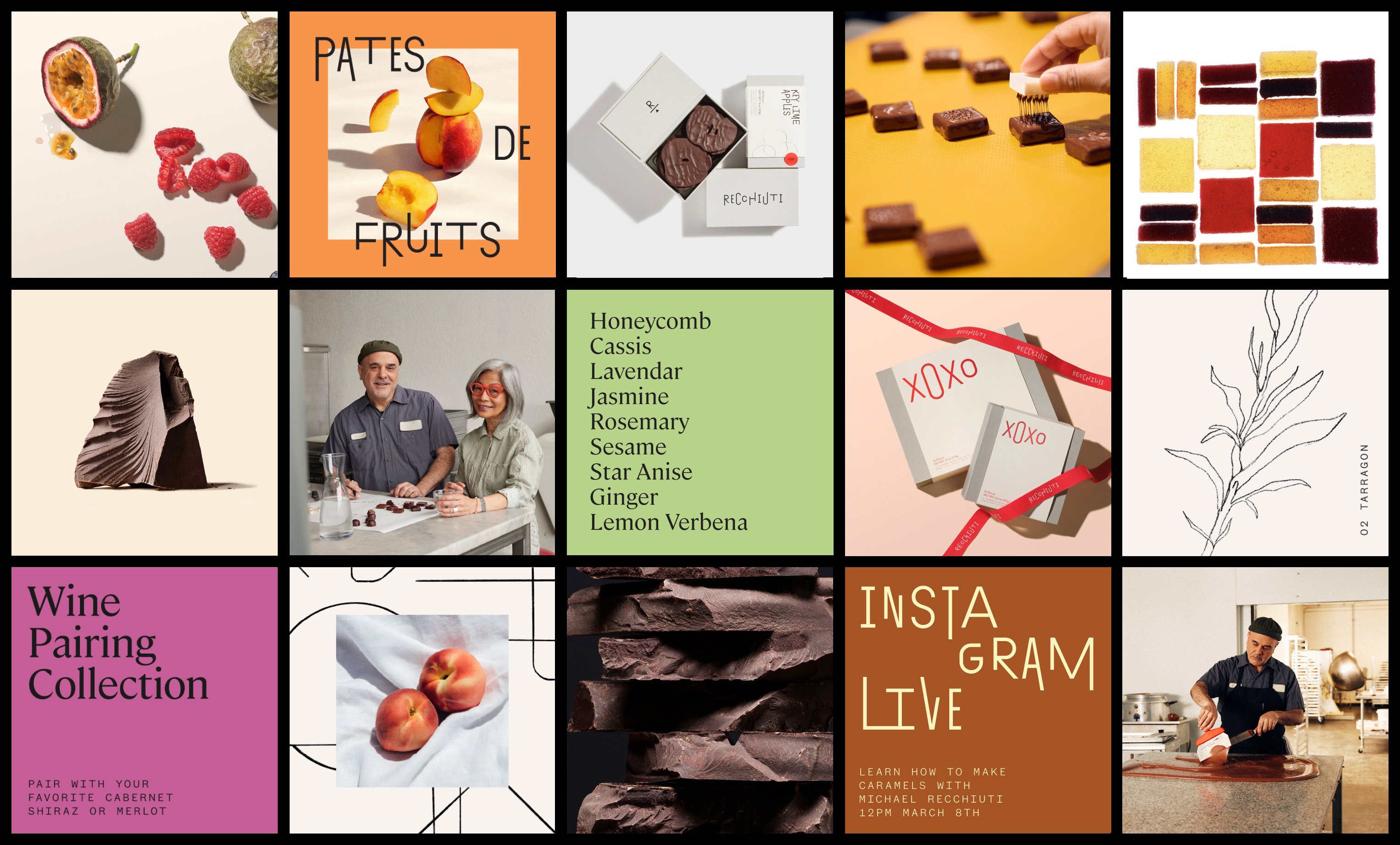
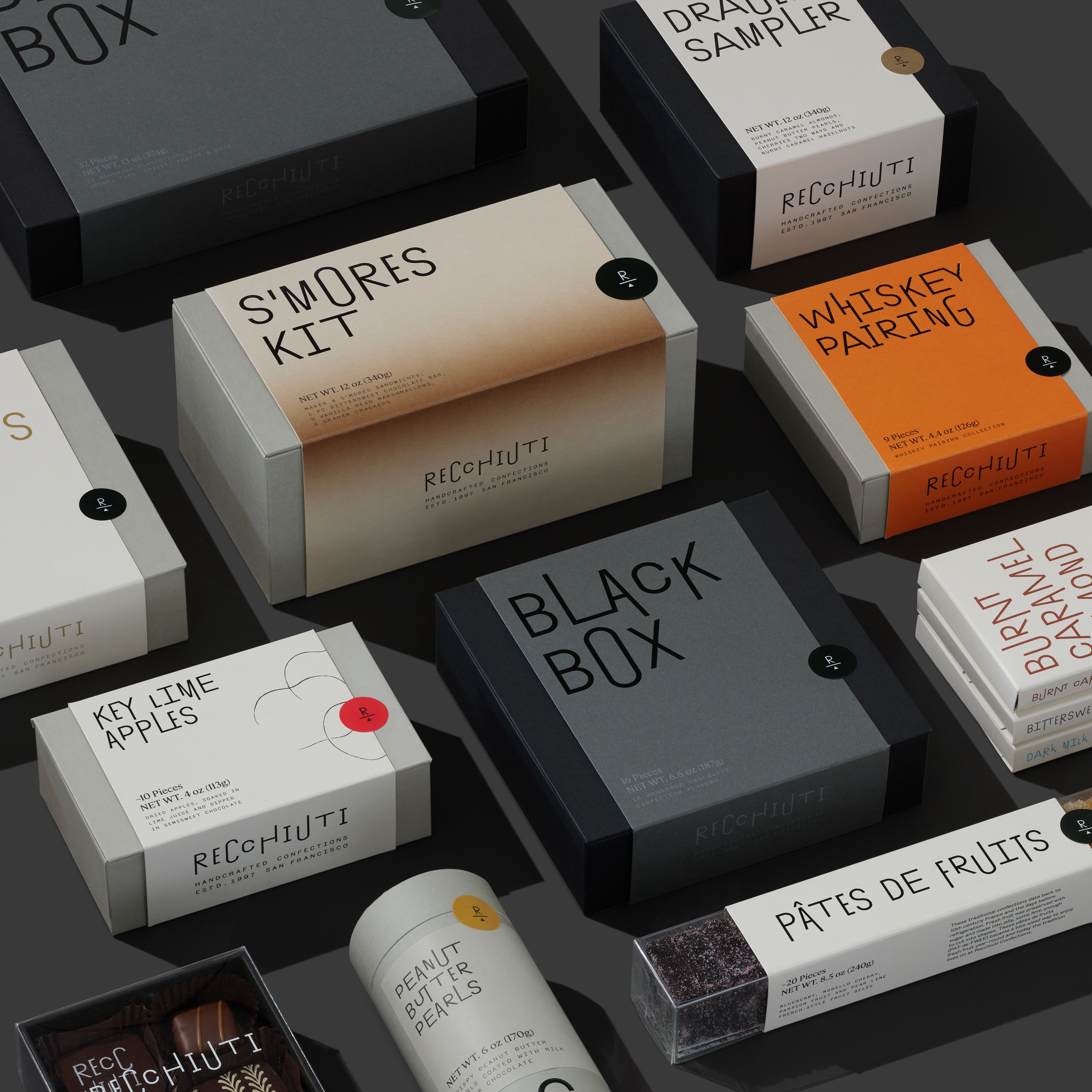
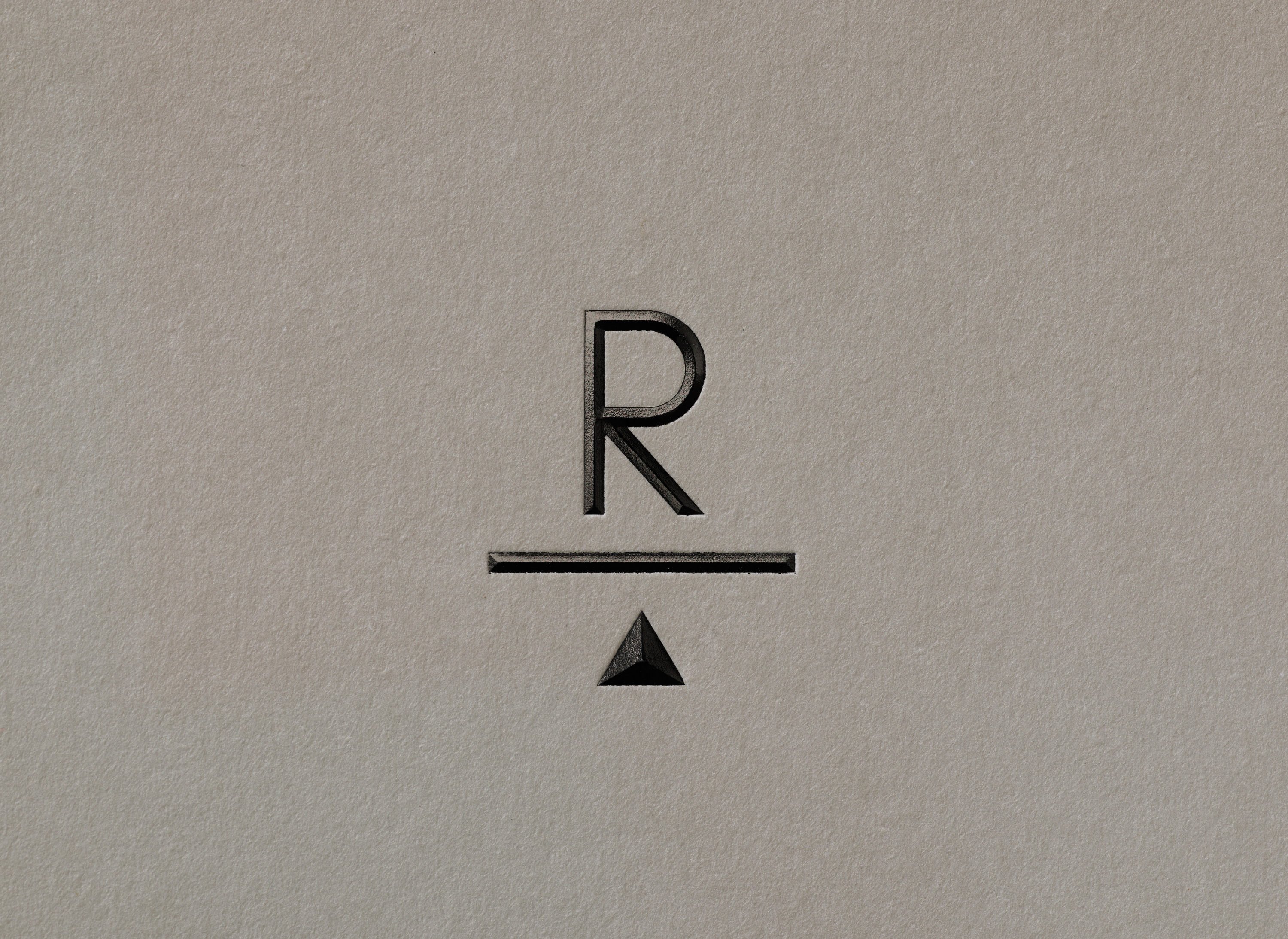
The use of colour across the brand highlights the same tension. While kept largely monotone, pops of colour can be seen across the packaging, serving as a subtle nod to the Recchiuti’s former palette, and often relating to the flavours within. For example, the S’mores Kit features a soft-roasted gradient reminiscent of toasted marshmallows. Similarly, Key Lime Pears feature a zingy green sticker adorned with the brand’s monogram – an ‘R’ on an abstract balancing board (that word again).
This is a visual identity where the sum of its parts work harmoniously to provide the chocolatier with an elevated look and feel that speaks to its spirit. It is both crafted and premium, modern and inviting, minimal and bright, artistically expressive and technically skilful. In short, it is sublimely balanced.
