Designed by Clase bcn
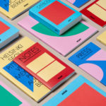
Arper 2018 by Clase bcn
Arper is an Italian furniture company producing chairs, tables and furnishings for community, work and home spaces. They seek an elegant resolution of function, form and finish which is founded on a total design philosophy that covers design, production and long-term impact. Arper commissioned Spanish studio Clase bcn to develop and design a new on and offline graphic identity for all...
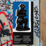
Sumer And The Modern Paradigm by Clase bcn
Sumer And The Modern Paradigm is an exhibition at Barcelona’s contemporary art gallery Fundació Joan Miró, and runs from 28th October 2017 to 21st January 2018. It intends explore and attempt to explain the influence of Mesopotamian art on modern artists, with a particular focus on the interwar period. The exhibition analyses work produced between the twenties and forties, takes a look...
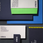
Enea by Clase bcn
Enea is a contemporary furniture manufacturer, located in Spain’s Basque Country, collaborating with respected designers such as Josep Lluscá, Gabriel Teixidó and the trio Lievore Alhterr Molina. Enea has a distinctive catalogue of versatile, comfortable and durable products, developed for both the private and commercial markets, with unique character in their play with form, colour and texture. With a desire to differentiate...
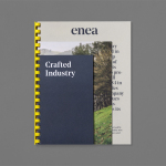
Enea by Clase bcn
Enea is a contemporary furniture manufacturer with a site in the Basque Country. Collaborating with designers Josep Lluscá, Gabriel Teixidó and the trio Lievore Alhterr Molina, Enea has developed a catalogue of versatile, comfortable, durable and functional products for the private and commercial markets. Seeking to differentiate itself from its competitors and with a desire to avoid cliches of the...