Colour in Use: Blue
Whale Tales by Interbrand
Every year an impressive 40,000 humpback whales travel along the Sydney coastline. This annual migration pattern is one of the many awe-inspiring natural spectacles that make the city so unique. It is fitting then, that the New Sydney Waterfront Company chose to revitalise Sydney’s Western Harbour Precinct with an installation of thirty whale tail sculptures, telling thirty individual stories, or...
Ortto by Christopher Doyle & Co.
All systems grow. What a fun line. Setting up and positioning Ortto, formerly Autopilot, as the leading marketing automation solution for business. The name is great, a wonderful move forward for the company, and sufficiently taking something technical and inhuman-sounding and giving it a somewhat anthropomorphised quality, easy to remember and providing room for growth into other technologies and services....
The Art Gallery of New South Wales by Mucho
The Art Gallery of New South Wales, founded in 1872 as the New South Wales Academy of Art, suffered from a fragmented brand architecture. Addressing this through a rationalised and simplified system, and reinforcing the master brand across all Gallery collateral became a central part of developing of a new brand identity which would support a repositioning strategy that moved...
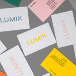
Lumik by Hey
Lumik is a Spanish lighting design and manufacture company, and partnership between the traditional metalworking company of Francesc and Ferran Martí, and interior designer and art director Frank Domínguez. Together they have 65 years of experience, and have built a catalogue of products with simple forms, moments of colour, elements of play and the industrial. These move between those that are...
Maisonette by Lotta Nieminen Studio
Maisonette is an American online retailer of luxury children’s brands, founded by former Vogue co-workers Sylvana Durrett and Luisana Mendoza Roccia. The retailer carries a carefully selected yet extensive catalogue of clothing, homeware, gifts and accessories that mixes local up-and-coming brands with those that are well-established and international. Maisonette’s visual identity, designed by New York based Lotta Nieminen Studio, intends to balance and juxtapose a...
Loyal Coffee by Mast
Loyal Coffee is a barista-owned and operated specialty coffee shop located in Colorado Springs. It features a high ceiling, exposed beams and concrete surfaces, natural material detail such as tree trunk stools, and crafted finishes that include a mosaic floor, carved wood panel and what looks like a ghost sign. Drawing on this, the surrounding landscape, and the loyal bond that...
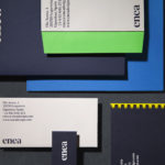
Enea by Clase bcn
Enea is a contemporary furniture manufacturer, located in Spain’s Basque Country, collaborating with respected designers such as Josep Lluscá, Gabriel Teixidó and the trio Lievore Alhterr Molina. Enea has a distinctive catalogue of versatile, comfortable and durable products, developed for both the private and commercial markets, with unique character in their play with form, colour and texture. With a desire to differentiate...
Blå Bär by BVD
Blå Bär (Swedish for blueberries) sells a variety miscellaneous goods from Scandinavia from its store in Osaka, Japan. These include, but are not limited to, glass and kitchenware, soft furnishings, ornaments and jewellery. Many of these could be described as having something of a shared Scandinavian simplicity of form, lightness of colour, natural material quality and cheerful character in pattern...
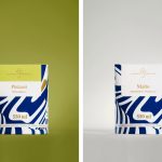
Suomen Jäätelö by Werklig
Suomen Jäätelö is a super-premium ice cream brand currently available in five flavours and a sorbet. These include Milk, Pistachio, Vanilla and Chocolate made from Finncattle milk, a Rhubarb sorbet and Spruce created in collaboration with iconic furniture maker Artek. Although ice cream is internationally ubiquitous, Suomen Jäätelö is described as having a distinctively Finnish character. This is expressed throughout its packaging design, developed by...
Run Mfg by Perky Bros
Run Mfg is an independent race design and production company, creating unique running events with a high-level of detail and creativity, founded by husband and wife team Nathan Barnhart and Elaine Lau working from their studio in Chicago. Nathan and Elaine commissioned graphic design studio Perky Bros to develop a brand identity that would link a variety of printed collateral,...

In Search Of The Present at EMMA by Werklig
In Search Of The Present is a new series of exhibitions on a 3–4 year cycle held at Helsinki’s Espoo Museum of Modern Art (EMMA). These intend to tackle many of the existential questions that we face in an ever changing world. The first exhibition, inspired by Olavi Paavolainen’s essay collection from 1929, took place between October ’16 – January ’17 and was a study in the representations...
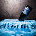
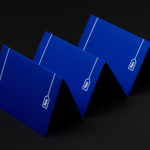
Brewdog Abstrakt by O Street
Brewdog’s Abstrakt is a limited edition craft beer concept that has released 20 different varieties since it began in 2010. Each beer is bottle-conditioned (bottled with a small amount of yeast, providing further fermentation and maturation), brewed and released just once, individually numbered and known only by their release code. It is a concept described as more art than beer, as boundary pushing and blurring...