Posted: | Author: Richard Baird | Filed under: Art and Design, Graphic Design Reviews, Logo Reviews | Tags: Binding, Brand Book, Brand Guidelines, Brand Identity Reviews, Branding & Packaging of 2017, Branding Blog, Branding Reviews, Brochure Design, Business Card Design, Catalogue Design, Colour in Use: Blue, Coloured Paper, Comb Binding, Design Blog, Design For Print, Design Opinion, Design Reviews, Design Reviews: Editorial Design, Designed by Clase bcn, Designed in Barcelona, Edge Painted Detail, Editorial Design, Fonts in Use: Noe, From Europe, Furniture Design Logos, Graphic Design, Graphic Design Blog, Homeware, Logo Design & Branding Blog, Logo Design Inspiration, Logo Design Resource, Logo Designs, Logos, Material Thinking, Print Finishing, Serif Logotypes, Spanish Design, Stationery Design, The Best Brand Identities of 2015, The Best Business Cards of 2015, The Best Graphic Design Work of 2017, The Best Logo Designs of 2015, The Very Best of 2017, Typography, Uncoated Papers & Cards, White Ink | Opinion by Richard Baird.
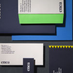
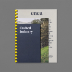
Enea is a contemporary furniture manufacturer, located in Spain’s Basque Country, collaborating with respected designers such as Josep Lluscá, Gabriel Teixidó and the trio Lievore Alhterr Molina. Enea has a distinctive catalogue of versatile, comfortable and durable products, developed for both the private and commercial markets, with unique character in their play with form, colour and texture.
With a desire to differentiate itself from its competitors, and with the intentions of avoiding industry clichés, Enea worked with Barcelona-based graphic design studio Clase bcn to create a new visual identity that would articulate, through image and type, colour and materiality, the company’s Basque origin and unique products in a distinctive and contemporary fashion and, using a striking spartan style, reference industrial manufacturing.
The project extended to business cards, brand guidelines, product brochures and company catalogue, and was launched alongside Enea’s latest range which coincided with the Milan Furniture Fair.
This post, an update to the original from 2015, features all new project images, a more extensive look at art direction, stationery and both product and company brochures, photographed as part of Clase bcn’s new website.
Continue reading this article
Posted: | Author: Richard Baird | Filed under: Business, Banking, Law and Finance, Logo Reviews | Tags: Brand Identity, Brand Identity Reviews, Branding, Branding Agency, Branding Blog, Branding Reviews, British Design, Business Card Design, Colour in Use: Red, Comb Binding, Corporate Identity Design, Design For Print, Design News, Design Opinion, Design Reviews, Designed by Spin, Designed in London, Graphic Design, Graphic Design Blog, Logo Design & Branding Blog, Logo Design Inspiration, Logo Design Resource, Logo Designs, Logo Opinion, Logotypes, Modernist Brand Identities, Sans-serif Typography, The Best Brand Identities of 2016, The Best Graphic Design Work of 2016, Typography, Uncoated Papers & Cards, White Block Foil | Opinion by Richard Baird.
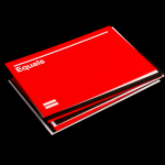
Equals is a UK independent cost and project management consultancy. Although not the largest, it is described as being an industry leader with a wide variety of clients. Equals recently worked with London based graphic design studio Spin to develop a new visual language that would be confident, bold and cohesive. This extended across stationery, business cards, book and manual templates, technical documents, signage, web design and implementation.
Continue reading this article
Posted: | Author: Richard Baird | Filed under: Art and Design, Logo Reviews | Tags: Binding, Brand Book, Brand Guidelines, Brand Identity Reviews, Branding Blog, Branding Reviews, Brochure Design, Business Card Design, Catalogue Design, Colour in Use: Blue, Coloured Paper, Comb Binding, Design For Print, Design Opinion, Design Reviews, Designed by Clase bcn, Designed in Barcelona, Edge Painted Detail, Fonts in Use: Noe, From Europe, Furniture Design Logos, Graphic Design, Graphic Design Blog, Homeware, Logo Design & Branding Blog, Logo Design Inspiration, Logo Design Resource, Logo Designs, Material Thinking, Print Finishing, Serif Logotypes, Spanish Design, Stationery Design, The Best Brand Identities of 2015, The Best Business Cards of 2015, The Best Logo Designs of 2015, The Very Best of 2015, Typography, Uncoated Papers & Cards, White Ink | Opinion by Richard Baird.
Enea is a contemporary furniture manufacturer with a site in the Basque Country. Collaborating with designers Josep Lluscá, Gabriel Teixidó and the trio Lievore Alhterr Molina, Enea has developed a catalogue of versatile, comfortable, durable and functional products for the private and commercial markets.
Seeking to differentiate itself from its competitors and with a desire to avoid cliches of the industry, Barcelona based graphic design studio Clase bcn developed a distinctive brand identity treatment for Enea that reflects the company’s Basque origin in a distinctive and contemporary fashion and, using a striking spartan style, references industrial manufacturing. This was visualised through type, colour, image contrast and print, and launched alongside Enea’s latest range which coincided with the Milan Furniture Fair. The project extended to business cards, brand guidelines and brochure.
Continue reading this article