
Finísima by Savvy
Finísima is the latest ale to emerge from the independent Mexican beer brewing category and is described as being for both those unaccustomed with the world of artisanal beer and the connoisseur. The ale’s packaging treatment, created by Mexican design studio Savvy, reflects its artisanal origin “without sacrificing the reach and reception of more commercial brands” by combining familiar craft aesthetics with...
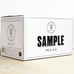
Sample Brew by Longton
To standout in an increasingly saturated market, boutique brewer Sample commissioned Melbourne-based design agency Longton to brand and package their American-inspired pale ale, slow brewed to the standards of the 1516 German purity law. Longton’s solution reflects this approach, a purity of ingredients and the brewery’s name with a distinctive and reductionist ‘sample pack’ aesthetic that balances a sense of small-scale,...