Finísima by Savvy
Opinion by Richard Baird Posted 26 February 2014
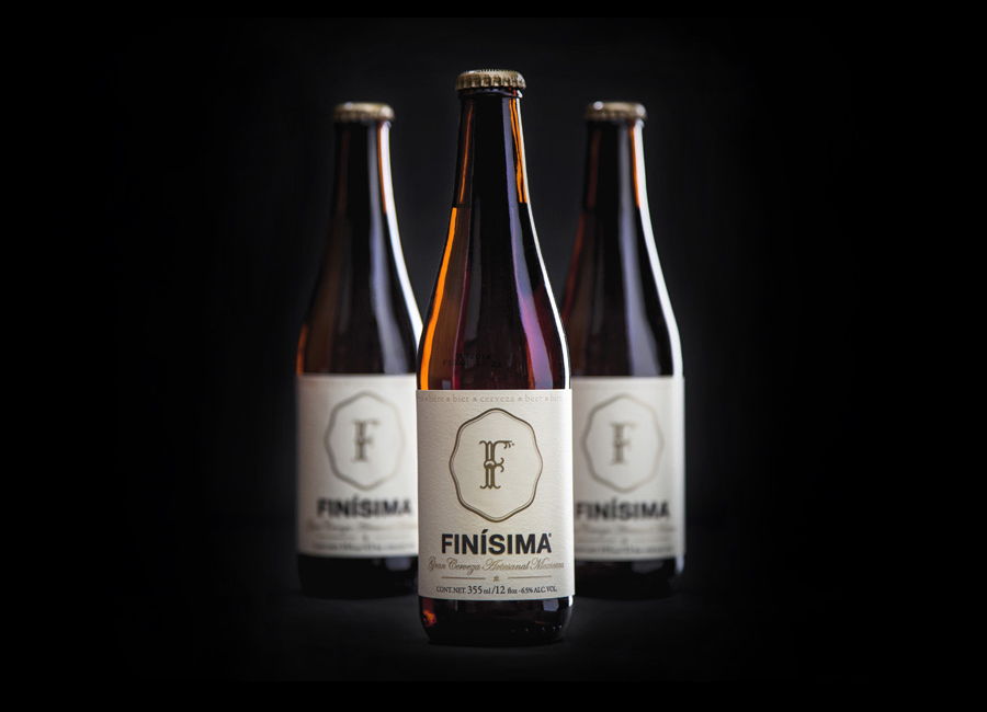
Finísima is the latest ale to emerge from the independent Mexican beer brewing category and is described as being for both those unaccustomed with the world of artisanal beer and the connoisseur.
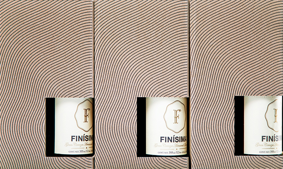
The ale’s packaging treatment, created by Mexican design studio Savvy, reflects its artisanal origin “without sacrificing the reach and reception of more commercial brands” by combining familiar craft aesthetics with those of an established premium nature.
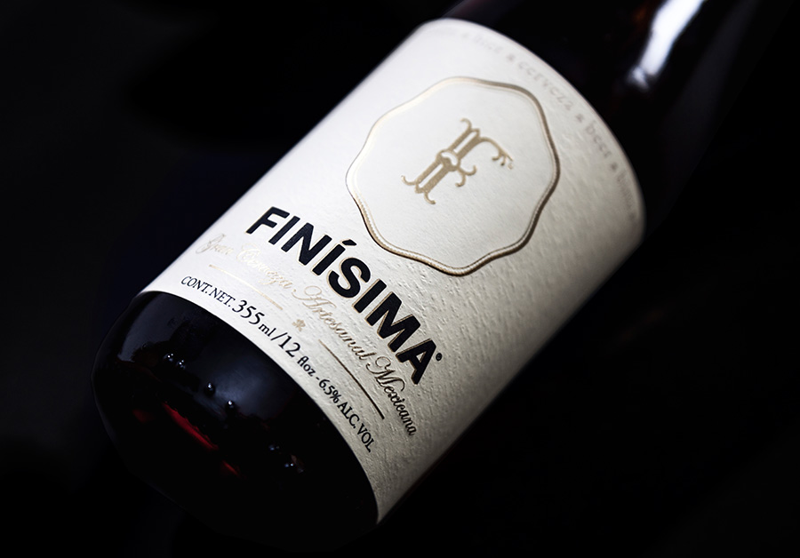
“Visually, it conveys a premium and defying presence. Through unusual formats, it displays top-quality finishes and materials. This is contrasted by a graphic language inspired on Pedro Friedeberg’s work and the Mexican surrealists from the 50s and 60s. We want to create an imaginary universe inspired by bohemian nights and struggling artists where Finísima is served as an antidote against routine or a potion for freedom and artistic creation.” – Savvy
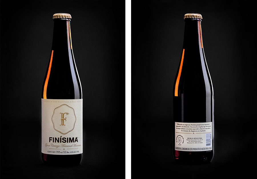
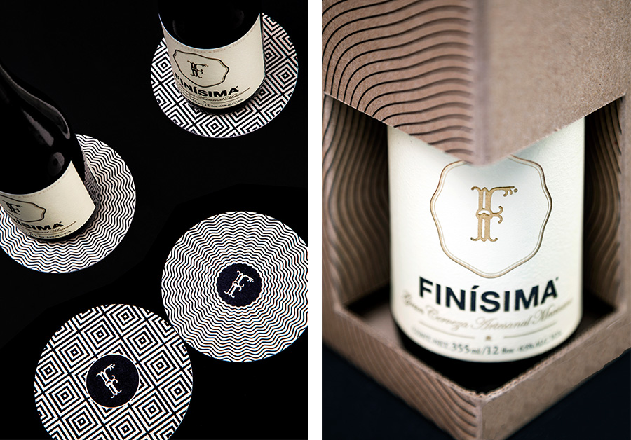
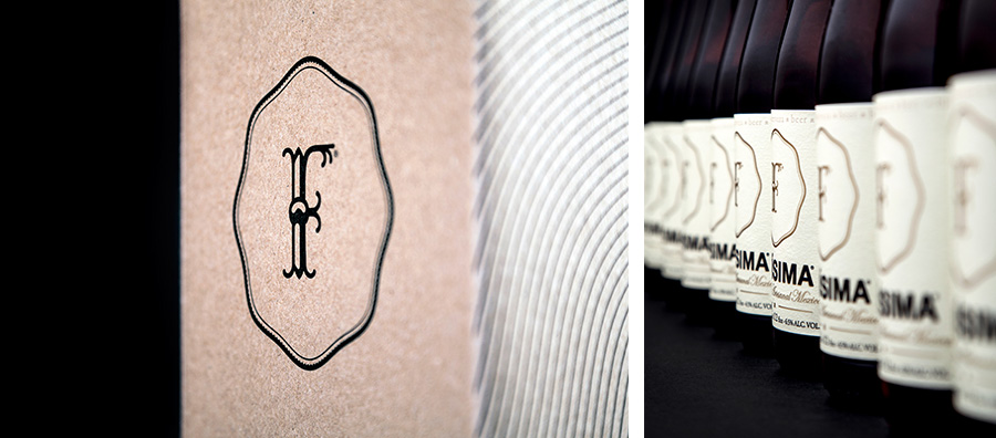
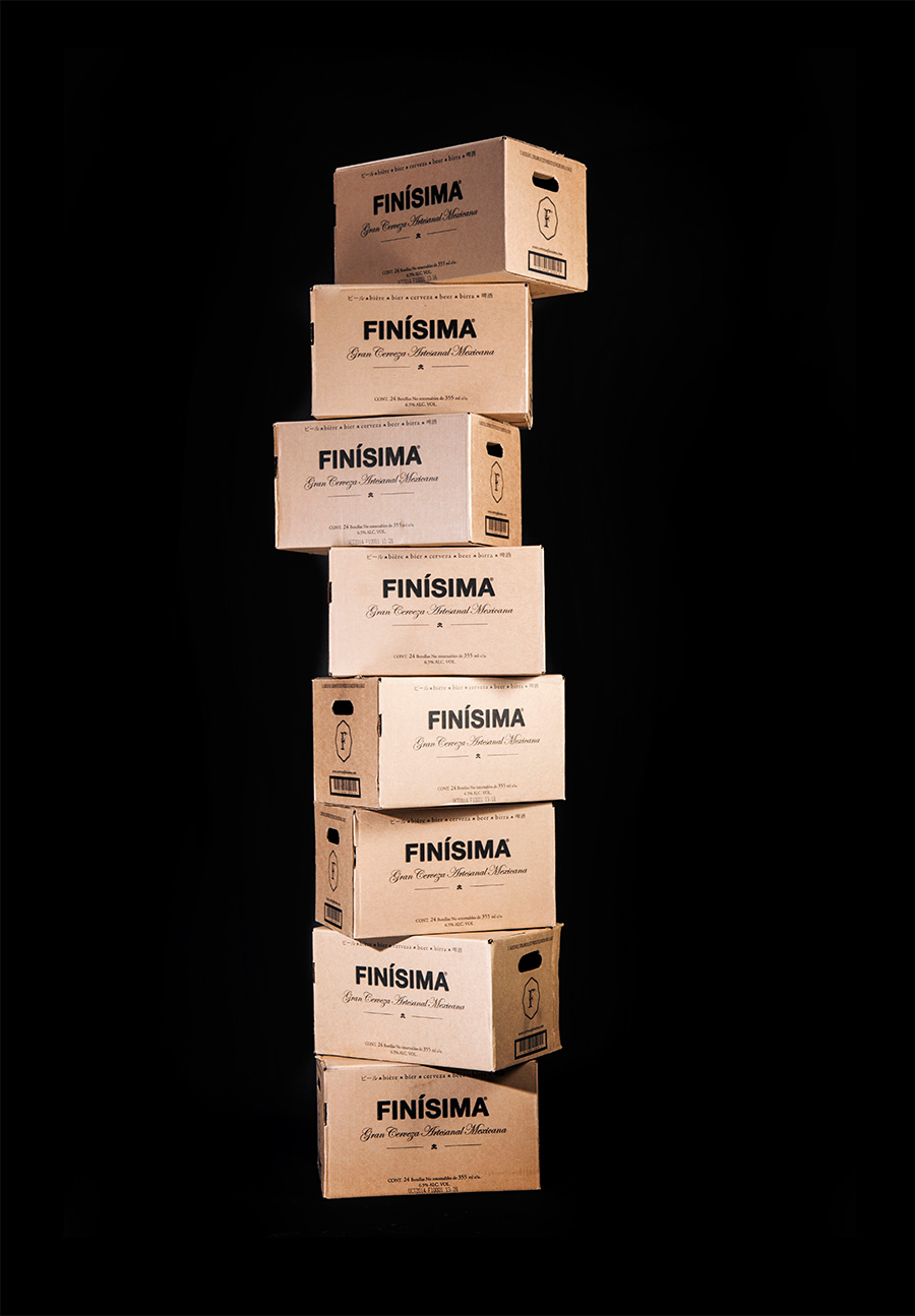
The duality of Finísima’s demographic and premium yet artisanal proposition is evident in the use of contrasting but well resolved details. From the flourish and age of a script and seal combination you might expect to see on a champagne bottle, keen to convey heritage and tradition, to the more recent on-trend utility of a bold sans-serif.
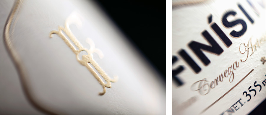
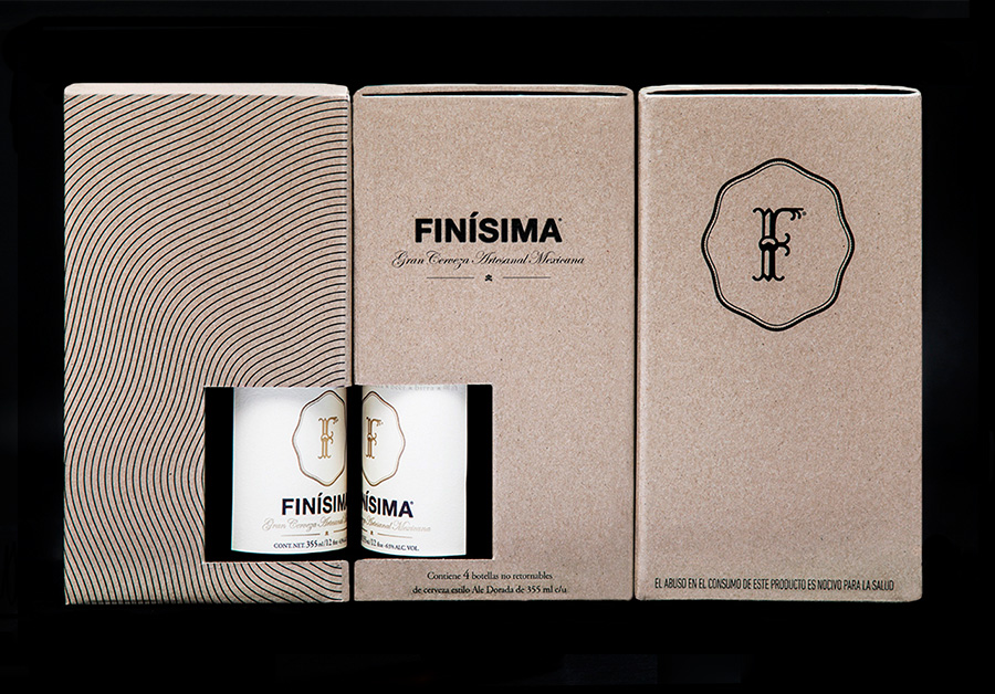
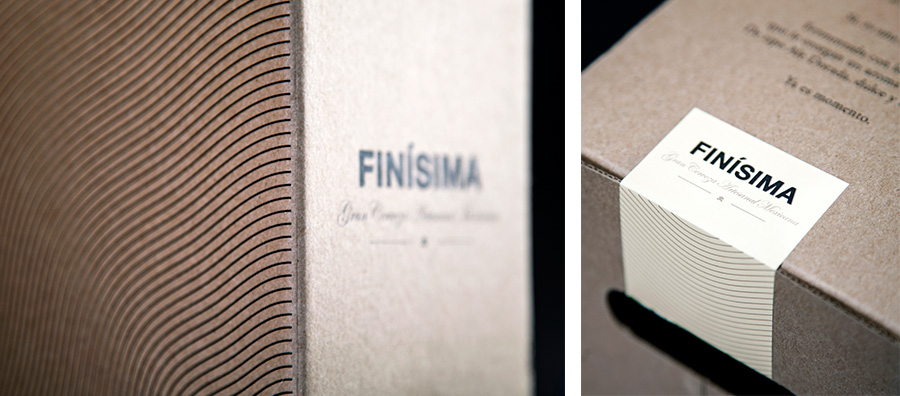
The two typographical choices are bound by a cohesive contrast of material and print finish. An off-the-shelf amber structural choice, labels with an organic raised surface texture, stickers and an uncoated, unbleached corrugated board, all hint at a small craft origin while a fine gold embossed detail and the boxing of bottles leverage a broad understanding of perceived high quality.

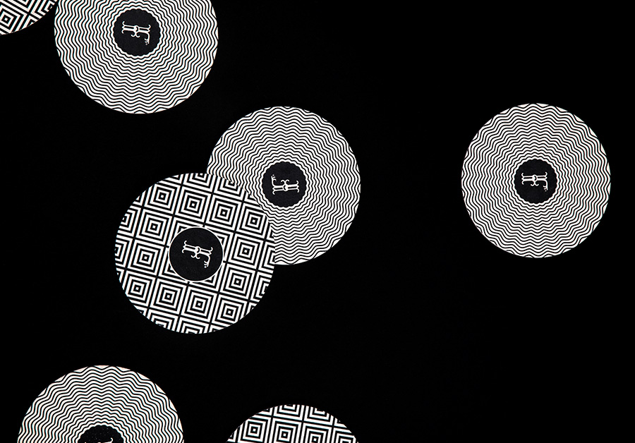
The geometric patterns of the lids and coasters, and the topographical waves of the boxes, inspired by Mexican artist Pedro Friedeberg, infuse the more familiar communicative details of type and material choice with distinctive character and a subtle regional, artistic reference that reflects the artistry now associated with batch brewing.
The result is an interesting and unusual union of small-scale craft and established high quality, disparate themes neatly resolved and appropriately informing aesthetic to derive visual and communicative impact.
