Crisp Packaging
Spudos by Paul Belford Ltd
We live in chaotic and excessive times. Brands and politicians alike demand attention, clamouring for consideration and creating – quite frankly, for me at least – an unwelcome cacophony of competing voices and issues. All too often, the lines between competing interest are blurred, and even absurd. I crave clarity and simplicity, particularly when it comes to basic consumables. What’s...
The London Crisp Co. by B&B Studio
The London Crisp Co. is a new hand cooked British crisp range, now available in local pubs throughout London, with a packaging treatment developed by B&B Studio. Absent the story you might expect from a small artisan crisp brand and avoiding the current favour for reduction, B&B Studio’s approach goes all in for provenance and visual impact, embracing a rich...

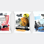
Popchips by Marx
Popchips is a four flavour range of potato chips from Ping which have been popped—much like popcorn—rather than backed or fried to create a healthier snack. New Zealand-based Marx Design were responsible for developing a new mascot for Ping that could work across multiple products in the snack food category and a packaging solution for the Popchips brand that would “avoid the clichés...