The London Crisp Co. by B&B Studio
Opinion by Richard Baird Posted 31 March 2015
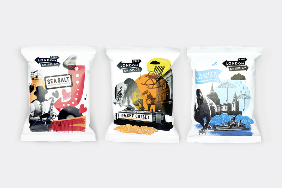
The London Crisp Co. is a new hand cooked British crisp range, now available in local pubs throughout London, with a packaging treatment developed by B&B Studio. Absent the story you might expect from a small artisan crisp brand and avoiding the current favour for reduction, B&B Studio’s approach goes all in for provenance and visual impact, embracing a rich and bold contrast of period and contemporary photography, illustration and typography that draws on the changing landscape and cultural history of London.

Each pack is a striking and unusual mix of imagery and theme. These include, but are not limited to, infrastructure, contemporary culture, the British Empire and its architecture, and a little of the stereotypical. These are neatly bound together by brand name, product provenance, and a consistent colour palette of black ink, a bright highlight and the white of the bag. Points of interest include Emirates Air Line, The Tea Building in Shoreditch and what might well be the Cutty Sark with quite a few other things to spot.
This initial impact of colour, disparate imagery, past and present, is further explored and given a subtle craft subtext in the collage and contrast of etched and freehand illustration, cut and paste photography, a use of stamp, spray and brush textures, and serif, sans-serif and hand drawn typography.
This appropriation and resolution of some of the characteristics, iconography and generalisations of London, and the way that these have been rendered, works well to establish a unique and current brand personality, firmly rooted in origin, that secures visual interest and flavour differentiation from a distance whilst also introducing a layer of communicative detail and an element of discovery up close.


Although the result leans heavily on provenance and is familiar in the way that it leverages Britishness, B&B’s stylistic considerations, a subtle tongue-in-cheek nationalism, the variety yet consistency of themes across each flavour, and the contemporary relevance and traditional values the contrast of imagery, colour, type and technique conveys, manages to layer a clear aesthetic distinction with a communicative detail that is sensitive to the conventions of the category. More from B&B Studio on BP&O.
Design: B&B Studio. Opinion: Richard Baird.