Custom Typography
If you’ve visited an off-licence, you’ve heard of Lebara – now thanks to Verve, the brand finally makes sense
Lebara. Le-ba-ra. It’s a word that’s become so familiar to many of us, sonically at least, as to have become almost part of the wallpaper. But semantically, conceptually, literally – do many of us really know what it is? If you’re anything like me or the very small sample of around five to six people who just happened to be...
Feel the heat
Most branding has to give some suggestion of what said brand is, or does, or stands for – it’s usually not ideal if they bear little to no resemblance or representation of their category, audience or ideals. The exceptions are usually things like record covers, or other inherently creative entities like musical instruments, editorial projects; occasionally booze brands, like the...
INTL 2025 by Warriors Studio and NAM
International Assembly began life as Graphic Design Festival Scotland back in 2014, founded by then-recent-ish grads Beth Wilson, James Gilchrist. The pair also helm Warriors Studio, which has been taking care of the festival’s creative direction, branding and design since its inaugural edition, too. GDFS became International Assembly, or INTL, in 2020; and when the new name and identity, also...
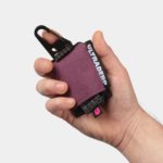
Monica Rich Kosann by Here
There’s been a fair bit of chatter in recent times in the brand design world about the ‘new codes of luxury’ – how today’s hip young well-to-dos are eschewing the signifiers of yesteryear (ostentation, gold, bling, anything remotely showy) for a more understated aesthetic. Being fabulously rich today, then, is perhaps a little like the whole ‘no makeup’ thing: anyone...
Muse Group by Collins
Muse Group exists as a collection of digital products covering all aspects of the creative process in music. This reviewer is familiar with Audacity and has used it in the past, but other platforms include Ultimate Guitar, MuseClass, MuseScore, and MuseHub. These tools are used by a range of professional musicians, budding amateurs, and everyone in between, working across all...
Sigma by Stockholm Design Lab
You could argue that there’s a fair few similarities in terms of Japan and Sweden’s approach to design, and the aesthetics of life more generally. Both are known often for a specific kind of minimalism – a tastefulness that eschews fluff, luxuriates in crisp whites and keeps its edges, everything in its right place, rules and order and form following...
Klangwelt Toggenburg by Studio Marcus Kraft
Klangwelt Toggenburg (which translates as ‘sound world Toggenburg’) is a cultural organisation that manages to marry a devotion to the experience and exploration of (you guessed it) sound, with breathtakingly gorgeous (as far as I can tell from Google Images, anyway) mountainous natural landscapes of the Swiss Alps, and some serious architectural chops to boot. Klangwelt Toggenburg began life more...
Siuru by Bond
Estonia’s Siuru plays with important questions, subverting and, at the same time, fulfilling expectations. Is it an art museum? A library? A cinema? Or a cultural institution? For a Bond (Veikkausliiga, Saaristo, Cable Factory) the design studio in charge of developing a brand identity for Siuru, this raised the concern, how do you brand something that seeks not to be characterised...
North Road by Manual
Independent content studio North Road was founded in 2022 to unite a portfolio of companies covering everything from scripted entertainment (‘Chernin Entertainment’) and non-scripted content (‘Kinetic Content’) to non-fiction productions (under ‘Words + Pictures’). Across these entities, North Road is one of the largest global suppliers of TV and film content, and is able to work on over 70 active...
Chester Zoo by How&How
I’d lazily assumed that, like jazz record sleeves and Dutch public transport, zoos were one of those sectors with a visual legacy that’s packed with game-changing brand design – the sort that fills the pages of graphic design histories, up there with the likes of Paul Rand’s ‘IBM’ and the FedEx arrow and Alan Fletcher’s gloriously clever ampersand trickery for...
Ultraderp by Mucho
The name Ultraderp seeks to combine all things extreme (think ‘ultrafast’, or ‘ultra marathon’) with ‘derp’, which is, apparently, the face a dog makes when they don’t know what’s happening. The product that bears this name is an ultra-light, easily-packable dog leash that can be worn on the collar and deployed when needed, simply by pulling the tongue-like tab. This...

Hello Klean by Two Times Elliott
Beauty is, of course, in the eye of the beholder, but there’s no denying that objectively, its branding and identity design has undergone some huge changes over the past decade or so. Gone are the days of faux-luxurious designs that were all about swathes of abstract silk; women coiffured to within an inch of their life; a microscopic lens on...