D&AD Award Winners
Orchestra Sinfonica di Milano by Landor & Fitch
In the words of synesthete Johann Wolfgang von Goethe, ‘music is liquid architecture; architecture is frozen music’. Unlike 19th-century architecture, contemporary graphic design is afforded no such static reprieve – it faces the challenge of animating the ‘universal language’. Whereas once the plastic arts could content themselves with merely freezing music, any contemporary attempt to visually translate music must now...
Logo
Flipper Taps
Red Dot Studio
2023, UK, Home
Going by Design Studio
If you’ve heard of Scott’s Cheap Flights, it’s more than likely through word of mouth – it’s the sort of thing shared by a helpful colleague or cousin when you discuss trying to make holiday plans, much like the sage advice to use a private browser when looking at flight prices. And from these fairly humble beginnings, the service –...
Time by For The People
‘The story of the internet is the story of life’. Understood in this way, rebranding Malaysia’s challenger internet service provider Time presented the appropriately existentially titled For the People with a daunting task. As legislation in Malaysia shifted, requiring companies like Time to share their infrastructure with other ISPs, competition has grown. As such, Time needed to evolve its brand. What is...
Forskningsrådet by ANTI
2022 was, let’s say, an interesting year for Forskningsrådet (The Norwegian Research Council). The public institution, which provides public funding for research and innovation across a wide range of fields, usually operates without controversy or intense public scrutiny. This changed in September 2021 when Norway held its national elections and got itself a change of government. And along with that,...

Eager by Ragged Edge
The visual ‘territories’ of design and the strategic routes of marketing and advertising run in cycles, parallel to consumer culture. Ideas that fall by the wayside one decade are rediscovered, remixed or recycled in another. Challenger brands grow, take on the established and are either acquired, expire or, sometimes, find a sweet spot for growth that allows them to remain true...
Future Factory by Dutchscot
‘Lead generation for creative agencies’. It’s one of those lines that makes complete sense to some but sounds like gobbledigook to everyone else. ‘Lead generation’ is a general mystery, unless your job depends on it. And what is a creative agency after all? But of course, so far as branding is concerned, ‘everyone else’ really doesn’t matter. Hitting the spot...
San Francisco Symphony by Collins
Formed in 1911, while San Francisco was rapidly rebuilding after the devastating earthquake of 1906, the San Francisco Symphony (SFS) has been serving audiences in the Bay Area and beyond for 111 years. In 2018, Esa-Pekka Salonen – a Finnish conductor and composer – was announced as the incoming musical director, with his tenure to start during the fall season...
Eames Institute by Manual
American industrial designers Ray and Charles Eames fundamentally believed that good design should be available to everybody. It’s ironic, therefore, that today – in part due to institutional bodies, galleries, collectors and capitalism – their work has been elevated far beyond the reach of the common person. Design that was supposed to be accessible has become a symbol of taste,...
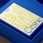
Crane by Collins
In 1775 Crane paper was used to print the first money for the American colonies, and by 1801 the company was the primary paper producer for local and regional banks. Later that century, equipped with an arsenal of innovative techniques from Europe, Crane won a contract with the Bureau of Engraving and Printing and became the supplier for the US...
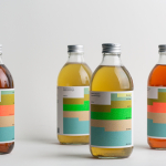
Swee Kombucha by Bedow
Although its recent rise to popularity has been rapid, running a quick search on ‘kombucha’ reveals that until the 21st century it had seen little category growth since its creation, more than 2000 years ago. For the uninitiated, kombucha is a fermented, non-alcoholic sweetened tea containing vitamins, amino acids and nutrients. This mix of familiarity (as a tea), its sweetness...
Logo
OneFootball
Design Studio
2021, UK