Danish Design
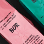
NOR Specialties by Re-public
NOR Specialities supports the development of plantation farmers and helps sustain local communities across Colombia, Guatemala, Nicaragua and Bolivia by way of its range of chocolate, cocoa nibs, roasted coffee beans and cold brew coffee products. NOR trades directly with family farms and producers of its raw ingredients, working with them to develop transparent and sustainable practices. Danish design studio Re-public worked with...
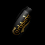
Carlsberg Black Gold by Kontrapunkt
Carlsberg is a Danish beer brand founded in 1847 by J.C. Jacobsen. It is part of the Carlsberg Group portfolio which also includes Tuborg, Kronenbourg and Somersby cider, as well as Carlsberg Export and Carlsberg Black Gold. Carlsberg has a significant heritage. And, like many other beer brands, has largely conveyed this using the visual language and associated legacy of the beer...
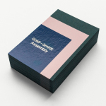
Gold—Smidt Assembly by Re-Public
Gold—Smidt Assembly is a Copenhagen-based pop-up art gallery that exhibits contemporary fine art across the globe, and offers a consultation service, collaborating with professional artists to curate sculptural pieces for commercial, public and residential spaces. Danish design studio Re-public worked with the gallery to develop a visual identity that would link a variety of assets that included signage, print communication and...
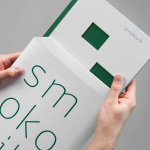
Smokovik by Studio8585
Smokovik is an exclusive property development, located on the Croatian Island of Krk, designed by renowned local architect Idis Turato. The development will be made up of both residential and commercial buildings that share a functional and sustainable build practice, a favour for modernity, flat surfaces and Mediterranean sea views. Smokovik’s brand identity, created by Studio8585 now working from Copenhagen, included logotype, brochure and website design, a...
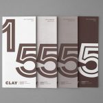
Clay by Studio Claus Due
Clay is a museum of ceramic arts and crafts, located in the Danish town of Middelfart, west of the capital. Exhibits range from a 235 year old plate to more recent and experimental pieces from contemporary artists. The museum worked with Studio Claus Due to develop a new visual identity system. This included business cards, stationery, signage, packaging, print communication and website, unified...
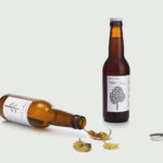
Mikkeller + Bedow Seasonal Beers by Bedow
Mikkeller + Bedow is a limited edition beer with a four seasons theme created by Danish brewery Mikkeller with packaging created by Stockholm-based graphic and product design studio Bedow....