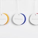
Talor&Jørgen Coffee by Bielke & Yang
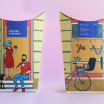
Talor&Jørgen is a Norwegian speciality coffee roastery and coffee subscription service that delivers small boxes of freshly roasted beans, sourced from across the globe, to subscribers based on their drinking habits rather than to a schedule. Product naming focuses on bringing to the forefront flavour notes rather than bean provenance, variety and preparation (although this is online and on pack) with the intention of making...
NAU by Toko
NAU is a new Australian furniture brand created by the premium designer furniture and lighting retailer Cult, and features work by futurist designer Gavin Harris and Adam Goodrum, a designer that believes an object justifies its existence through story and detail. Design by Toko worked with Cult to develop name, and create a logo and graphic identity for NAU that...
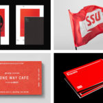
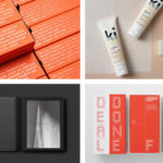
BP&O Collections — Red In Branding
A collection of some of the very best brand identity and graphic design projects that effectively utilise red, reviewed and published on BP&O. This post features work by Toko, Bond and Character, and covers simple logo and stationery projects, and extends to broader brand identity programmes. These play with large areas of red, red as highlight or a small conceptual accent, and...
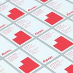
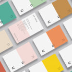
Maven by Design By Toko
Maven is described by Design By Toko, the Sydney-based design studio behind its recent rebranding, as a top-tier architecture recruitment agency operating worldwide. Drawing on the built environment and with the intention of expressing the agency’s prominence within the architecture industry Toko developed a brand identity of simplicity and impact through bold solid form and single colour that links business...
BP&O Collections — Best Awards Finalists 2017
The Best Awards is an annual celebration of interactive, graphic, product and spacial design work from New Zealand and Australia, run by The Designer’s Institute. This year’s event will take place on Friday 6th October at Auckland’s Viaduct Events Centre where winning studios will be awarded a Gold Pin for best in category, a Supreme Pin for best in discipline or a Purple Pin for those considered to...
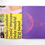
Campus by MultiAdaptor
Campus is Google’s network of co-working and event spaces for the many start-ups it has and continues to help fund. These are located in London, Madrid, Warsaw, São Paulo, Seoul, and Tel Aviv, with another to open in Berlin soon. The Campus community has over 80,000 members and collectively received over $537 million in funding which has created more than 11,000...
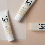
Ki Sunscreen by Akin
Ki Sunscreen was developed by national skincare clinic Caci to protect against the harsh New Zealand sun, and the skin damage and premature ageing that UVA and UVB rays can cause. It is made from the latest generation of ingredients proven to protect, and those that help to control oils and maintain a matt finish. This balance between clinically proven effectiveness and cosmetic...
BP&O Collections — Retail
A continually updated collection of some of the best brand identity design work for retailers, reviewed and published on BP&O. This post features work by Two Times Elliott, BVD and Blok, and includes simple wordmark and stationery sets, and extends to those that included signage, packaging and brochures. Projects move between the reductive and eye-catching in form, type and colour,...

Institute by Commission Studio
Institute is a full service creative studio from New York working with clients to connect with people through creative direction, live experiences, concept development, content creation, production and post-production services. Institute’s work is described as being underpinned by thoughtful and meaningful creativity, and although their clients are often high profile, their presence is intentionally modest. London-based Commission Studio worked with Institute to develop...
January Moon by Perky Bros
January Moon is a range of contemporary teething jewellery from American artist and designer Jenny Luckett, created in response to the birth of her son and in the discovery she could no longer wear her favourite pieces. The range intends to satisfy the stylistic sensitivities of modern mothers while also aiding their child’s development. The range is characterised by a variety...
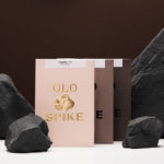
Old Spike Coffee by Commission Studio
Old Spike is a coffee roastery, subscription service and wholesaler, cafe and social enterprise working with the homeless, located in South East London. It is situated on the site of a former workhouse, a place where the poor would break rocks over metal spikes for food and lodgings, and where the roaster gets its name. With a desire to separate the roastery’s commercial...
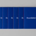
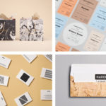
Bundlelist by Bunch
Bundlelist is an online platform that simplifies and draws together international mobile bundle costs, with a specific focus on mobile retail data, and facilitates comparisons between countries and mobile operators. Design studio Bunch worked to develop UX, UI and visual identity for the platform, which included logotype and a bundle of promotional notebooks....