Design Studio Logos
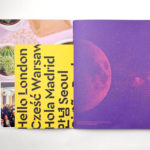
Campus by MultiAdaptor
Campus is Google’s network of co-working and event spaces for the many start-ups it has and continues to help fund. These are located in London, Madrid, Warsaw, São Paulo, Seoul, and Tel Aviv, with another to open in Berlin soon. The Campus community has over 80,000 members and collectively received over $537 million in funding which has created more than 11,000...

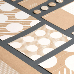
Institute by Commission Studio
Institute is a full service creative studio from New York working with clients to connect with people through creative direction, live experiences, concept development, content creation, production and post-production services. Institute’s work is described as being underpinned by thoughtful and meaningful creativity, and although their clients are often high profile, their presence is intentionally modest. London-based Commission Studio worked with Institute to develop...
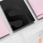
Studio Una by Studio Una
Studio Una is graphic design business, run by Sebastian Hager and Sebastian König, with an office in the German city of Hamburg. The duo works within the fields of visual communication and brand identity design, online and in print, and describe themselves as attaching great importance to the aesthetic effect of design, alongside strong concepts and strategic decisions. This positioning is conveyed...
Studio South by Studio South
Studio South, formerly APLUS, is graphic design studio working within the fields of brand identity and packaging from their office in the city of Auckland, New Zealand. In conjunction with a new name and site launch, which coincides with the expansion of studio space, South have also developed a new visual identity treatment. This extends across business cards, folders and headed paper, a...
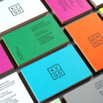
KVGD by Kerr Vernon
KVGD is a Glasgow based graphic design studio run by Kerr Vernon that works within the fields of brand identity design and print, has a ‘be nice, do good work’ philosophy, and a reputation for producing engaging, thoughtful and crafted projects. The studio’s client base is diverse, local and national, and includes businesses such as gallery, event and creative workspace The Whisky Bond,...
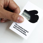
Designers Anonymous by Designers Anonymous
Designers Anonymous is London-based multidisciplinary design agency with global clients from a variety of sectors. The agency has appeared on BP&O on a number of occasions, with highlights including their packaging work for Zest and Patchett’s, and their identity work for Fuller’s hospitality brands The Parcel Yard, The Tokenhouse and Brewer St. Following the launch of their new website this...