Torrefacto designed by Fork
Posted: Filed under: Food and Drink, Logo Reviews, Packaging Reviews | Tags: Brand Identity Design, Brand Identity Reviews, Branding, Branding Blog, Branding News, Branding Reviews, Business Card Design, Coffee Logos and Packaging Design, Creative Packaging, Design For Print, Designed by Fork, Graphic Design Blog, Handcraft, Heat Treated Detail, Logo Design & Branding Blog, Logo Design Inspiration, Logo Design Resource, Logo News, Logotypes, Monogram Design, New Logo, Newsprint, Packaging Company, Packaging Design Resource, Script Logotypes, Stationery Design, The Best Brand Identities of 2015, The Best Logo Designs of 2015, The Best Packaging of 2015, Uncoated Papers & Cards Comments Off on Torrefacto designed by ForkOpinion by Richard Baird.
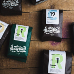
Torrefacto is a Russian coffee roasting business founded in 2011 in response to what they describe as the difficulty of sourcing freshly roasted coffee beans in Moscow, and the time and trouble associated with importing it. Torrefacto prides itself on batch production and hand roasting processes, good consumer relations – which sees its owners personally answering letters and addressing website comments – and a combined roasting and delivery service that reduces the time between roasting, which takes place each Saturday, and receipt.
Created by design studio Fork, Torrefacto’s new brand identity, which included logotype, packaging and stationery, reflects some of the convenience of door-to-door service, individual consumer-focused values and the craft associated with selecting and roasting coffee beans, through typography, structural design, paper choice, colour and finish, in a way that introduces character to, and increases the perceived value of, what has become an everyday experience.
Mary Wong designed by Fork
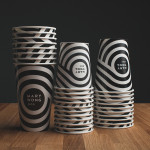
Posted: Filed under: Food and Drink, Logo Reviews | Tags: Brand Identity, Brand Identity Design, Brand Identity Reviews, Branding, Branding Blog, Branding Reviews, Coffee Cup Designs, Designed by Fork, Logo Design & Branding Blog, Logo News, Logotypes, Neon Sign Design, New Logo, Packaging Design, Serif Logotypes, Spot Colours, Stationery Design, The Best Brand Identities of 2014, The Best Logo Designs of 2014, The Best Packaging of 2014 Comments Off on Mary Wong designed by ForkMary Wong is a fast-food chain, with locations throughout the Russian city of Rostov-on-Don, that prepares Chinese noodles with both Asian and American influences. Mary Wong’s brand identity, a combination of bilingual typography, logotype, black noodle boxes with bright spot coloured stickers, t-shirts, environmental design and signage developed by Moscow based studio Fork, was inspired by Tokyo and New York nightscapes and reflect the chain’s fusion of east and west.