Designed by Mash Creative
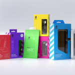
uBear by Hype Type Studio & Mash Creative
uBear is a high-end mobile phone, tablet and laptop accessories business located in Los Angeles, California. Their visual identity, developed by Hype Type Studio and Mash Creative, included a new logo, stationery set, packaging and responsive website. By utilising the bold graphic detail of diagonal stripes, sans-serif type, a bright and diverse colour palette, fine diagrammatic illustration, foils and varnishes and a simple bear...
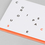
Curious Space by Mash Creative & May Ninth
Curious Space is a London-based scenographers—a specialist scene setter—that creates “unique and inspiring spaces for museums, galleries and more”. Their visual identity, developed by Mash Creative and May Ninth, ‘splits apart to create a physical space that intrigues whilst the type can sit either horizontally or vertically in numerous layouts within the dotted grid”, establishing a flexible and unusual yet structured...
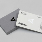
Ali Sharaf by Mash Creative
Ali Sharaf is a Bahrain-based commercial photographer who specialises in fashion, beauty and lifestyle images for the advertising and editorial markets. He describes himself as contemporary, upbeat, outspoken and edgy. Inspired by a shared interest in Swiss modernism and adopting a less is more approach, design studio Mash Creative developed a new brand identity for Ali that combines an iconic...