Designed by Mast
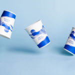
Loyal Coffee by Mast
Loyal Coffee is a barista-owned and operated specialty coffee shop located in Colorado Springs. It features a high ceiling, exposed beams and concrete surfaces, natural material detail such as tree trunk stools, and crafted finishes that include a mosaic floor, carved wood panel and what looks like a ghost sign. Drawing on this, the surrounding landscape, and the loyal bond that...
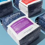
Huckleberry Roasters by Mast
Huckleberry is a Colorado-based coffee roaster established in 2011 by Koan Goedman and Mark Mann. Huckleberry worked with local graphic design studio Mast to rework their packaging in a way that would make the most of some well-established assets which included Mackey Saturday’s logotype, and would introduce more of the personality of its founder’s. This was achieved through the introduction of bright spot colours, geometric pattern...
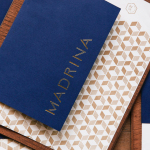
Madrina by Mast
Madrina is a Dallas based Mexican restaurant with a menu that plays with French culinary influences and Mexican tradition. The restaurant has a distinctive interior of exposed concrete beams, delicate gold light fixtures, leather upholstered chairs, beveled mirrors and tiled flooring. Like the menu, the interior is a fusion of influences, yet remains cohesive and distinctive. American graphic design studio Mast set out to...
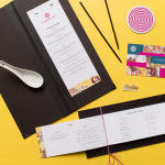
Tanoshii Ramen Bar by Mast
Ramen is a Japanese meat broth and wheat-noodle soup that originated in China and is now embraced internationally. While many enjoy instant versions, the best is said to be prepared over days and is the product, and some would say the art form, of a creative and experienced chef. These are the values of Tanoshii. As the first dedicated ramen bar...