Designed by Matchstic

Prism by Matchstic
Prism is a new thermally fused laminate brand from Arauco—a global manufacturer of sustainable wood products—created to appeal to the art and design market currently dominated by well-known brands. Arauco worked with American graphic design studio Matchstic to develop a brand identity for Prism that would communicate the value of a product often perceived as low-value within a market that often favours reclaimed woods and...
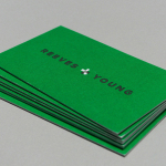
Reeves & Young by Matchstic
Reeves & Young is an Atlanta based construction and sub-contracting business that was formed in 2015 following the merger of Reeves Contracting Company and Potts Construction. To coincide with this merger, Reeves & Young worked with American graphic design studio Matchstic to develop a new brand identity that would convey the combined strength of the two businesses but would also be sensitive to...