Prism by Matchstic
Opinion by Richard Baird Posted 2 May 2016
Prism is a new thermally fused laminate brand from Arauco—a global manufacturer of sustainable wood products—created to appeal to the art and design market currently dominated by well-known brands. Arauco worked with American graphic design studio Matchstic to develop a brand identity for Prism that would communicate the value of a product often perceived as low-value within a market that often favours reclaimed woods and other solid materials.
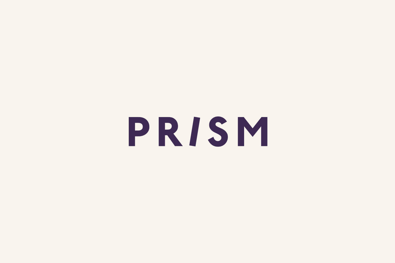
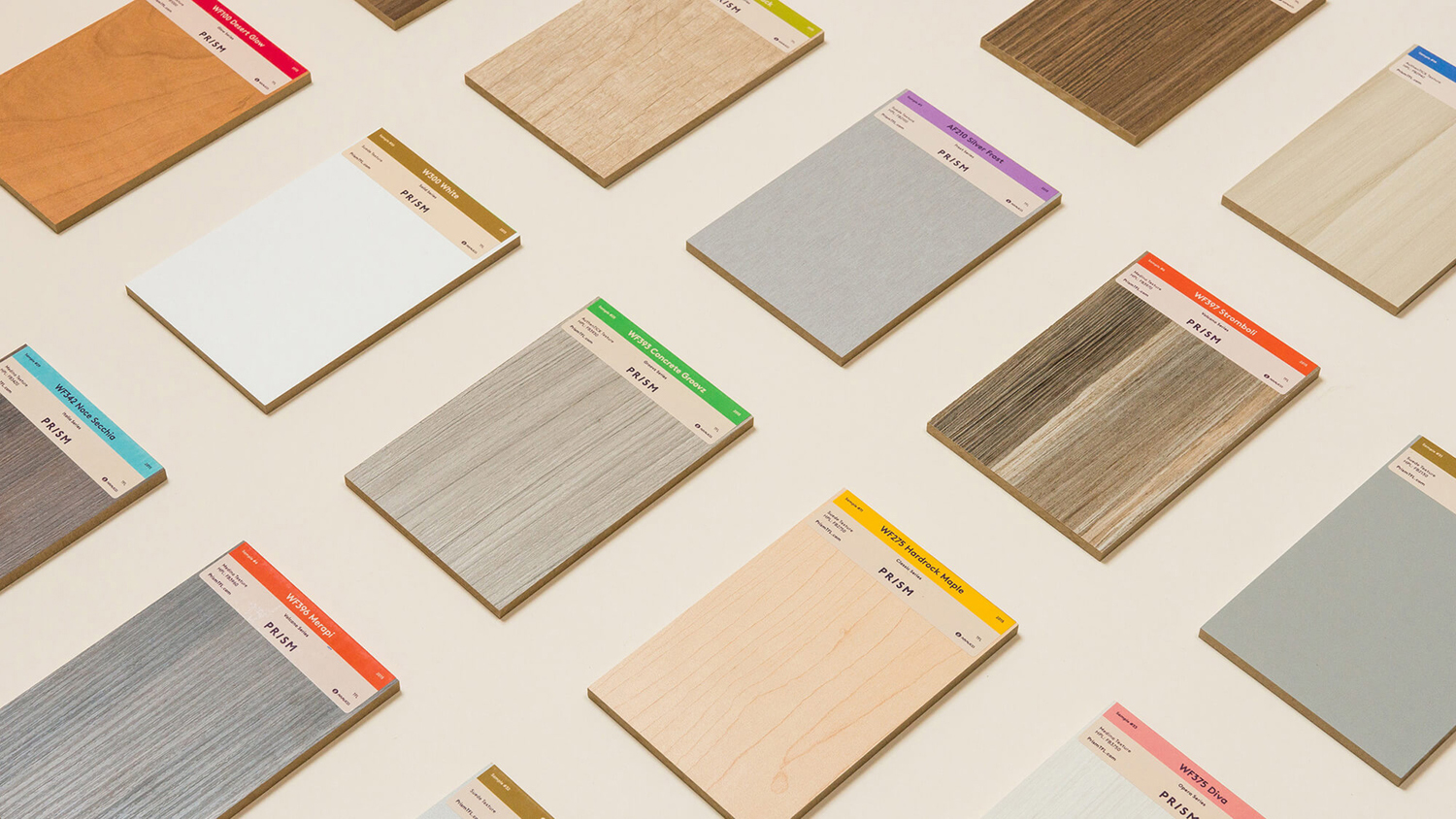
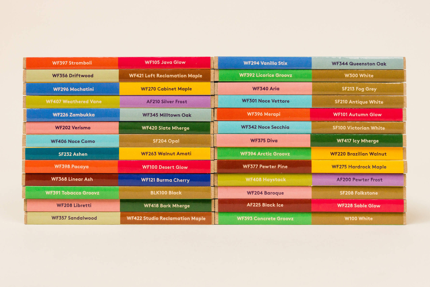
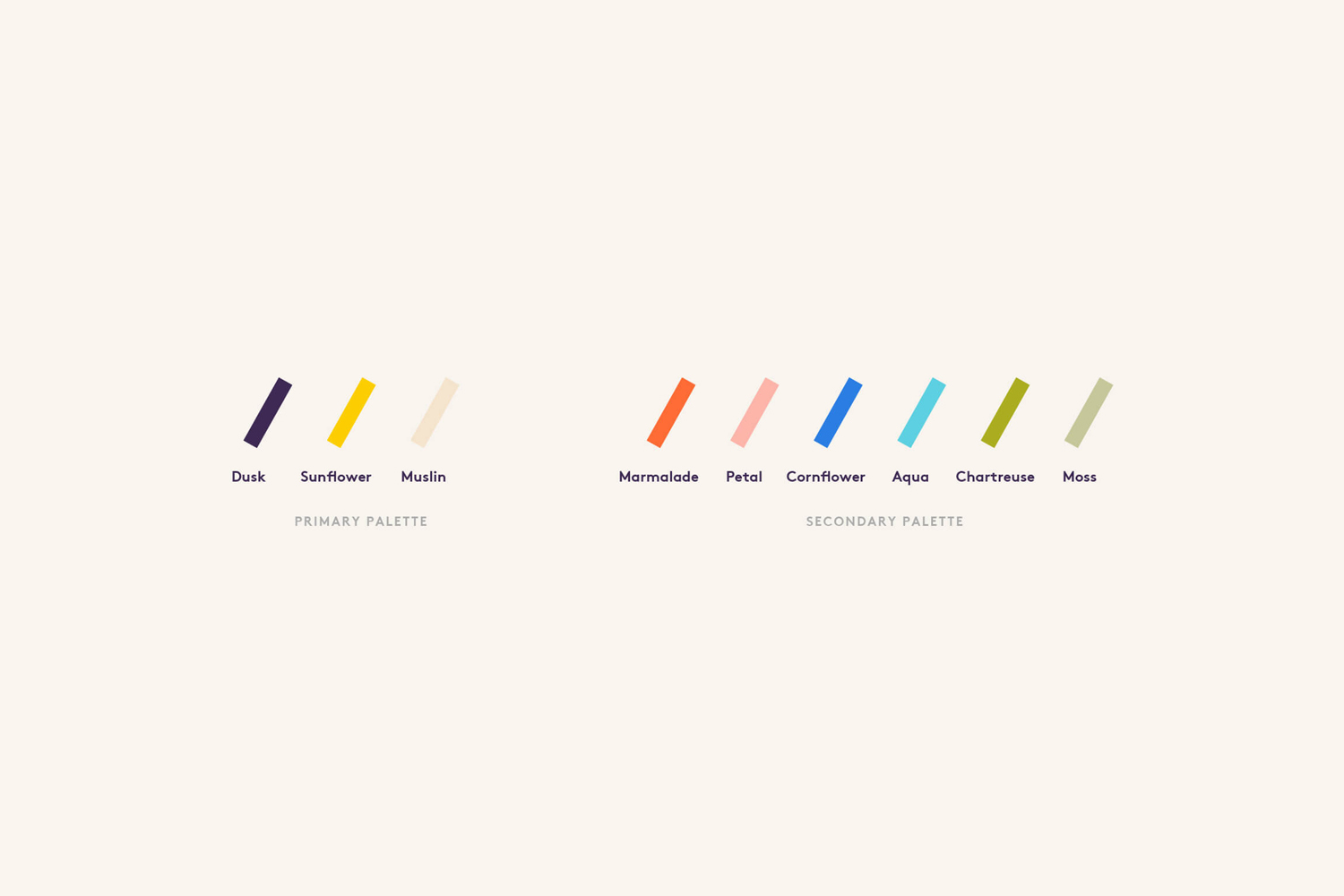
Matchstic described their intention as wanting to give Prism an impactful and colourful personality, one that would shift perceptions and would place it in stark contrast to its competition. This is effectively achieved through naming, a bright and diverse colour palette, simple but eye catching imagery and a playful tone of voice.
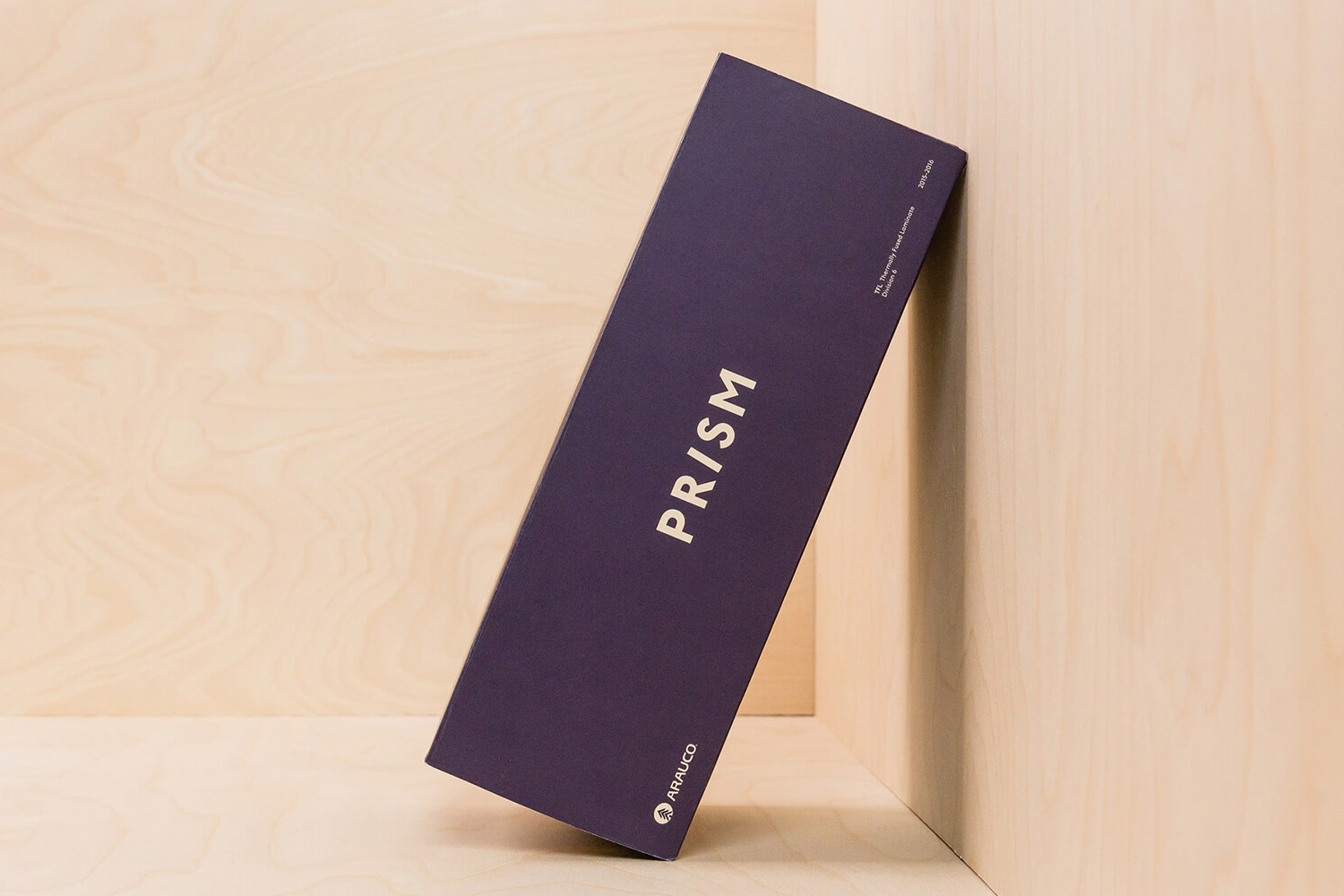
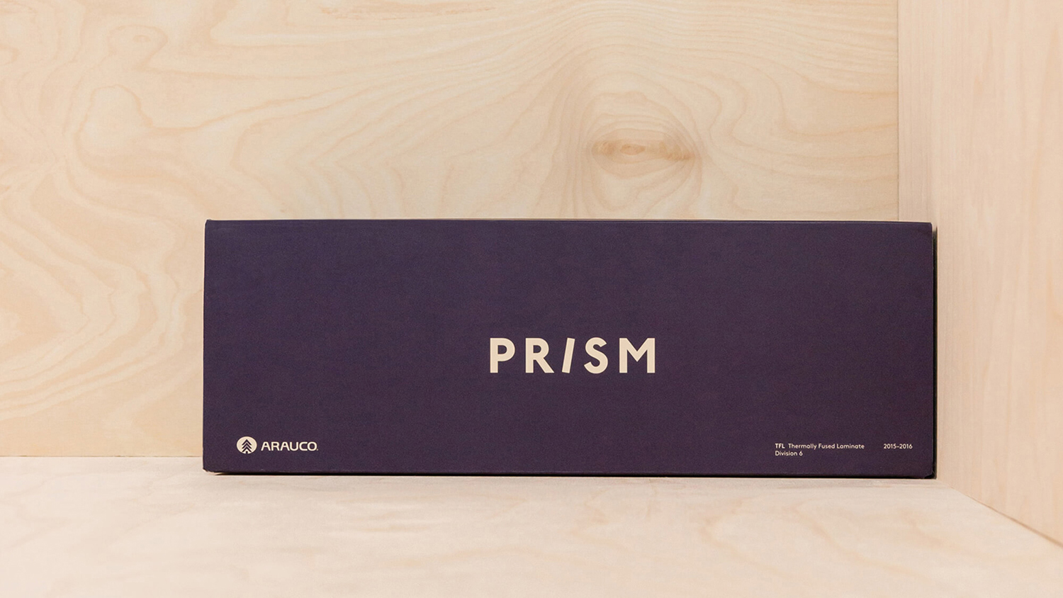
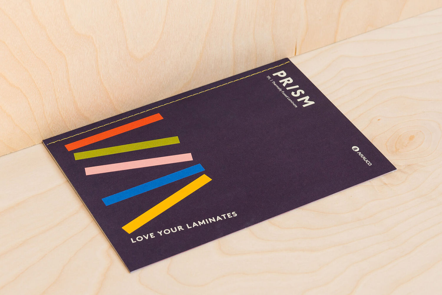
The logotype is straightforward and current in the choice of typeface, with the slanted I giving it a slightly proprietary quality rooted in the form of laminates. This then plays out as a variety of simple but bold images. While aesthetically compelling these also feel grounded in a clear expression of creativity, variety and modernity.
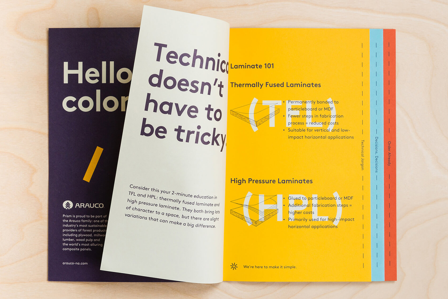
Bands of colour, a personable but functional monolinear sans-serif, simple illustration, stitched detail and clear communication system across products plays with the very current favour for the modernist aesthetic and a touch of craft. Contrast is used to good effect, with flat bright colour, geometric type and horizontal labels drawing out and accentuating natural material colour, vertical organic lines and texture.

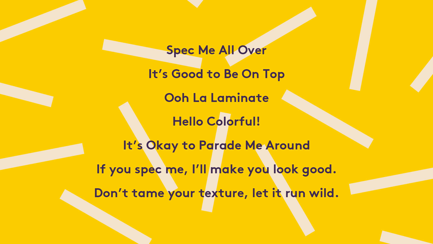
Brand character, as expressed through language, leans quite far into the big and very personable, more consumer facing in tone than business to business. Given the context of laminates, it is unexpected, which certainly has value, marking it out as significantly different, and in keeping with the colour palette and further emphasised through the typesetting of the brochure.

Prism’s brand identity looks to challenge perception, and it certainly does that. It asks designers to take another look at laminates, and their creative opportunities alongside, rather than in opposition to, solid and reclaimed materials. It suggests that laminates, much like colour, can be remixed, giving an old and overlooked finish a new contemporary context. Compelling and current colour, naming conventions, type, typesetting and form language all feel rooted in this creative opportunity and communicative intention. More from Matchstic on BP&O.
Design: Matchstic. Opinion: Richard Baird.

