Designed by Maud
Ebb Dunedin by Maud
Design-savvy duo and father and son team Dylan and Frank worked alongside Gary Todd Architecture and interior design team INDYK Architects to develop Ebb, a contemporary boutique hotel located at the heart of Dunedin, a city on the South Island of New Zealand. Ebb is uniquely situated at the edge of the reclaimed Otago Harbour–a place where Polynesian travellers would...
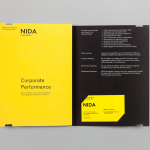
The National Institute of Dramatic Art by Maud
The National Institute of Dramatic Art is a national education and training organisation for the performing arts in Australia, and is responsible for developing the talents of some of the country’s biggest stars. With the continued democratisation of performance through digital platforms such as Youtube, and concerns that this had the potential to undermine NIDA’s conservatoire approach, NIDA pursues a...
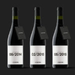
Le Naturel by Moruba
Le Naturel is an all-natural wine created without the use of sulphites by Spanish producer Vintae. Vintae describes itself as an innovative, young and dynamic enterprise, representing the avant-garde and revolutionising different aspects of the wine-growing industry. The wine’s packaging, developed by Moruba, embraces an unusual and distinctive change in communicative priorities, discarding the perceived high qualities of foil and tactile papers, verbose narrative, the...
Single Origin Roasters by Maud
Single Origin is a Sydney-based coffee specialist with a roast works in Botany and a cafe in Surrey Hills. Single Origin approached Maud to create a brand identity solution—which included logo design, stationery and packaging—that would reflect the low-key nature of the brand, the founders’ desire to avoid any notion of commercialism and help them expand into new markets. In a ‘category rife...