Designed by O Street
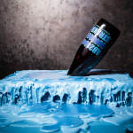
Brewdog Abstrakt by O Street
Brewdog’s Abstrakt is a limited edition craft beer concept that has released 20 different varieties since it began in 2010. Each beer is bottle-conditioned (bottled with a small amount of yeast, providing further fermentation and maturation), brewed and released just once, individually numbered and known only by their release code. It is a concept described as more art than beer, as boundary pushing and blurring...

Brewdog Menus by O Street
O Street worked with craft brewery Brewdog; best known for their beers and big attitude but also a growing hospitality presence throughout the United Kingdom, to create a distinctive menu design and system for over fifty of their bars. This included both a full menu which features a handmade backboard, and a Daily Drafts menu, individually finished at each location....

Karla Black + Kishio Suga: A New Order by O Street
A New Order is an exhibition of the work of Karla Black and Kishio Suga taking place at Modern One of the Scottish National Gallery of Modern Art between 22nd October and 19th February. The artists, unaware of each other’s work prior to the conception of the exhibition, working on opposite sides of the world, are described as being united in their use of...
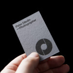
Peter Dibdin by O Street
Peter Dibdin is a photographer who brings creativity, technical knowledge, professionalism and a personal approach to both studio and location shoots for clients working within the commercial, private, arts and editorial sectors. Following a recent move to a studio in Edinburgh’s creative hub of Summerhall, Peter commissioned long-term collaborator O Street to refresh his brand identity in a way that would reflect his...
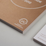
Whisky Ambassador by O Street
Whisky Ambassador is an Accredited, UK-based one-day training course that introduces bar staff and license holders to the techniques of effective Scotch whisky selling. Based around a simple monogram and sans serif logo-type combination delivered as an emboss and metallic spot colour treatment across tactile and uncoated material choices, design studio O Street’s visual identity for Whisky Ambassador – a recent start-up –...