Designed in Sydney

Tsukiyo by The Colour Club
I’d never really heard of Osaka’s Dotonbori district before encountering this project, let alone been there. Neither, I’d guess, have many of the patrons of Tsukiyo, a modern Japanese street food restaurant inspired by the area and based in Sydney’s Darling Square. But the power of great branding is such that even just looking at the identity in 2D, on...

The Dinner Ladies by Universal Favourite
‘Dinner ladies’ doesn’t have the most glamorous connotations in England – depending on your experience at school, it likely conjures up memories of scoops of greying, tepid mash-adjacent slop unceremoniously plopped onto a plate; something to do with turkey dinosaurs; a troop of formidable but visibly jaded people responsible for making every school smell like on-the-turn cottage pie from around...

Monkey Baa Theatre Co. by Universal Favourite
Theatre is an artform that relies not only on its visual and verbal performance elements, but the text from which all the rest of the more showy aspects are born. An obvious point, but one that often makes me wonder: why do so many theatre companies have such terrible names? Maybe it’s a sort of in-joke, maybe I’m just missing...
Black Star Pastry by Studio Ongarato
A visual identity just as Instagrammable as the ‘the world’s most Instagrammed cake’. Sydney bakery Black Star Pastry has been on the ascendancy, from local pastry maker to global cult status, racking up millions of views, thousands of loyal followers and generating hype around its ‘original cakes woven together with poetic storytelling’. Working with Japanese illustrator Noritake, (known for his...
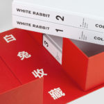
White Rabbit Collection by Toko
The White Rabbit Collection is a contemporary arts publication showcasing the work of 99 artists drawn from the White Rabbit, a contemporary art museum, gallery and archive in Sydney. The museum has become one of the world’s most significant collections of Chinese contemporary art, with over 2000 works from 700 artists. Through this new publication, designed by Australia design studio Toko...
CareerTrackers Awards by Garbett
CareerTrackers is an Australian charitable organisation that addresses Indigenous disadvantage by developing professional career pathways, internship programs and links with private sector employers for Indigenous university students. It does this through a model adapted from an African-American internship program that has been tackling disadvantage for over 45 years. This model sees students intern with sponsoring companies with the intention of converting them...

The Architect’s Bookshop by Garbett
The Architect’s Bookshop is a new design-focused retailer, located in Sydney’s Surrey Hills, devoted to the books of architecture and interior design, landscaping and urban development. The space was conceptualised as being more than a bookshop but a place to take time out to browse, a chance to engage with the material and form of the books, and as a place...
CareerTrackers by Garbett
CareerTrackers is an Australian nation-wide charitable organisation that addresses Indigenous disadvantage by developing professional career pathways, internship programs and links with private sector employers for Indigenous university students. It does this through a model adapted from an African-American internship program which has a proven legacy of 45 years. This is based on an approach that sees students intern with sponsoring companies...
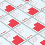
Maven by Design By Toko
Maven is described by Design By Toko, the Sydney-based design studio behind its recent rebranding, as a top-tier architecture recruitment agency operating worldwide. Drawing on the built environment and with the intention of expressing the agency’s prominence within the architecture industry Toko developed a brand identity of simplicity and impact through bold solid form and single colour that links business...

Sydlexia: Making Sense Of Dyslexia by BBDO Dubai
Sydney Dyslexia intends to challenge the misconception that dyslexia is a learning disability, and instead, move the conversation forward, to more appropriately address it as a learning difference. Sydlexia is an innovative and pioneering platform, created by Sydney Dyslexia, to help aid this change, and offers new techniques and training methods to help facilitate “dyslexia correction”. Dyslexia is the most common learning disorder....
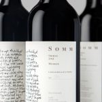
Niche Wine Co. — Somm by Frost
Somm is a limited edition Australian Shiraz from Niche Wine Co., a winery that embraces an innovative dry farming process that yields fewer yet higher quality grapes with an intensity of flavour and colour. With a desire to convey an established, old vineyard feel, and a sense of heritage and sophistication, Niche Wine Co. worked with Sydney-based studio Frost to develop a name and wine...
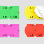
ShopAround by Design by Toko
ShopAround is described as a creative supermarket, however, in more conventional terms, began as an artist representation agency in 1998. It has grown, since then, to become a creative production agency specialising in contemporary illustration, graphic design, animation, motion graphics and interactive design. ShopAround co-ordinates a network of over 80 international freelance designers, and fosters new creative talent from its offices in New York, Amsterdam...