Emboss Detail
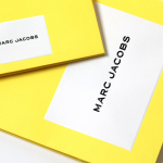
Marc Jacobs by Triboro
Fashion designer Marc Jacobs heads his own eponymous fashion brand, as well as diffusion lines The Marc Jacobs and Heaven by Marc Jacobs. He was also creative director at Louis Vuitton from 1997 to 2014, where he created the company’s first ready-to-wear clothing line. In his own words, Jacobs’ work is ‘a little preppy, a little grungy, a little couture’, and this...
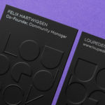
Loupedeck by Bond
Loupedeck is a Finnish startup and photo editing console designed to make the process of image manipulation faster in Adobe Lightroom for both Windows and Mac users. It is described as being an intuitive replacement for keyboard and mouse, is mapped exactly to Lightroom to encourage creative spontaneity and experimentation, and suited to beginners and professionals alike. To help establish and...
Planned Living Architects by A Friend Of Mine
Planned Living Architects (PLA) is located on Australia’s Mornington Peninsula and has an architectural portfolio that shows a sensitivity and responsiveness to the uniqueness of each site, is environmentally-consciencious, materially mindful, beautiful and functional. The studio is well-regarded, has decades of experience and expertise working within coastal and rural areas, is known for its pared-back style, and has a philosophy that is...

Institute by Commission Studio
Institute is a full service creative studio from New York working with clients to connect with people through creative direction, live experiences, concept development, content creation, production and post-production services. Institute’s work is described as being underpinned by thoughtful and meaningful creativity, and although their clients are often high profile, their presence is intentionally modest. London-based Commission Studio worked with Institute to develop...
Hill Of Grace Restaurant by Band
Hill of Grace Restaurant was created by renowned Australian wine maker Henschke and is located at the historic Adelaide Oval. With the intention of elevating experience, Henschke worked with design studio Band to develop a new brand identity that would match the quality of its food and wine, and establish a stronger connection with the roots of the brand, the Henschke vineyard. This is explored...
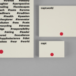
Capt by Bunch
Capt is a San Francisco-based start-up that connects creators wanting to monetize their videos with brands looking for new content and talent. The platform is made up of an app that allows creators to shoot, upload and license their videos, and a website that acts as a market place for buyers. This website also serves as a place to connect creatives with those...
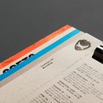
Brewdog Menus by O Street
O Street worked with craft brewery Brewdog; best known for their beers and big attitude but also a growing hospitality presence throughout the United Kingdom, to create a distinctive menu design and system for over fifty of their bars. This included both a full menu which features a handmade backboard, and a Daily Drafts menu, individually finished at each location....

OpenView by Pentagram
OpenView is a Boston-based business dedicated to investing in and helping to grow what are described as expansion-stage companies that are working in the software development sector. OpenView has a unique hands-on approach, and worked with Pentagram’s Natasha Jen to express this through positioning, tone of voice and visual identity design. This included custom typography, stationery, business cards, website and...
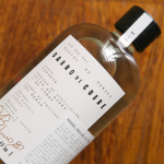
Barro de Cobre by Savvy
Barro de Cobre is a mezcal from Oaxaca, Southern Mexico, distilled twice; once using a clay pot and the second in copper. It is a unique process that takes time, but produces a strong yet smooth, clear but earthy character. The name Barro de Cobre, Copper Clay roughly translated, is an expression of this process, which also goes on to inform brand identity...
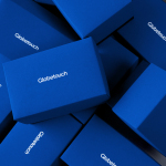
Globetouch by Bunch
Globetouch is a UK communications business and platform owned by operators and providing a wide range of mobile devices with access to a global and cloud-based ecosystem through an extensive network of offices and data centres. This extensive network and global reach is expressed throughout Globetouch’s brand identity, created by Bunch, using a modern pared-down colour palette inspired by migratory birds, a G that matches...
Playground by Character
Playground is an American venture fund and start-up studio that takes a hands-on approach to mentoring the next generation of entrepreneurs. It was established with the intention of removing typical operational burdens associated with product development, drawing on the first-hand experiences of its four founders, freeing entrepreneurs to focus on what makes their idea great. Playground not only funds new ventures but offers...
InsideSource by Mucho
InsideSource is an American office space planning, design and installation business with 25 years experience and past clients that have included Facebook, Box, Shutterfly and Tango. InsideSource worked with graphic design studio Mucho to help them better express who they are and what they do through a new visual identity. This was achieved using a modular and custom type-based system that runs across tote bags,...