Planned Living Architects by A Friend Of Mine
Opinion by Richard Baird Posted 16 October 2017
Planned Living Architects (PLA) is located on Australia’s Mornington Peninsula and has an architectural portfolio that shows a sensitivity and responsiveness to the uniqueness of each site, is environmentally-consciencious, materially mindful, beautiful and functional. The studio is well-regarded, has decades of experience and expertise working within coastal and rural areas, is known for its pared-back style, and has a philosophy that is rooted in the fluid connection between the built and natural environment. These principles, considerations, style and expertise are expressed by their new brand identity, created by Melbourne-based design studio A Friend Of Mine, in the typesetting of logotype, the spacing of acronym, the design and finish of illustration, and the photography of Sean Fennessy. The project features printed assets such as business cards, envelopes, portfolio and tote bag, and digital assets that included a responsive logotype and website.

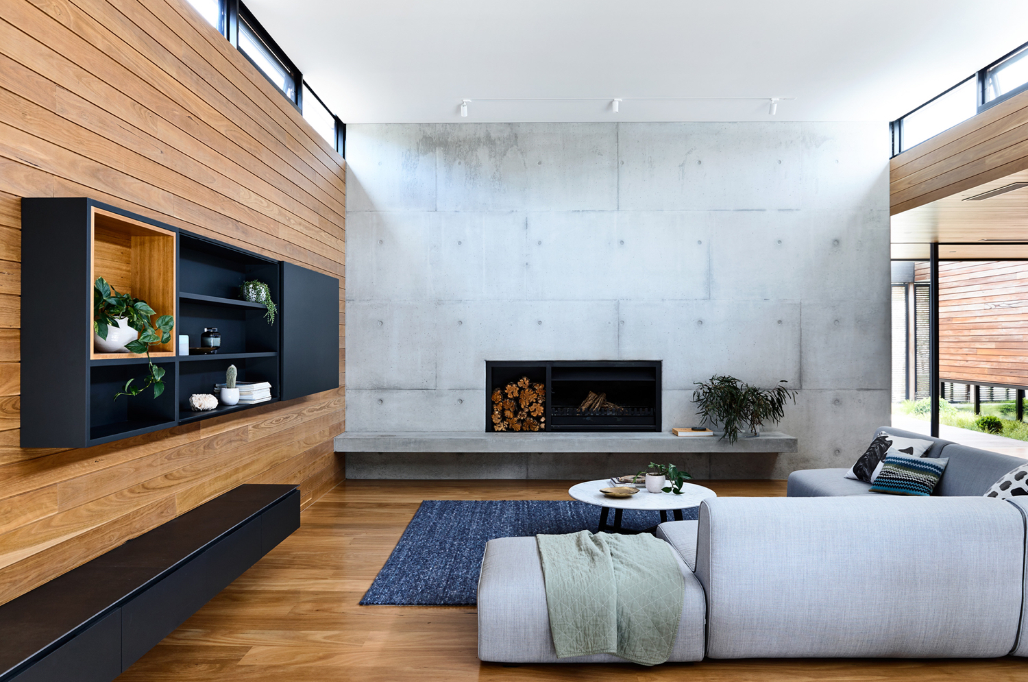
DS House is a good distillation and expression of the philosophies that run throughout PLA’s portfolio. This is characterised by a distinctive exterior and interior continuity, with the robust forms and exposed uncoated surface of cast concrete and the linear and natural qualities of timber connecting the two. This continuity is developed by the use of large windows that flood space with natural light, and bay doors that dissolve the barrier between built and natural environment.


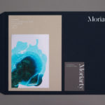
Although it is a small project it features a number of well-intentioned details that bring to light and reference some of the unique qualities of PLA’s portfolio. Fluidity of movement, a contextual sensitivity (typically rural landscapes and coastal areas) and familiar architectural cues (colour, form and arrangement) neatly intersect in an undulating illustration. This finds an intelligible, unexpected and distinctive balance between an organic topographical and wave-like quality, a neat land and sea duality, and the measurement and order brought by and associated with architectural grids.
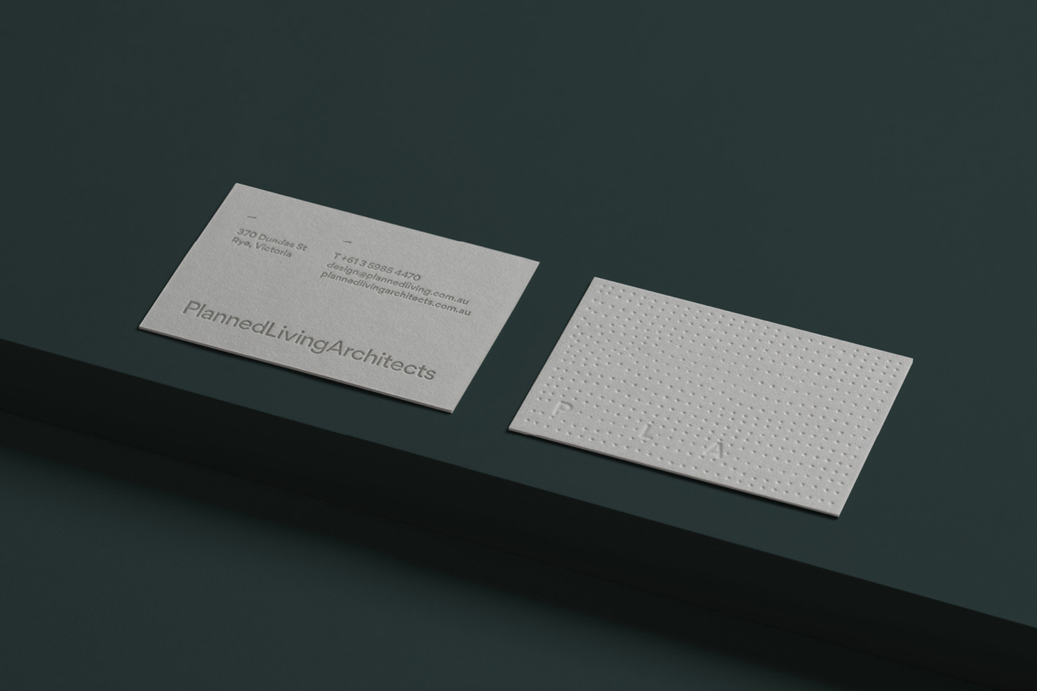
The blind embossing of this illustration across business cards and portfolio cover effectively emphasises this topographical quality, and works in the themes of light and shade, and makes a connection to the materiality of architecture. It might have been good to have seen a few variations of this, however, photography builds on this in a more compelling well.
Logotype and acronym play with both an economy and generosity of space (interior and exterior), a sense of structure, and conveys the pared-back nature of the studio’s work and its user-focus and functionality. It does this in type choice, a neogrotesque with a geometric foundation, its typesetting absent word space, and dynamic rollover feature online. This use of space in the acronym, “dictated by the space left by removing letters” is not unusual, but much like the use of topographical grid, material, colour and finish, is an accessible and understandable expression for broader market.
The photography of Sean Fennessy, which is scattered amongst PLA’s portfolio, captures the local surf scene and ocean, and works in a compelling drawcard for clients looking to build beach houses. There is a satisfying contrast and commonality between image and graphic expression, that works well to add in an aspirational and contextual quality to portfolio photography. Colour grading and composition forms a useful link between outdoor and indoor photography. The choice of Australian designer Thomas Gillett’s font Gordita feels like another, albeit hidden, nod to context, rather than choosing something international.


A Friend Of Mine effectively dip into the universal visual vernacular of the architecture industry. Grids, space and typographical utility but a human approachability, light, shade and dyed concrete concrete grey boards, are all touched upon. However, the introduction of an organic element, in graphic and photographic expression, rooted in the fluidity of structure and its rural and coastal location, as well as structural and landscape photography, builds in a distinctive component, clearly rooted in the unique positioning of studio. More from A Friend Of Mine on BP&O.
Design: A Friend Of Mine. Architecture Photography: Derek Swalwell. Landscape Photography: Sean Fennessy. Portfolio Photography: Sarah Anderson. Opinion: Richard Baird. Fonts: Gordita.