Estate Agent
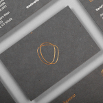
DNA Development by Face
DNA development is a New York based, privately held and vertically integrated real estate investment and development business that looks to create beautiful, functional and liveable spaces. This intention is reflected throughout their new brand identity, designed by Mexican graphic design studio Face, across business cards, stationery, notebooks and website....
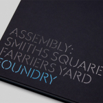
Assembly by Blast
Assembly is a new 250,000 sq ft. development project managed by Axa Real Estate, located in London’s Hammersmith, and comprised of 4 office buildings, 3 public squares, bars, restaurants and estate wide amenities. As a business hub the development is strategically positioned between Central London and Heathrow, with easy access to the Underground, road and river networks. Working with Axa Real Estate, Bell...
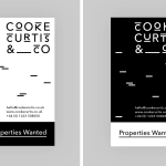
Cooke Curtis & Co. by The District
Cooke Curtis & Co. is an award-winning estate agent with an office in Cambridge, United Kingdom. It has a portfolio and a thorough understanding of properties throughout the city and in neighbouring villages. Although the business was established last year, its founders have over thirty-five years of industry experience. Local graphic design studio The District were commissioned by the estate agent to develop a visual identity that...

Fox Real Estate by Parallax
Fox is described by Parallax Design, the Australian graphic design studio behind its new brand identity, as one of Adelaide’s most respected boutique real estate agencies. Established in 2005 by Andrew Fox, Fox Real Estate specialises in the selling of high-end properties. Following business growth and to coincide with a move to larger premises, Fox worked with Parallax to develop a...
The Stow Brothers by Build
The Stow Brothers is an estate agent working within the area of Walthamstow, a place where urban London meets the Epping Forest, and is described by the estate agent as a rapidly expanding community of like-minded people looking for a place with a strong sense of community, plenty of culture, good food and a decent pint. UK-based graphic design studio Build worked with The...