Fabric Covers
Lukas/Markus – Kalle Sanner by Lundgren+Lindqvist
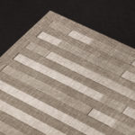
Lukas/Markus is a decade-long photographic project by Kalle Sanner shot with a large format camera and exploring the mirrored and connected chapels of Saint Lukas and Saint Markus designed by architect Sven Brolid. The structure was built during the 1960s, a period when Swedish functionalism was at its height, and is located in the Western Cemetery of Gothenburg. The book,...
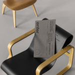
Enter Arkitektur by Lundgren+Lindqvist
Enter Arkitektur is a Swedish two-office architectural practice located in the cities of Jönköping and Gothenburg. It has a rich history that goes back to the 1950’s and a portfolio that moves between residential housing and commercial building projects. In response to restructuring and expansion, the practice worked with Lundgren+Lindqvist to develop a graphic identity that would better represent their...
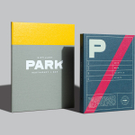
Park Restaurant & Distillery by Glasfurd & Walker
Park is a bar, restaurant and distillery located in the Canadian resort town of Banff, within the Banff National Park, and the province of Alberta. It is a region of diverse natural beauty which includes mountains, prairies, forests and desert badlands, and that attracts walkers, campers and skiers locally and internationally. The restaurant is a celebration of Banff’s alpine history and lifestyle. This runs...
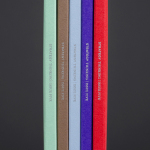
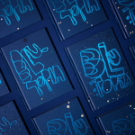
Strategy Thinking Issue 5 by Strategy
Strategy Thinking™ is an ongoing self-published series from New Zealand, Australia and Tokyo based graphic design studio Strategy. It provides the studio with a concise and compelling platform to showcase their work, communicate how they help their clients, and convey the insight and creative thinking that unites their five studios. The series also includes in-depth case studies and articles. The latest edition...
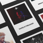
John Reynolds’ Blutopia by Inhouse
John Reynolds is a New Zealand based contemporary artist, Arts Foundation Laureate, Sydney Biennale headliner and Walters Prize nominee. John began painting large abstract panels, however, has moved towards creating work with a typographic and structural foundation and has embraced smaller formats which has, amongst others, included postcards and stamps. Blutopia is a full colour reproduction of John Reynolds’ Bluetopia series from 2014...
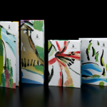
Life or Death by DIA
Life or Death is a New York and LA based full-service public relations and management business with hip hop roots. It draws its name from the idea that, within the music industry, there is no middle ground, it is either life or death. This abstraction and dual notion manifests itself within the firm’s new brand identity system, designed by DIA, as...
Marbella Club by Pentagram
Marbella Club is a hotel, spa and golf resort located in the Spanish coastal city of Marbella, on the shores of the Mediterranean sea. Built as the private residence of Prince Alfonso of Hohenlohe-Langenburg, and converted by the prince into an exclusive, private hotel and retreat in 1957, Marbella Club has a significant heritage, one that has played host to royalty,...
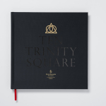
Ten Trinity Square by Pentagram
Ten Trinity Square is a super prime real estate project developed by the Chinese conglomerate Reignwood Group. It is made up of a private members club, residencies and a Four Seasons hotel, all set within the Port of London Authority building which is located at the centre of the city near the Tower of London and with views of the Thames....
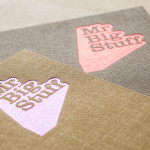
Mr Big Stuff by Can I Play
Mr Big Stuff is a Melbourne-based Southern American soul food restaurant and cocktail bar with a unique and distinctive interior designed by Technē Architecture and influenced by the music and film culture of the 1970’s and 80’s. The restaurant features an exposed concrete floor, timber and acoustic foam walls, neon signage and utilitarian furniture, as well as interior graphics and a brand identity treatment...