Fonts In Use: Simplon

Center for the Study of Political Graphics by Blok
The Center for the Study of Political Graphics (CSPG) explores the enduring power and immediacy of the political poster in the fight against inequality, their capacity to acknowledge and bring to light the injustices and atrocities of the world, and through their archival, keep alive the stories, voices and controversies that they have come to represent. CSPG worked with Canadian...
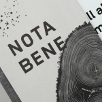
Nota Bene by Blok
Nota Bene is a restaurant, located on Toronto’s Queen Street West, with a menu made from locally-sourced and seasonal ingredients. It was opened by chef David Lee and business partners Yannick Bigourdan and Franco Prevedello in 2008, and was awarded “Best New Restaurant” by Toronto Life and enRoute Magazine soon after. To coincide with the restaurant’s 2016 relaunch—which saw David Lee take...
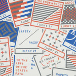
Lucky 21 by Blok
Lucky 21 is a film production company, located in the US city of Dallas, who bring a “contagious energy and tireless drive” to the industry and have a production team and director roster that includes the talents of Jeff Bednarz, The Chartrands, and Tom Ryan, some of whom have worked for big brands such as TGI Fridays, AIG and Home Depot. Lucky...

Meteorologisk Institutt by Neue
Meteorologisk Institutt provides meteorological data to Norway’s military, civil services and the general public with the intention of safe guarding life, property and the environment. Design agency Neue developed a new visual identity solution for the institute that mixes geometric shapes, material and print choices and the humanistic and environmental detail of photography to achieve communicative and aesthetic contrast and capture the data drawn from...