Nota Bene by Blok
Opinion by Richard Baird Posted 22 February 2016

Nota Bene is a restaurant, located on Toronto’s Queen Street West, with a menu made from locally-sourced and seasonal ingredients. It was opened by chef David Lee and business partners Yannick Bigourdan and Franco Prevedello in 2008, and was awarded “Best New Restaurant” by Toronto Life and enRoute Magazine soon after.
To coincide with the restaurant’s 2016 relaunch—which saw David Lee take sole ownership and the unveiling of a new menu and interior—Nota Bene worked with Canadian graphic design studio Blok to develop a new visual identity. This was inspired by David Lee’s approach to food and the restaurant’s new environment; a marriage of organic detail and contemporary materiality created by +tongtong, and runs across menus, stationery, business cards, postcards, coasters, packaging and website.

Blok’s brand identity for Nota Bene mirrors the essence of what good food is; elements that can be individually discerned yet brought together in surprising and creative ways.
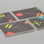
Here, organic imagery, paint splashes and the robust and reductive qualities of Simplon, as well as a playfulness of text, appear individually pronounced in their disparity, communicative in their universality, but distinctive in the way that they have been weaved together. These are also united by contemporary colour palette and uncoated material texture. Together, these effectively and clearly express the craft, creativity, spontaneity and values of the chef, his use of natural ingredients and the conviviality of the restaurant experience.


Contrast is used to great effect, emphasising each asset. This includes abrupt cuts through paper and typography, bisections of colour, a mix of paper sizes and robust uppercase letterforms set over the texture of image. There is a strong sense of continuity throughout, which also makes its way online.
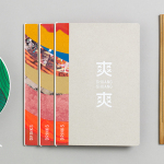
The fine detail of tree cross sections have been reproduced exceptionally well, and are enhanced by the reductive qualities of a sans-serif. This type choice feels mechanical in its form and spacing, and, alongside image and splashes, function as a fair reflection of the creativity and natural ingredients of Nota Bene’s dishes, and their meticulous but industrious reproduction in the kitchen.

Although this blend of natural image and precise type is not an unusual concept, the way this has been expressed, alongside colour and paper selection, appears distinctive, and presumably cohesive within the context of interior design.
There is perhaps little in the way of nuance. Colour palette is clearly current, images are obvious in their expression of nature and craft, and the paint splashes, although a little precise in their radial nature, introduce a sense of artistic spontaneity and flourish.

Conceptually, the work is grounded and the aesthetic well-implemented. There is plenty of detail throughout and a change in image that adds a variety and interest, however, the menus are the real highlight, demonstrating a great eye for paper colour, quality and size, as well as image, type and form contrast. These function to divide and define sections and content but also deliver an aesthetic interest and character. The materiality of restaurant interior also emerges in the choice of wooden boards.


The weight of type against the visual texture and detail of image, a use of organic form and precise typography, a good eye for proportion and the craft of implementation allows each asset to feel pronounced but well-balanced in print, and appear as a compelling distillation of the kitchen process. Everything is clearly defined, rooted in a communicative intention and worked together in a thoroughly contemporary and visually compelling way. More from Blok on BP&O.
Design: Blok. Opinion: Richard Baird. Fonts Used: Simplon.