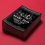
Fonts in Use: Founders Grotesk
So Energy by Studio Blackburn
I’ve said it before and I’ll say it again: it’s all well and good making some striking, retina-toastingly fluoro, brave as hell design work for, say, a kombucha startup or CBD lube or a record sleeve or an art book. These things are by dint of their very existence, context, and audience, already sort of cool. But the real creative...
Mama Mexa by Seachange
Tacos are a Mexican staple, consisting of a small hand-sized corn or wheat-based tortilla topped with a range of fillings. They make for perfect on-the-go food, packed full of flavour. This combination of convenience (quick to make or eat) and tastiness has seen the traditional dish rise in popularity as an ideal product to package and sell in many markets....
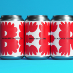
Oji by Seachange
Oji is a sushi brand of firsts. It is the first in New Zealand to use fully recyclable and biodegradable packaging and the first to use all free-range products. This is a significant move forward and marks the brand out from well-established competitors. Oji opened in New Zealand with two locations in Auckland’s Commercial Bay, a place where they source...
Endgame: Duchamp, Chess, and the Avant-Garde by Hey
Endgame: Duchamp, Chess, and the Avant-Garde was a temporary exhibition that took place at Barcelona’s Fundació Joan Miró between October 2016 and January 2017. It was curated by Manuel Segade, explored the history of modern art through the lens of its relationship to chess, and featured a variety of works by 20th century artist. These included Marcel Duchamp’s La Partie d’échecs, Max Ernst’s...
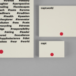
Capt by Bunch
Capt is a San Francisco-based start-up that connects creators wanting to monetize their videos with brands looking for new content and talent. The platform is made up of an app that allows creators to shoot, upload and license their videos, and a website that acts as a market place for buyers. This website also serves as a place to connect creatives with those...
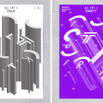
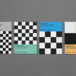
C( )T( ) – Typojanchi 2015 by Studio fnt
Typojanchi is an international biennale that looks to explore the various intersections at which visual language meets culture, politics and the economy. Its forth event, which took place between the 11th November and the 27th December 2015 in the South Korean city of Seoul, was based around the themes of, and relationship between, cities and typography. This is communicated within its...
Helsinki Philharmonic Orchestra by Bond
Helsinki Philharmonic Orchestra is a 102 strong ensemble, currently led by chief conductor John Storgårds, with its primary venue being the Helsinki Music Centre. It has a significant history, beginning as the Helsinki Orchestral Society in 1882 and acquiring its current name following a merger with the Helsinki Symphony Orchestra in 1914. In 2016 the orchestra will have its first female chief conductor following...
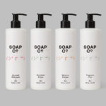
Soap Co. by Paul Belford Ltd
Soap Co. is a UK based social enterprise, luxury soap manufacturer and brand, that provides employment to people who are blind, disabled or disadvantaged. These individuals make up 70% of their team. All profits go back into the business to create and fund further job opportunities. Soap Co. recently launched a range of luxury handmade soaps, hand washes and hand lotions,...
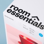
Room Essentials by Collins
Room Essentials is a line of modernist home furnishings created and sold by American retailer Target. The range covers over 2,000 products across 60 categories, and includes items such as blankets, lighting, chairs, tables and tableware. While securing significant revenue for the retailer, the range has, over the last five years, experienced a downturn in sales generated by its Millennial...
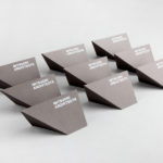
Mitsuori Architects by Hunt &Co.
Mitsuori Architects is an architectural design studio that creates high quality structures and spaces that merge aesthetic beauty with careful planning and thoughtful detailing. Their large scale project experience is combined with the flexibility of a smaller practice allowing them to provide big clients with a personalised service. Mitsuori’s visual identity, designed by Melbourne based Hunt & Co. and informed by a name that translates from Japanese as...
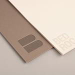
Bedroc by Perky Bros
Bedroc is a Tennessee-based consultancy firm that takes complex business issues and simplifies them with technology to reduce risk, optimise efficiency and creating revenue for its clients (ROC). The firm’s visual identity, created by multidisciplinary design agency Perky Bros, avoids the conventions of the industry and instead favours a direction that draws an analogy between bedrock and technology—the physical stability, sub-surface...