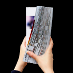
French Fold
Platform 10: Live Feed by Pentagram
Platform 10 is the latest edition of the Harvard University Graduate School of Design’s annual abstract of student work, events, lectures and exhibitions. Under the theme “Live Feed” and inspired by social media feeds, Pentagram’s Natasha Jen and team have collated and formalised the 2016-2017 school year, in reverse chronological order, presenting this as a timeline of images drawn from a...
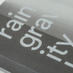
Rain, Gravity, Heat, Cold by Blok
Superkül is a Canadian architecture studio with a diverse portfolio of understated boldness, subtlety and spacial richness, rooted in a process that intends to find the essence of each project and remain true to this throughout design and development. To celebrate the studio’s first ten years Superkül worked with Blok to create Rain, Gravity, Heat, Cold, a book that would serve as a collection of...