Designed by Freytag Anderson

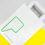
Filmore by Freytag Anderson
Filmore is a unisex skincare range and everyday routine. It is produced in Scotland for the national and international market using effective natural ingredients and Scottish water. Glasgow-based studio Freytag Anderson worked with Filmore on brand identity and packaging design. Referencing the International Code of Signals (ICS) and informed by their client’s love of Scandinavian design, the studio created a minimal graphic...
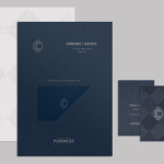
CC Bar by Freytag Anderson
Glasgow based design studio Freytag Anderson recently worked with Fraher Architects to develop the brand identity and collateral for Champagne & Cocktails at the Hilton Hotel, 22 Park Lane, London. Based around a monogram, midnight blue colour palette, hand crafted finishes of wood cut and etched glass detail, and both visual and material texture, Freytag Anderson delivered what they describe as a luxurious and old-world aesthetic that is...

The Fableists by Freytag Anderson
The Fableists is a children’s clothing company that creates quality basics, predominantly unisex, designed to last with ‘punk rock flair’ and utilitarian, vintage clothing and work wear influence. Their products are underpinned by a sustainable brand philosophy that pays and treats their suppliers fairly, considers its impact on the environment and aims to educate buyers on the complete life cycle of their...
Partick Dental by Freytag Anderson
Design studio Freytag Anderson were recently commissioned by Glasgow based Partick Dental to create a “fresh and vibrant visual identity” for their local practices. The studio saw the opportunity to create a clear concept that would avoid the “usual clichés associated with the industry” and have an inclusivity that would strike a solid balance between minimal, contemporary, inviting and established, through a...