Geometric Pattern
BRiMM by Harriman Steel
Combining an online shop, journal, and collective, BRiMM describes itself as a platform for ‘planet-positive living’, drawing together some big ideas and ruthlessly sustainable brands. Based between London and Stockholm, it was founded last year by James Haycock, who’s billed as, ‘an exited founder, angel investor, and the vision behind’ it all. The fact the whole thing looks so great...

Doméstico Shop & Doméstico Market by Mucho
Doméstico Shop is online retailer of designer homeware which has grown to become the leader in the Spanish market. It stocks an array of items, from furniture and kitchenwear to textiles and lighting. To coincide with the launch of Doméstico’s concept store Doméstico Market, and the opening of a new flagship store in Barcelona, the retailer worked with Mucho to...
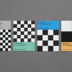
Endgame: Duchamp, Chess, and the Avant-Garde by Hey
Endgame: Duchamp, Chess, and the Avant-Garde was a temporary exhibition that took place at Barcelona’s Fundació Joan Miró between October 2016 and January 2017. It was curated by Manuel Segade, explored the history of modern art through the lens of its relationship to chess, and featured a variety of works by 20th century artist. These included Marcel Duchamp’s La Partie d’échecs, Max Ernst’s...
Corps Reviver & L’Heure du Cocktail by Spin
Corps Reviver is a French publisher and revivalist, redesigning and reprinting classic literary works, the first of which is L’Heure du Cocktail, The Cocktail Hour, written by journalists Marcel Requien and Lucien Farnoux-Reynaud and originally published in 1927. L’Heure du Cocktail, at the time, revolutionised the cocktail book, approaching the subject in a new way. This 2017 bilingual edition, presented in French and English,...

tvN by Studio fnt
Total Variety Network (tvN) is a South Korean nationwide television network, founded in 2006, that offers a wide variety of general entertainment programming. tvN recently worked with Studio fnt on the creation of an offline visual identity for its store, expressed through its products, a mix of office stationery and furniture. These include adhesive notes and notebooks, pen and business card holders,...
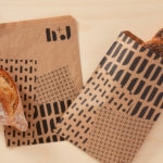
H+J by Spy
H+J is a UK independent catering business, established in 2004, that has provided food and catering solutions to venues such as The Cutty Sark, Moët & Chandon, Abbey Road, RIBA and Selfridges. Their services include working lunches and private dining rooms, large scale food courts, cafes and deli bars. London-based graphic design studio Spy worked with H+J to develop a new brand identity that would...

Sant Francesc by Mucho
Sant Francesc is a 5-star hotel located in the Placa Sant Francesc, beside the Church of the Templarios, within the city of Palma on the Spanish island of Mallorca. The hotel is set inside the walls of a restored historical landmark built in a neoclassical style during the 19th century and has 42 rooms and suites. Some of these rooms include wood-beamed ceilings, original frescos and...
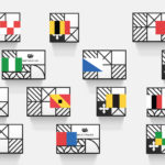
Helvetimart by Anagrama, Mexico
Helvetimart is a supermarket in the Swiss city of Lausanne. It offers a broad range of groceries and high-quality Swiss specialities sourced from across the country. The supermarket also holds daily tastings and workshops, has an informed staff and a tablet-based service that gives shoppers access to information on the Swiss cantons and their products. Drawing on regional flags and antique architecture, Mexican graphic design...

Vi Novell 2016 by Atipus
Vi Novell 2016 is a young wine from Catalonia with an intense ruby colour and a fresh and fruity flavour profile. It is the seventh in an ongoing series, and is dedicated to the party; the open-air dance, the joy and celebration of the beginning of the season, the first sip of wine, shared with friends, and the continued enjoyment of a long tradition...
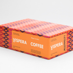
Víspera Coffee by Stockholm Design Lab
Víspera is premium coffee brand that intends to bring together the best of two worlds, a blend of 100% Arabica coffee beans sourced from the high altitude plantations of Colombia and a Swedish eye for quality and craftsmanship in its roasting. This meeting is visually articulated through type contrast, colour and pattern across Víspera’s packaging, developed by Stockholm Design Lab....
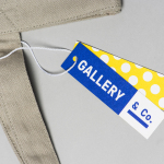
Gallery & Co. by Foreign Policy
& Co. links museum shop, a food and drink retailer and cafe housed within the National Gallery Singapore. These share a brand identity designed by Singapore-based graphic design studio Foreign Policy, built around the basic foundations of modern art and design; primary colour, geometric form and repetition, and Grilli Type’s GT Pressura. This runs across and unites a variety of printed materials that includes, but is...
Allsorts Black & White Edition by Bond
Bond continue to work with Scandinavian confectionery brand Cloetta, owner of liquorish brand Allsorts, on the packaging for their Allsorts Black & White edition. The packaging for Allsorts’ originals range looked to bring the distinctive shapes and colours of the liquorice to the forefront using geometric forms and bright colour, enhanced by the black background of a simple card box. It was an approach rightly described...