Corps Reviver & L’Heure du Cocktail by Spin
Opinion by Richard Baird Posted 1 June 2017
Corps Reviver is a French publisher and revivalist, redesigning and reprinting classic literary works, the first of which is L’Heure du Cocktail, The Cocktail Hour, written by journalists Marcel Requien and Lucien Farnoux-Reynaud and originally published in 1927. L’Heure du Cocktail, at the time, revolutionised the cocktail book, approaching the subject in a new way. This 2017 bilingual edition, presented in French and English, designed by Spin and illustrated by Spin’s Tony Brook, also offers a new take, pairing expressionist image with a more formal and modernist approach to layout and type. The release of L’Heure du Cocktail coincides with the launch of Corps Reviver’s own identity, also designed by Spin. This similarly explores something of the modernist, in the choice of type and use of form and pattern which appears to be rooted in the military associations of name.
There are two components to this post, the Corps Reviver visual identity, presented first and linking business cards, stationery and bookmarks, and the design and illustration of L’Heure du Cocktail 2017. Both share something of a modernist aesthetic in their combination of form and type, play and austerity, but are divided by colour and in the way that the latter favours something more of the expressionist. This distinction makes sense, with publisher establishing an unwavering and overarching continuity through repetition of form and neutrality of colour, and publication delivering character through bright papers and bold image.

Internationally, there are a few different approaches to military chevrons. As Corps Reviver is a French publisher, the two upward pointing arrows makes sense, or at least reads like this, within the context of name. Although visual identity is austere in its reduction and absence of colour, the relationship between form and name introduces something of the playful, outside of a militaristic context, whilst borrowing a sense of unwavering commitment. The chevrons are a little less successful when worked into logotype, which has the Vs flipped, sharing a commonality with logo yet, confusingly, reading more as A’s.
Logo and the choice of Dada Grotesk, a modest sans-serif, and the interaction of space and pattern, calls to mind the modernism of the mid-century; both the typographical play associated with the Swiss International Style and the recognisable structure and consistency of corporate America. This is clearly a period and movement that is looked upon fondly by Spin, presumably by Corps Revival and selected as the best way to connect with its intended market.
Corporate modernism, as experienced and understood by many through the reprinting of standards manuals, logo books, exhibition retrospectives and the monographs of designers that flourished during this period, has seen a growth in interest, be that in response to current affairs, a design nostalgia that desires a return to simpler systems, or the continued romanticisation of the ideals of the past. It is not often you find a natural coalescence between the genuine revivalist intentions of a publisher, a period passion of a design studio, and the peak enthusiasm of those that buy into these kinds of books, but this may well be it.
A couple of small criticisms. Concept (name-play) and implementation (colour and pattern) shares a lot in common with art fair and exhibition Collect, also designed by Spin. And the studio, as much as it is a lovely colour, return to the bright orange that runs across their work for Simon Pengelly, Matthew Hilton and UCA. This is, however, rooted in the setting of the sun, the passing of time and cocktail hours, which is neat, and more than just a stylistic flourish.

L’Heure du Cocktail, 2017
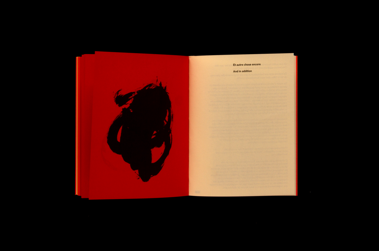
The design of L’Heure du Cocktail, like the Corps Reviver identity, also draws on a modernist past, but focuses in further, playing with an element of expressionism. Like publisher, expressionism has its origins in France, and much like the book, is rooted in the beginning of the 20th Century. This can be seen in loose brush strokes and irregular forms that present the experience of cocktail drinking from the subjective and singular perspective of the illustrator, Spin’s Tony Brook, and in the contrasting formal approach to type and layout which feels grounded in a methodical process.


The use of coloured paper and its gradation through the book is a particular highlight. There is a sense of process and the passing of time to this, and, in conjunction with bold image, absent page numbers, challenges the conventional approach to reading and divides content. This looks like a book that should be dipped into, rather than read front to back, and experienced as a piece of design as much as it is about cocktail making.
As the chevrons of the logo play with name, cover plays with duality, that of a clock and the stain of a cocktail napkin. These a simple and evident ideas of the smile in the mind variety, the play of you might associate with designers of the mid-century. As one offs these are pleasant, as a recurring motif amongst future releases, and continuing component of visual identity, this would be particularly neat. More work by Spin on BP&O.
Design: Spin. Illustration: Tony Brook. Opinion: Richard Baird. Fonts Used: Dada Grotesk.