Fitness, Health and Beauty
Equipped for Life
The protein market has absolutely boomed in recent years – a trend that doesn’t look as though it’s going away any time soon: a 2025 survey from the US-based International Food Information Council (IFIC) revealed that the most common diet that Americans followed in the past year was “high protein”, and that consumers use “good source of protein” as the...
Mix and Match
Ten or so years ago I’d wager that most of us hadn’t even heard of padel, but the tennis-adjacent pursuit has boomed in recent years: there’s reportedly a whopping 30 million padel players worldwide, as of stats from late 2024. Despite the fact the name sounds somewhat Ye Olde-ish – it wouldn’t be surprising to see a reference or two...
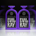
Evil Ray by Seachange
Until fairly recently, arguably sunscreen brands have had to do little in the way of brand design. Instead, they’ve been able to coast along relying on their credentials alone – and the fact that (in the UK at least) there hasn’t been a ton of competition. Things have been largely almost medicinal and rigidly adherent to category tropes: orange, yellow,...
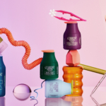
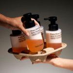
Cocolab by Wedge
It’s pretty hard to get excited about dental floss. Oral care, for the most part, lives firmly in the realm of obligation rather than desire, a twice-daily chore that sits somewhere between setting your alarm and taking the bins out. It’s precisely this emotional dead zone that Cocolab (formerly Cocofloss) set out to disrupt when it was founded in California...
Current State by Werner Design Werks
Current State is a skincare line launched by sisters Emily and Lanie Parr a couple of years back, which aims to “disrupt the status quo”, according to Werner Design Werks which created its boldly multicoloured branding. There’s a lot to love about this packaging and brand design – not least, that expansive approach to colour. It seems that Werner Design...
Project Send by Foreign Policy
Since their advent, kinetic and variable type have become a familiar part of the lexicon of brand design. It’s little surprise really: they offer a way to make an identity consistent yet dynamic; uniform but multifarious; endlessly flexible with countless opportunities to modify mood, tone, and messaging. But few projects seem to use kinetic type as a way to visually...

To My Ships by Formafantasma
There’s something almost monk-like about the branding for To My Ships, a new personal care brand founded by Daniel Bense. As former Head of Commercial at Aesop and Managing Director at Sunspel, Bense is clearly a man who understands that today, luxury isn’t about bling, gold ornamentation, and gauche, showy baubles; but about minimalism and understatement, and things that smell...
Ten by Paul Belford Ltd
I’ve been writing about the work of Paul Belford Ltd. (Next Chapter, Spudos & Social Enterprise) for very nearly fifteen years. Initially, and admittedly, the articles practically wrote themselves, which was ideal for a self-taught designer with very little experience but keen to take an approach to learning that was very much my own. That was to write about a...
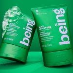
being by Zuru Edge
What does Gen Z really want? It’s the question at the heart of a thousand nigh-on identical think pieces; and at the fulcrum, it seems, of endless board meetings chaired by Gen Xers, and populated by ‘geriatric Millennials’, like me. My generation was simple. We wanted avocados, didn’t we? We wanted everything to be in millennial pink and to have...
Hello Klean by Two Times Elliott
Beauty is, of course, in the eye of the beholder, but there’s no denying that objectively, its branding and identity design has undergone some huge changes over the past decade or so. Gone are the days of faux-luxurious designs that were all about swathes of abstract silk; women coiffured to within an inch of their life; a microscopic lens on...
Compound by DesignStudio
What does ‘healthcare’ look like today, especially when we’re increasingly talking about preventative treatment? For Parsley Health and GlycanAge, which promote functional medicine, it’s serene – all blush pink, forest green and rounded corners; for Modern Age, which focuses on longevity, it’s more clinical, with high-resolution botanical imagery and classical icons; Ezra, which offers full-body MRIs as cancer prevention, goes...
Uoga Uoga Kids by andstudio
Since 2019, sales of beauty products labelled ‘clean’ have soared in popularity, and – as with all consumer trends, from interiors to fashion design – parental preferences influence the marketplace for children’s products as much as adults’. Enter Uoga Uoga (which translates to ‘Berry Berry’), a Lithuanian natural beauty and skincare company founded in 2010 that produces mineral-based makeup as...