Icon Design
So Energy by Studio Blackburn
I’ve said it before and I’ll say it again: it’s all well and good making some striking, retina-toastingly fluoro, brave as hell design work for, say, a kombucha startup or CBD lube or a record sleeve or an art book. These things are by dint of their very existence, context, and audience, already sort of cool. But the real creative...
IAAC by Mucho
The IAAC (Institute for Advanced Architecture of Catalonia) is an organisation which boasts a remit that feels both nigh-on impossibly wide but also hyperspecific. Based in Barcelona and founded in 2001 as a hub for innovation in architecture and design, IAAC describes itself as ‘a platform for producing knowledge to shape the future of cities, buildings and society’. The long...
Big Cartel by How&How
Big Cartel launched in 2005 as a low-cost, easily customisable ecommerce platform specifically aimed at artists and other creatives. In the two decades since, the platform has quietly revolutionised what it is to be an independent maker, powering more than $2.5 billion in sales from ceramicists, jewellery designers, illustrators, and the occasional medieval tapestry revivalist. But as the marketplace for,...
Siuru by Bond
Estonia’s Siuru plays with important questions, subverting and, at the same time, fulfilling expectations. Is it an art museum? A library? A cinema? Or a cultural institution? For a Bond (Veikkausliiga, Saaristo, Cable Factory) the design studio in charge of developing a brand identity for Siuru, this raised the concern, how do you brand something that seeks not to be characterised...
Reveri by Mother
There’s no denying the proliferation of all things that the more curmudgeonly crowds might deem ‘woowoo’ over recent years. Crystals, gong baths, singing bowls, silent retreats, tarot et al were once firmly languishing on the fringes of society, and are now de rigeur among the Stoke Newington set and TikTok classes alike. This rise in self-help-led esotericism has run concurrently...
RTS Cambridge Convention by Studio Kiln
The Royal Television Society’s annual two-day event at The University of Cambridge brings together leading television industry bigwigs to ponder the present and future of the small screen. This year, over 350 luminaries descended on Cambridge to contend with such weighty topics as ‘the future of media, the impact of AI, and the role of opinion in news’. Quite a...
LEGO by Interbrand & OLA
As recognisable brands go, LEGO is up there with the Nike swooshes and McGolden Arches of this world. Pretty much anything in that red and yellow lockup with vaguely Stay Puft-esque lettering (naturally there’s a LEGO version of that exact sailor) instantly says ‘LEGO’ – even when what it really says is, unlawfully, ‘Lepin’; or somehow scraping into legality, ‘Xinh’;...
RSPCA by JKR
It’s often the launch of major charity rebrands that puts the gulf between how the design world views something, and how the rest of the world might, into sharp relief. Countless headlines abound bemoaning the £££millions ‘spent on a new logo’, as if that’s just about all there is to it, and now the children/animals/elderly etc will directly suffer as...

Wisl by andstudio
Shaking off a hangover on a crisp Sunday morning kick-about with the boys; dunking a perfect basket on a court raked with the long shadows of a high-summer sunset; obliterating Janet from HR in a ‘friendly’ after-work squash game/grudge-match. These vignettes, I am assured by those who participate in such wholesome activities, capture both the hazy idyll and everyday reality...
Sing King by Nomad
I’m going to break with a decade of convention and jump right in. I love this. I was sold as soon as I saw the logo, it’s in the BP&O Gallery. It’s rare you see this kind of logo today. It’s mostly, and understandably, logotypes that prevail today. Those that are striped down to function well on multiple devices. Blanding?...

Raw Wine by The Counter Press
Raw Wine is an international two-day wine fair that takes place in the cities of LA, London, Berlin and New York. It was founded by Deborah Lambert and Isabelle Legeron MW, France’s only female master of wine, and provides an opportunity for growers, makers and buyers to get together. Raw Wine is also a celebration of the best organic, biodynamic and...

Sakki by Bond
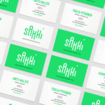
Sakki is Finland’s national union of vocational students. It is made up of 15-20 year olds from a variety of nations, and offers support, tackles student issues, and engages in activism. Scandinavian graphic design studio Bond worked with the union to design and develop a mobile-first experience, and a visual identity made up of tilt-responsive iconography, a bright, simple and modern colour...