Kraft Paper
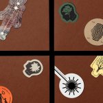
Divine Farmer by Base Design
International creative studio network Base Design is behind the branding for Divine Farmer, a California-based wellness company with an identity centred on New Age-style iconography and a heavy reliance on storytelling. Divine Farmer was founded by Polina Bowler, an acupuncturist and herbalist and owner of LA-based holistic wellness centre East Meets West who came up with the idea for the...

The Wool Pot by Seachange Studio
More plants, less plastic. A noble mission. Over the last decade, revelation has followed revelation with regards to the environmental impact of what seemed like the most innocuous of objects. Now it’s the turn of the humble flower pot. Yep, that. Stacked and sitting empty in the shed, or at the bottom of the garden. It turns out that these...

Think Packaging by Seachange
Cutting and creasing since 2010, Think is a design-driven structural packaging agency with an over-arching emphasis on form: ‘the neat bevels, the tight creases, the perfect fit’. The team of cardboard engineers has an international reputation thanks to its portfolio of award-winning work for global studios and brands, from startups to industry leaders, including Marx and Supply (New Zealand), OMSE...
CareerTrackers Awards by Garbett
CareerTrackers is an Australian charitable organisation that addresses Indigenous disadvantage by developing professional career pathways, internship programs and links with private sector employers for Indigenous university students. It does this through a model adapted from an African-American internship program that has been tackling disadvantage for over 45 years. This model sees students intern with sponsoring companies with the intention of converting them...
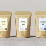
Tea & Glory by Socio Design
Tea & Glory are loose-leaf tea experts and are described as the antithesis of fast-paced coffee culture. In the same spirit of ancient tea drinking rituals, the brand is interested in the continued promotion of slow-living, a lifestyle that seeks to place more focus on the small details and experiences of everyday life. With a desire to better express this position Tea &...
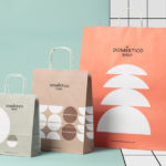
Doméstico Shop & Doméstico Market by Mucho
Doméstico Shop is online retailer of designer homeware which has grown to become the leader in the Spanish market. It stocks an array of items, from furniture and kitchenwear to textiles and lighting. To coincide with the launch of Doméstico’s concept store Doméstico Market, and the opening of a new flagship store in Barcelona, the retailer worked with Mucho to...
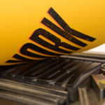
Raw Wine by The Counter Press
Raw Wine is an international two-day wine fair that takes place in the cities of LA, London, Berlin and New York. It was founded by Deborah Lambert and Isabelle Legeron MW, France’s only female master of wine, and provides an opportunity for growers, makers and buyers to get together. Raw Wine is also a celebration of the best organic, biodynamic and...

Tulura by Build
Tulura is an independent luxury botanical skincare brand created Eileen Feighny, a former professional model brought up in Korea and now working from New York. The first of Tulura’s products is a two-step moisturising program that includes a vitamin peptide serum and a botanical facial oil made from seasonal ingredients hand picked and custom-blended. Ingredients are chosen for their effectiveness, and formulations created without the use...
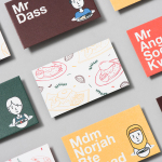
EAT by Fable
EAT is the second installation of a two-year long series of exhibitions that draw on the gastronomic memories of residents from Jurong, Singapore. Graphic design studio Fable worked to create the visual identity for EAT which included a variety of printed collateral. These appear to take their cues from menus and street food packaging, a contemporary gallery aesthetic and juxtaposes these...
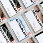
David Rowland by ico Design
David Rowland is an award-winning and straight-talking London-based photographer who has been capturing images for leading brands and agencies for over two decades. With a desire to remind existing and potential clients of his expertise and technical know-how David worked with graphic design studio and client ico Design to develop a new brand identity and supporting collateral. This included, alongside a new logotype, business...
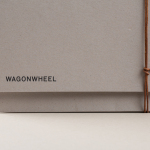
Wagon Wheel by Perky Bros
Wagon Wheel is a Nashville-based boutique real estate title and escrow company established by three partners with substantial experience working for larger corporate law offices who wanted to establish a company with a more casual corporate culture and client experience. This, and Wagon Wheel’s Nashville roots, is expressed throughout its new brand identity, designed by graphic design studio Perky Bros, using...
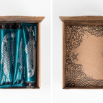
Biggans Böcklingpastej by Bedow
Böcklingpastej is a smoked herring fish paste from Biggans, a small family owned company creating products for the Swedish market since 1952. The company recently worked with Stockholm-based graphic design studio Bedow, who had previously helped them with the packaging for their range of sauces, to develop product packaging and POS for Böcklingpastej. This replaces a heavily branded logo-centric design with one of...