Tea & Glory by Socio Design
Opinion by Richard Baird Posted 9 November 2018

Tea & Glory are loose-leaf tea experts and are described as the antithesis of fast-paced coffee culture. In the same spirit of ancient tea drinking rituals, the brand is interested in the continued promotion of slow-living, a lifestyle that seeks to place more focus on the small details and experiences of everyday life. With a desire to better express this position Tea & Glory worked with London-based design studio Socio Design to develop a visual identity, packaging system and interior signage that connects retail and hospitality experience, and that materially projects their ethos outside of the T&G space. Assets included loose tea pouches and boxes, takeaway cups and shopping bags. These are linked by a T&G logo, Klim Type Foundry’s Domaine Display, Sans and Condensed, a pastel colour palette, copper block foiling and a delicate pattern.

The Tea & Glory cafe, located in The London Borough of Camden, is characterised by its Scandinavian qualities in the long vertical wooden slats of the walls, smooth exposed concrete surfaces, industrial lighting and exposed utilities overhead, a slatted wooden menu board and a neutral, natural and urban colour palette. The cafe also includes the theatre of a row of infusion crucibles. Furniture, fixtures and fittings introduce moments of delicate metal framework, with a spiral staircase being a particularly nice detail transitioning between floors. This could, of course, also be read as having the some of the qualities of an Eastern tea room filtered through the lens of the West.
The basement space features a brightly coloured and full wall mural of mountains, cherry blossom and rice fields. This feels out of place, a blunt reference, and in opposition to a visual identity that is modern and refined, delicate in aesthetic and reference with a systematic rigour capable of uniting a broad range of tea products.

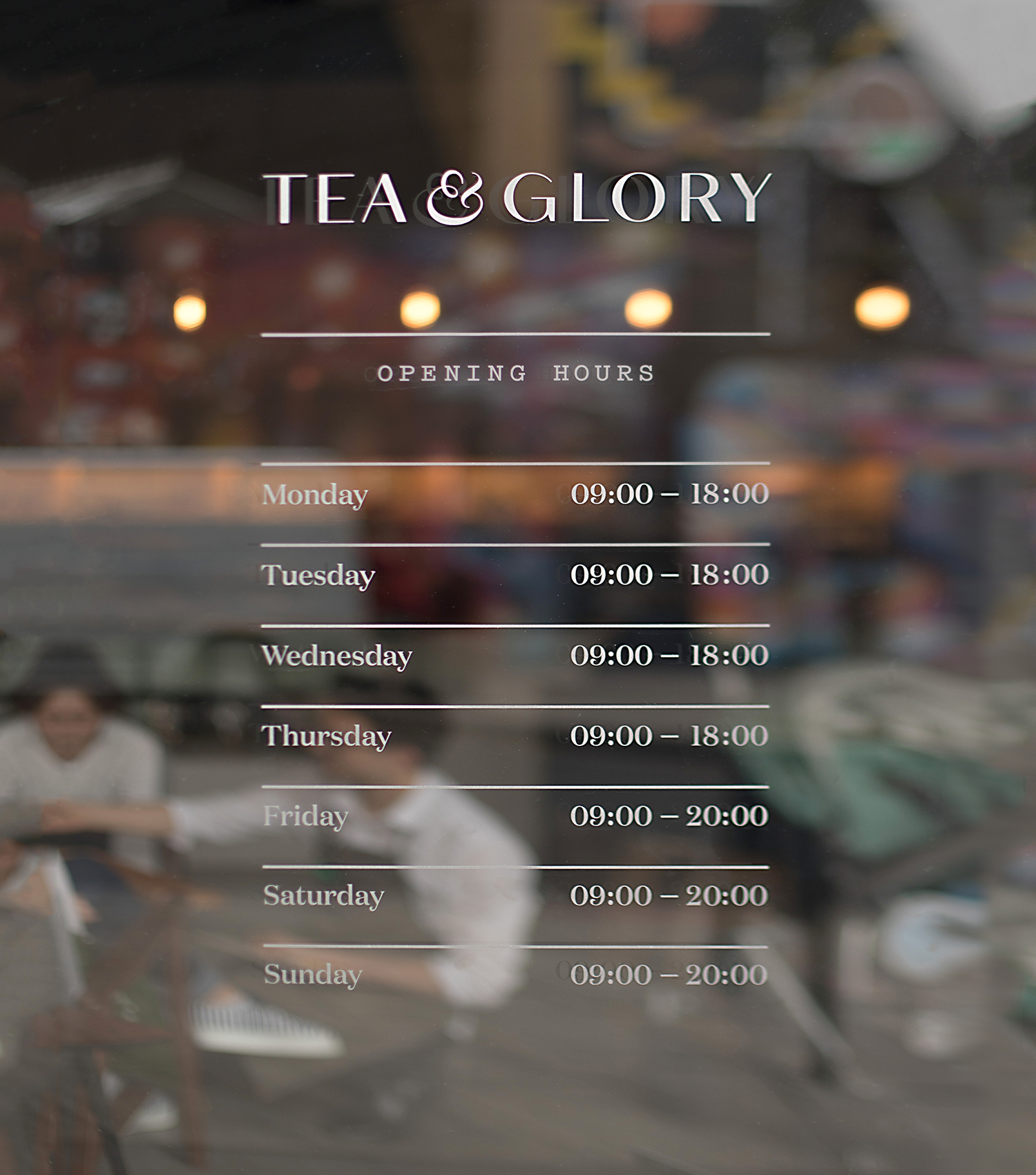
The tone of the brand is described as being contemplative. This emerges in the use of space, material and subtle allusions throughout visual identity. The pattern work is perhaps the highlight, however, the ampersand, a reference to a steaming cup of tea is a pleasant detail.
The pattern works as a subtle and neat confluence of ideas. A hexagonal grid-system ties in neatly with the structure of packaging labels and the methodology of tea preparation. It also has something of an old map about it, journeys and discovery come to mind, a connection to the earth broadly, and then more specifically in the ideograms, the implication of water and soil shaping growth and the flavour of tea.
Outside of these references, the pattern is aesthetically delightful and reconfigurable, with space around imagery being a critical part of identity, mentioned in brand guidelines and linked to contemplation, space for thought, developed further through the light and shade of blind embossing. This pattern, in the lightness of its lines, also holds a block foil particularly well, perhaps a subtle reference to Chinese copper teapots.
It would have been good to have seen this pattern intersect retail space, perhaps set into concrete, cut into wood or as a little detail on the windows instead of the circles, which offer little.

There is a pleasant interplay between the contemporary, enduring luxury and craft in the intersection of pastel colours, block foiling and packaging materials, textures, structures and mechanisms of opening. Much of this brings to the surface a sense of quality and expense, setting expectations high. The materiality of packaging makes sure that there is a complete experience, and a richness and continuity of brand positioning, although this falls short online.

Klim Type foundry’s Domaine Display, Sans and Condensed collectively have a pleasant balance of elegant and refined capitals, with calligraphic qualities in the contrast of stroke weight, a lowercase of small flourishes, and a variety of widths that increase functionality and use across different packaging structures. The flourishes of Demain Display, although small are pronounced, that the character of the typeface is recognisable, and in its accessibility and increasing popularity, may become commonplace. The ampersand does, however, serve to layer in a completely custom and own-able detail.

The result is refined and thoughtful with an evident but not excessive material quality to it although it is curious to see such expense applied to disposable takeaway coffee cups. Strategically it channels, in some ways, the visual language you might associate with a small boutique fashion brand, particularly in the detailing of the bags and in the choice of pastels. This crossover helps fold tea drinking into the lifestyle space. More work by Socio Design on BP&O.
Design: Socio Design. Opinion: Richard Baird. Fonts: Domaine Display, Domain Sans, Domain Condensed & Pitch.