Designed by Lo Siento
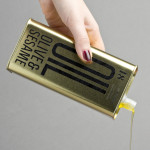
Olive & Sesame Oil by Lo Siento
Design agency Lo Siento have recently completed their packaging design work for Spanish olive oil producer Olis Bargalló‘s new Olive & Sesame variety. Lo Siento’s use of condensed sans-serif typography, stacked vertically, and printed with a single black ink makes great use of the tall tin and its warm gold colour. Typography, structural choice and straightforward language share a similar commercial...
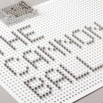
The Cannonball by Lo Siento
The Cannonball is a Spanish production studio that develops ‘creative and sophisticated audio-visual narratives’ within the fields of broadcast television, photography, social media, fashion films and motion graphics. Their visual identity, developed by Barcelona-based brand and graphic design agency Lo Siento working in collaboration with Dave Sedgwick, utilises a ball bearing, grid-based concept to give the associated force of the name...