IAAC by Mucho
The IAAC (Institute for Advanced Architecture of Catalonia) is an organisation which boasts a remit that feels both nigh-on impossibly wide but also hyperspecific. Based in Barcelona and founded in 2001 as a hub for innovation in architecture and design, IAAC describes itself as ‘a platform for producing knowledge to shape the future of cities, buildings and society’. The long...

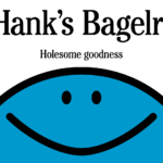
Hank’s Bagelry by Studio Ongarato
Sometimes, a brand identity can be deeply strategic, have a rich heritage or an involving narrative. Other times, it can be simply eye catching and cool. Suites of custom designed icons, art directed photography, tone of voice, motion behaviours, programmatic graphic elements and bespoke in-house content generating tools…. not every brand needs these. They’re colours to paint with. I call...
Pinky Swear by The Working Assembly
I could be totally wrong, but it really does look like New York-based branding agency The Working Assembly had a lot of fun working on the branding for Pinky Swear. A restaurant and cocktail lounge on Chrystie St on Manhattan’s Lower East Side, Pinky Swear opened earlier this year as a fascinating concept unlike anything we’ve really encountered before: yes,...
Monica Rich Kosann by Here
There’s been a fair bit of chatter in recent times in the brand design world about the ‘new codes of luxury’ – how today’s hip young well-to-dos are eschewing the signifiers of yesteryear (ostentation, gold, bling, anything remotely showy) for a more understated aesthetic. Being fabulously rich today, then, is perhaps a little like the whole ‘no makeup’ thing: anyone...
Phoenix Organics by Marx Design
It’s a tale as old as time: a once beloved brand – a pioneering brand even, the first of its kind or category – that gets rather lost over the years, muddled in a confusion of sub-brands and spin-offs. Such brands often fall victim to a sort of design by committee – and rarely intentionally: as companies grow and expand...

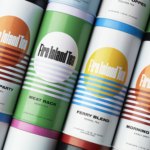
Fire Island Tea by Stephen Moss
Fire Island has always seemed far more a mythical utopia than a real, physical geographical, location to me; in part simply because of its name: Fire Island seems wrenched straight out of Greek legend – elemental, fearsome, alluring, almost a contradiction as surrounded by water yet inherently burning. But mostly, it’s thanks to Frank O’Hara, whose mid-20th-century poetry eschewed the...
12 by Base Design
If New York really is the city that never sleeps, that’s in no small part thanks to coffee – and now, increasingly, a newer entrant to the socially acceptable uppers scene, matcha. Capitalising on the growing interest in the sludgy green pick-me-up is 12, a new-ish matcha-centric café and retail store that opened last year in Manhattan’s NoHo area. Sited...
Big Cartel by How&How
Big Cartel launched in 2005 as a low-cost, easily customisable ecommerce platform specifically aimed at artists and other creatives. In the two decades since, the platform has quietly revolutionised what it is to be an independent maker, powering more than $2.5 billion in sales from ceramicists, jewellery designers, illustrators, and the occasional medieval tapestry revivalist. But as the marketplace for,...

Tsukiyo by The Colour Club
I’d never really heard of Osaka’s Dotonbori district before encountering this project, let alone been there. Neither, I’d guess, have many of the patrons of Tsukiyo, a modern Japanese street food restaurant inspired by the area and based in Sydney’s Darling Square. But the power of great branding is such that even just looking at the identity in 2D, on...
Klangwelt Toggenburg by Studio Marcus Kraft
Klangwelt Toggenburg (which translates as ‘sound world Toggenburg’) is a cultural organisation that manages to marry a devotion to the experience and exploration of (you guessed it) sound, with breathtakingly gorgeous (as far as I can tell from Google Images, anyway) mountainous natural landscapes of the Swiss Alps, and some serious architectural chops to boot. Klangwelt Toggenburg began life more...
BRiMM by Harriman Steel
Combining an online shop, journal, and collective, BRiMM describes itself as a platform for ‘planet-positive living’, drawing together some big ideas and ruthlessly sustainable brands. Based between London and Stockholm, it was founded last year by James Haycock, who’s billed as, ‘an exited founder, angel investor, and the vision behind’ it all. The fact the whole thing looks so great...

Teller by Werklig
The social and cultural activity of sharing stories has been, and continues to be, an essential part of human experience. Storytelling contributes to the cohesion of, and sometimes control over, individuals and groups, preserving and passing on knowledge, and instilling moral values. Many of us live by the values and knowledge established over thousands of years through stories. With improvisation...