Mexican Design

El Pintor by Anagrama
El Pintor is a high-quality tequila and mezcal brand said to have been handcrafted by the world’s second certified maestro tequilero. El Pinto’s approach intends to create perfectly equilibrated spirits through the intersection of science and artistry. This artistry forms the basis of El Pinto’s graphic identity and packaging design developed by Anagrama. This is characterised by colour blocking, tapered bottle, distinctive screw...

Hüngry Beast by Savvy
Hüngry Beast is a cafe and juice bar located in Mexico City’s Roma Norte neighbourhood, a place of recent cultural and gastronomic development. It is a modern and casual experience with a focus on simple, high-quality cold-pressed and gluten-free products creatively prepared from healthy organic ingredients. The urban, natural and creative positioning of the cafe is expressed materially throughout an...

Orson Burger Kitchen by Anagrama
Taking inspiration from the work of artist Edward Hopper, and the style of the American diners of the 1920s and 1930s, Mexican design studio Anagrama developed an interior and visual identity design for Orson, a restaurant in the city of San Pedro pairing burgers with a wide selection of wines and milkshakes. The project, alongside a distinctive interior design of material detail,...
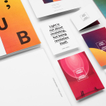
Helvetimart by Anagrama, Mexico
Helvetimart is a supermarket in the Swiss city of Lausanne. It offers a broad range of groceries and high-quality Swiss specialities sourced from across the country. The supermarket also holds daily tastings and workshops, has an informed staff and a tablet-based service that gives shoppers access to information on the Swiss cantons and their products. Drawing on regional flags and antique architecture, Mexican graphic design...

Someone Somewhere by Sociedad Anónima
Someone Somewhere is a clothing and accessories brand. Each of its products are designed and made in Mexico by small communities of textile artisans. The social and cultural contexts that are the foundation of brand are expressed by its new visual identity, created by Mexico City-based graphic design studio Sociedad Anonima, through naming and a graphic device that calls out maker and origin....

Barro de Cobre by Savvy
Barro de Cobre is a mezcal from Oaxaca, Southern Mexico, distilled twice; once using a clay pot and the second in copper. It is a unique process that takes time, but produces a strong yet smooth, clear but earthy character. The name Barro de Cobre, Copper Clay roughly translated, is an expression of this process, which also goes on to inform brand identity...
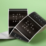
Hermoso Cariño by La Tortillería
Hermoso Cariño, a name taken from the title of a Mexican love song, is a gift shop with unique line of products. These are described as Mexican in the least expected way, leaning more towards the contemporary, but not forgetting tradition, and crafted by a new generation of designers. This is expressed throughout Hermoso Cariño’s brand identity, created by La Tortillería, through a mix of type,...

Marquez Quevedo by La Tortillería
Márquez Quevedo is a San Pedro based architectural practice that balances space, proportion, materials, form and colour to compose creative spaces filled with movement. Drawing on what is described as the practice’s sophisticated style and vision Mexican graphic design studio La Tortillería developed a new brand identity for Márquez Quevedo with a sense of space, structure and materiality, both in image and physical texture, that links business cards, stationery...
DNA Development by Face
DNA development is a New York based, privately held and vertically integrated real estate investment and development business that looks to create beautiful, functional and liveable spaces. This intention is reflected throughout their new brand identity, designed by Mexican graphic design studio Face, across business cards, stationery, notebooks and website....
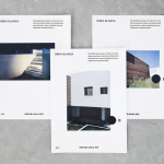
Obra Blanca by Savvy
Obra Blanca is an architecture studio, established in 2013, with offices in the Mexican city of Veracruz. The studio looks to transcend Mexico’s architectural landscape, remain independent and resistant to trends, and free to experiment and explore. It attributes a building’s value to its coherence, craftsmanship, materiality, functionality and context. Obra Blanca represents the last step in construction, the stage at which a building stops being just a structure and...
James Turrell; Jardín Botánico by Savvy
Botanico Culiacan is a 10 acre botanical garden, designed and built by Tatiana Bilbao in 2012, and located in the city of Culiacán, México. The garden is dedicated to conservation, eduction and botanical investigation, plays host to a variety of cultural events and is home to a contemporary art collection commissioned specifically for the space. Botanico Culiacan’s latest installation, James Turell’s Encounter, is the...

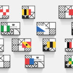
Hardpop 7 Years by Face
Hardpop is an electronic music venue located in the Mexican city of Juárez. It plays host to both international and national DJ’s and has been acknowledged twice by DJ Magazine as one of the best clubs in the world. Hardpop’s brand identity, a contemporary interpretation of military insignia, and a mix of conventional and unconventional typographic forms created by graphic design...