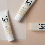
Ki Sunscreen by Akin
Ki Sunscreen was developed by national skincare clinic Caci to protect against the harsh New Zealand sun, and the skin damage and premature ageing that UVA and UVB rays can cause. It is made from the latest generation of ingredients proven to protect, and those that help to control oils and maintain a matt finish. This balance between clinically proven effectiveness and cosmetic...
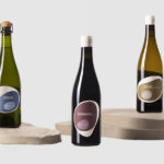
Pepe Raventós Natural Wines by Mucho
Bastard Negre, Xarel·lo and Ancestral are a small batch natural wine collection created, with minimal intervention, by Spanish vintner Pepe Raventós. Although Pepe is in charge of a vineyard that has been in his family’s hands for over 22 generations, and maintains the philosophies of his father and grandfather, this small collection was produced in the garage of his house,...
Carlsberg Black Gold by Kontrapunkt
Carlsberg is a Danish beer brand founded in 1847 by J.C. Jacobsen. It is part of the Carlsberg Group portfolio which also includes Tuborg, Kronenbourg and Somersby cider, as well as Carlsberg Export and Carlsberg Black Gold. Carlsberg has a significant heritage. And, like many other beer brands, has largely conveyed this using the visual language and associated legacy of the beer...

REF by Kurppa Hosk
REF is an environmentally conscientious Swedish hair care brand with a range of products that are made from high quality organic ingredients. With a desire to enter the international market of the US and further into the Nordic regions, both dominated by well-established FMCG, Scandinavian design studio Kurppa Hosk were commissioned to rejuvenate REF’s visual identity. This included packaging design, art...
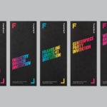
Frameline 41 by Mucho
Frameline is an American nonprofit arts organisation and the world’s longest running LGBTQ film festival. Frameline continues its mission, since its founding in 1977, to change the world through the power of gay cinema, and to connect filmmakers with audiences locally and internationally. Graphic design studio Mucho worked with Frameline on its visual identity and campaigns for its 40th and 41st LGBTQ...

Chaos by Socio Design
Inspired by fashion’s current fascination with customisation, technology and a “sense of light-hearted fun”, creative duo and stylists Charlotte Stockdale and Katie Lyall created Chaos, a new UK luxury lifestyle brand producing limited edition and personalised tech and travel accessories. Through form and finish, materiality and graphic design, Chaos products, which include phone cases and charms, zips and luggage tags, express the brand’s take on practicality...
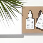
Tulura by Build
Tulura is an independent luxury botanical skincare brand created Eileen Feighny, a former professional model brought up in Korea and now working from New York. The first of Tulura’s products is a two-step moisturising program that includes a vitamin peptide serum and a botanical facial oil made from seasonal ingredients hand picked and custom-blended. Ingredients are chosen for their effectiveness, and formulations created without the use...

Filmore by Freytag Anderson
Filmore is a unisex skincare range and everyday routine. It is produced in Scotland for the national and international market using effective natural ingredients and Scottish water. Glasgow-based studio Freytag Anderson worked with Filmore on brand identity and packaging design. Referencing the International Code of Signals (ICS) and informed by their client’s love of Scandinavian design, the studio created a minimal graphic...
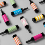
Vi Novell 2016 by Atipus
Vi Novell 2016 is a young wine from Catalonia with an intense ruby colour and a fresh and fruity flavour profile. It is the seventh in an ongoing series, and is dedicated to the party; the open-air dance, the joy and celebration of the beginning of the season, the first sip of wine, shared with friends, and the continued enjoyment of a long tradition...
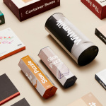
DOIY by Folch
DOIY is product design company creating playful objects that move between the useful and the more whimsical. These include items such as icepop socks, bicycle pizza slicer and unicorn scent. Much of this is firmly tongue-in-cheek but good quality, retailing in high-end and design-focused stores as well as larger chains. With the introduction of materials such as ceramics, woods, metal and porcelain across its new ranges,...
Tangent GC Soap by Carl Nas Associates
Tangent GC is a Scandinavian organic garment and shoe care company developing products that intend to ensure longevity. The company’s brand identity, a simple utilitarian typographical expression, designed by Essen International, delivered a sense of informational immediacy through the absence of superfluous stylistic detail and colour, dividing content in the arrangement, orientation and typesetting of Akkurat Mono. Venturing into organic personal skincare, Tangent GC worked with...
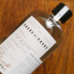
Barro de Cobre by Savvy
Barro de Cobre is a mezcal from Oaxaca, Southern Mexico, distilled twice; once using a clay pot and the second in copper. It is a unique process that takes time, but produces a strong yet smooth, clear but earthy character. The name Barro de Cobre, Copper Clay roughly translated, is an expression of this process, which also goes on to inform brand identity...