
Mathias Dahlgren Edition by Essen International
Mathias Dahlgren Edition is a set of contemporary kitchen appliances which are the product of a collaboration between the Grand Hôtel Stockholm, its renowned Swedish Michelin starred chef Mathias Dahlgren, and kitchenware retailer Dafra. Scandinavian graphic design studio Essen International worked with the trio to translate the culinary vision and creativity of Mathias Dahlgren into a modern graphic expression and packaging solution...
Terri Timely by Bedow
Terri Timely is a Californian directing duo creating short films, music videos and commercials. Although they collaborate with a variety of clients; these include Mitsubishi, Amazon and Comcast, much of the duo’s work share a quirky and humorous visual style. This is expressed by their new brand identity, developed by Swedish graphic design studio Bedow, through a simple but playful visual style and animation...
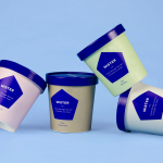
Mister by Brief
Mister crafts all natural, artisanal and seasonal ice cream from its location on Mainland Street, Vancouver, using a liquid nitrogen technique that rapidly freezes products to create less ice crystals and air compared to traditional ice creams. This gives Mister’s ice cream a richer, creamier and denser quality that does not require stabilisers or fillers. Mister worked with local graphic design studio Brief to develop a...
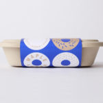
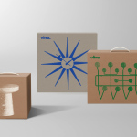
Happy Maple by Garbett
Happy Maple is a Adelaide-based bakery dedicated to producing small batch 100% vegan donuts, baked not fried, made from gluten, tree nut and peanut free recipes. Orders are by phone, e-mail or through their pop-up stores. There is no website, just a social media presence with lots of donut images, a personable approach to communication, and a cheerful brand identity created by...
Smithey Ironware Company by Stitch
Smithey is an ironworks producing kitchenware from its location in Charleston, South Carolina. Smithey’s first product, a 10 inch skillet, features a smooth, non-stick cooking surface, created using a handcrafted method of finishing and polishing. This process was developed in response to the rough, coarse and sandpaper-like finish that proliferates the ironware market, which creates an uneven surface temperature, makes it...
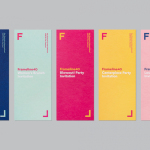
Frameline 40 by Mucho
Frameline is a San Francisco-based nonprofit arts organisation and LGBTQ film festival that intends to change the world through the power of gay cinema, and to connect filmmakers with audiences locally and internationally. Graphic design studio Mucho worked with Frameline on its brand identity and campaign for its 40th LGBTQ film festival, delivering a system based around a framing device, a bright and diverse colour palette and...
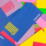
Freewheel by Collins
Freewheel is a dedicated Wi-Fi only mobile phone service launched by American cable television company Cablevision. Freewheel allows people to break free from contracts by providing unrivalled communications accessibility without large and expensive data plans and hidden fees. This is made possible by a network of over a million Wi-Fi hotspots. Freewheel’s egalitarian intention and connectivity is effectively expressed by its visual identity, created by New York based studio...
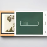
Hegel Music Systems by Neue
Hegel is a Norwegian amplifier, pre-amplifier and multi-media player business with a proprietary Error Correction System that limits harmonic distortion without compromising other parameters. Established in the early 1990’s, Hegel has grown to become a well-established supplier of high-end hi-fi products, nationally and internationally, and is committed to sound reproduction that adds nothing (or as little as possible). This is the foundation of their new packaging...
Vitra by BVD
Vitra is a Swiss furniture manufacturer that holds the European license to many of Herman Miller’s ranges. It has a large and diverse catalogue of contemporary home and office furnishings, furniture for public spaces and timeless classics by notable designers such as Charles & Ray Eames, George Nelson and Verner Panton. After years of admiring Vitra’s range of furniture, Scandinavian graphic design studio BVD...
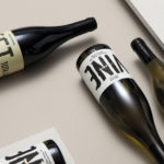
Estones de Mishima by Folch
Vins de Mas Sersal is a Spanish wine producer, founded by winemaker Salvi Moliner and sommelier Sergi Montalà in 2008. Inspired by the lyrics of Qui n’ha Begut from the album Set Tota La Vida (Thirsty The Whole Life) by singer, songwriter and friend of Salvi and Sergi, David Carabén of the indie band Mishima, the winery created a special...
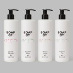
Soap Co. by Paul Belford Ltd
Soap Co. is a UK based social enterprise, luxury soap manufacturer and brand, that provides employment to people who are blind, disabled or disadvantaged. These individuals make up 70% of their team. All profits go back into the business to create and fund further job opportunities. Soap Co. recently launched a range of luxury handmade soaps, hand washes and hand lotions,...
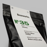
Beanworks by Paul Belford Ltd
Beanworks is a UK wholesale coffee roaster and supplier, coffee machine specialist and barista training school. It prepares its beans using a customised vintage Italian drum roasting machine that allow it to digitally monitor process, and produces a range of single and multi-origin coffee varieties. Although the roaster embraces contemporary artisanal coffee culture, when it comes to naming conventions it favours the utility of numbers,...